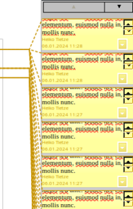
Using comments is a key feature in text processing. A typical workflow might be to review a document where notes are made by different colleagues. LibreOffice Writer currently shows these comments in the document margin, which is limited to the page height, ending up in the need to scroll long text (even while editing [1]) and eventually in paging-like interactions if the number of comments exceed the total size. The long outstanding bug 38295 complains about “Many margin comments/notes are complicated to use”.
 Requirements
One possible solution is to provide access to comments in the sidebar, requested in bug 106316 “New sidebar deck for comments”. The deck has to offer the functionality:
- Display and edit comments: beyond the obvious it has been requested to add rich text formatting [2] capabilities (not necessarily part of this project but it might become more easy to implement)
- Indicate different reviewers: comments are colored by authors (which is requested to be customizable [3])
- Show comments in threads: notes with replies need to be displayed in their natural relation (however, showing any depth in conversation makes the handling very difficult and up to one level should be sufficient)
- Delete a comment: relevant for single notes and a complete thread; but deleting all comments is perhaps better suited for the main menu
- Set the resolved status: possible for one note and the complete thread
- Filter/Search: although search is often requested [4,5,6], most use cases should be solved by a filter; the sidebar deck should allow to filter for authors, time, and status
- Sort: users ask for sort by time [7] and position [8] (which is relevant currently in case of multiple columns)
- Customize the content: some requests [9,10] suggest to save space
Mockup
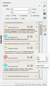
 Threads are shown in panels, with a short reference to the commented text on top. The authors are indicated via a chat-like tag using different colors and the name token (the full name could be shown per tooltip).
The most relevant interactions, ie. Reply and Toggle Resolved, are directly available on each comment; the more disruptive Delete and more global actions are available per context menu. And it should remain possible to Edit own comments (which would be the default action executed on double-click; a single click scrolls to the document position).
Each comment can collapse into a single line; if done on top next to the reference text, the whole thread would be minimized – and the number of replies shown in this case.
The options what information is visible; it might be a good idea to allow collapsing this area as well.
Resolved comments are indicated by a different icon (green here), clicking the icon toggles the flag. In addition, the comment text becomes disabled.
We should also consider accessibility and allow navigation and interaction inside the deck per keyboard [11].
Connectors
Showing comments in the document margin allows to connect it to the related text. This is efficient for a small number but becomes quickly cluttered and hard to use, is faulty [12], causes performance issues [13,14,15], lacks on standard interactions [16,17], and has accessibility issues [18].
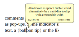
 And if we have comments in a sidebar, this connection wont work anyway (given the “margin comments” are hidden). A solution for this issue, proposed in bug 101714, is to display comments as pop-ups. Some indicator similar to bookmarks would be always visible (here a curly bracket) and if the user hovers over the text, a balloon tip or the like displays the full comment.
To keep workflow and UI flexible for different workflow we suggest to keep the current “margin comments”. That makes also sense when users work on the document with the need for other decks.
Implementation
The code difficulty should be well-suited for a Google Summer of Code project, or similar. Sounds like a plan for you? Get in contact and become a LibreOffice hacker!
And if you are just a user, please tell us what you think about the proposal. Would it support your workflow, is the design appealing, what features are missing… Your input is very much appreciated.
References
[1] Bug 145673: Comment box doesn’t expand while typing (scrollbar instead)
[2] Bug 81458: Add complex/rich text FORMATTING for COMMENTS in Writer, e.g. bullet points, text color, inserting tables…
[3] Bug 61242: Customise comments background color in Writer
[4] Bug 96474: Search *only* within comments
[5] Bug 106696: Ability to search for comment author in Find & Replace dialog
[6] Bug 127324: Make comments searchable by default, if shown.
[7] Bug 125667: Add option to sort comments by time
[8] Bug 131383: Sort comments in documents according the actual position (relevant for two and more text columns)
[9] Bug 86887: Start Comment boxes with one line height and allow to hide author/date
[10] Bug 62150: Allow customizing information & font size present in all comments (ie. remove author/date) to conserve space
[11] Bug 102054: Allow access and modifying of comment with keyboard
[12] Bug 106152: Moving view cursor over a comment anchor position is faulty
[13] Bug 61558: High CPU load when scrolling a document with many comments
[14] Bug 60418: ODT with excessive lots of Comments causes heavy CPU and memory load, can crash on saving
[15] Bug 148350: Toolbar & sidebar button state updates slowly when moving between comments and document
[16] Bug 64731: Make text selection for comments movable / editable
[17] Bug 139634: Selection of words by double click and mouse move in comments
[18] Bug 90725: Reading comments and modifications log
