
Configuring tables is an every day task for word processors. Most users likely insert a table via menu or toolbar and size the columns per mouse. This usually wont result in a satisfying precision and the table properties dialog would be the next step. But here the problems begin for real since using a certain width for all columns is not possible unless the “Adapt table width” is checked, which requires to change the “Automatic” alignment on a different tab to something else.
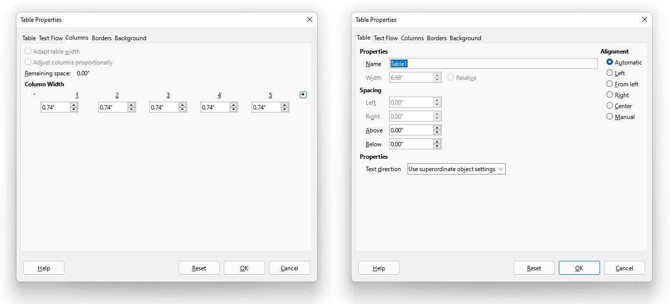
This workflow is hard to understand and results in many complaints like “Setting unevenly distributed column width is hard & cumbersome” (tdf#114633), “Revamp the Column tab of Table Properties dialog” (tdf#145739), “Table Alignment options are somewhat confusing” (tdf#145980), “Columns tab of Table Properties dialog doesn’t allow setting width of all columns to same value” (tdf#145738) and enhancement ideas such as “Adapting table width by default” (tdf#113960), “Adjust columns proportionally should/could be supported with visual accolade (lock)” (tdf#142588), or “Add ‘Row’ tab to Table Properties dialog” (tdf#104443).
User Stories
A user story is an informal, natural language description of features of a software system to describe the requirements. While the examples use concrete values it rather illustrates what use case the UI needs to cover.
![]()
Benjamin wants a table with 5 equally sized columns to fills the total page width.
![]()
Benjamin wants a table with 5 columns and 5 rows having exactly 1 cm width and height to draw a floor plan.
![]()
Benjamin wants a table with 4 columns having an exact width of 1 cm at the middle and otherwise filling the remaining space to show small images next to text.
![]()
Benjamin wants a table with 3 columns to have 10%, 30%, and 60% width.
- Benjamin wants to add/delete columns to a table and keep some columns at the same size while other should fill the remaining space.
Mockup
We started the mockup with the axiom to have attributes on the same page that belong to each other. In other words, the goal is to merge the current two tabs into one.
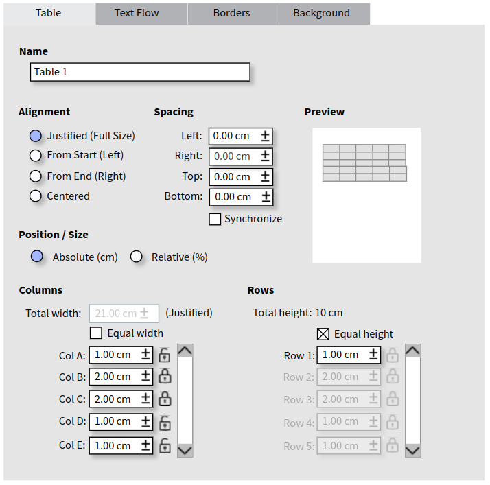
The dialog starts with basic information such as name, alignment, and spacing. We removed the option “From Left” from the list of alignments and renamed the “Automatic” option to “Justified (Full Size)”. Since languages may run from left to right (LTR) or right to left (RTL) the start can be at the left side or at the right. On the other hand, just calling it “From Start”, without “Left” in case of LTR, might be confusing for people who are unfamiliar with this duality.
The new workflow begins with “Column” (and “Row” next to it, which works the same). As of today, the total width is locked depending on the alignment (which is now clearly shown by a static text). The control look like disabled in the mockup but should be read-only in the implementation. The columns are arranged vertically in a scrollwindow. The checkbox Equal width allows to set all by one, the lock next to each column to make this value fix- changes apply only to other columns.
Some questions needs to be addressed:
- What happens when the total size is fix and the user changes Col A?
The maximum is clearly defined by the total width divided by the number of columns, respectively the sum of the widths. Reducing the value adds the remaining size to the next column in case of full-size tables – or shrinks the table in other alignments (as today). However, if the next column is locked, the second next will be used, etc. In case all columns are locked the value cannot change (minimum = maximum). With “Equal width” being checked, the remaining width is distributed equally to the columns that haven’t been locked.
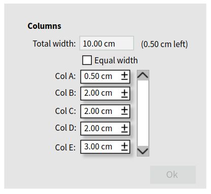 As alternative solution we pondered over is a ‘slack’ option. Remaining values fill a buffer, shown right of the total width, and the dialog cannot be closed until this buffer is zeroed. The advantage is to have a cleaner UI as the locks add some noise to the design. Since changing a value always increases or decreases the buffer first, the locks are pointless here. On the other hand, having a buffer is also not a very common design and affects the learning curve.
- How about the relative sizes?
It will be used for both, the total size as well as the column width and row height. If the total paragraph width is 17 cm, and the table is centered with 2 cm spacing left and right, the total table width of 13 cm is 76% (as today). The percentage of column widths adds up to 100%.
- What happens when the size cannot be distributed equally with the necessary precision?
We discussed this rounding issue and a potential solution is to use fractions, at least in the UI, like 1/3 for 33%. But the precision would be another issue and we suggest to accept one column to be 34% for now in case of relative values or to have a few millimetres off when distributing absolute values equally.
- What happens to the columns when adding / removing one?
In the current implementation, adding a column squeezes it in rather than expanding the table. And the optimal column width is also a one-shot function. The idea of the reworked design is to have more freedom in the configuration. If columns are locked, it should keep its size as best as possible (adding a column to a table with all columns locked still needs to work), having chosen an equal distribution should affect the table also after modifications.
What do you think about this modification?
PS: Special thanks to Eyal Rozenberg for working on this proposal.
I like having a single tab to configure the table. I like the clarity of start (left) and end (right). I really like having the preview!
1. While the locks do add a little clutter, I really like having exact control over which columns can change width and which ones I want left alone.
2. I would like to be able to add and delete rows and columns here, rather than deleting them from the page view and then having to come here to adjust the remaining rows and/or columns.
3. In order to insert a column in a justified table, I would prefer at least one existing column be unlocked, indicating to take the space from that column. In order to change a column width, both the column to be changed, and at least one other column should be unlocked. If more than one column is unlocked, I would like that to mean to take from all unlocked columns equally.
4. When rows or columns are to be adjusted equally, I would like to see the subsequent rows (or columns) all set to the equal width – unlike the picture above where some of the ‘equal’ rows show as 2cm not 1.
5. I don’t see the slack buffer giving me the same control as the individual locks. I do like seeing the table width, and having the option of bleeding the table into the margin a little, without allowing the table to exceed the page width – or at least not until there is an option to wrap a table horizontally onto the next page :)
6. When using percentages, why not use 2 digits after the decimal, so 1/3 shows as 33.33 rather than bumping one to 34.
Really excited to see the results!
> 1. While the locks do add a little clutter, I really like having exact control over which columns can change width and which ones I want left alone.
With the slack option, everything is always left alone. You control everything exactly, yourself. And remember that with this part of the dialog, you can’t change the overall width and have the extra width distributed among the columns.
Re: (5.) See my clarifying comment about how you the slack option also gives you the same control.
Re: (6.) Rounding, accuracy and fractional values are an ongoing pain point in LO (especially w.r.t alignment and sizing of drawing objects). Here, the numbers need to add up to 1; and yet you want them distributed equally :-( In the design meeting, my position was to _not_ try to solve this problem with the design change, but rather trying to steer clear of it, i.e. treat it as an orthogonal issue.
To the developers: On Windows platforms, change the default theme to a high contrast one and see how LibreOffice looks. You’ll discover many things you need to fix.
The high contrast issues are collected at https://bugs.documentfoundation.org/show_bug.cgi?id=103537. Theming is in fact a topic where we have to improve a lot.
This is a clear improvement. It respects left-to-right and right-to-left languages. Please go ahead as proposed.
Heiko,
again you are not taking into consideration the l10n – those strings in the mockup for sure will not be so short in other languages as they are in English, so do start to add/consider some added spacing (for the sake of localized UIs) when dreaming about making UIs better.
In Heiko’s defense:
1. It’s just a mock-up, not the final form.
2. Can’t the label text extend away from the text-boxes?
Also – I don’t speak that many languages; can you give an example of a language in which some of the strings are much longer?
Clarifying one of Heiko’s points in the post, regarding the slack option:
> Since changing a value always increases or decreases the buffer first, the locks are pointless here
The point is that the column sizes are not affected by anything other than directly changing them. If you enlarge or reduce something, the only thing that’s affected is the slack:
* Wider or narrower table – bigger or smaller slack.
* Add or reduce a column’s width – bigger or smaller slack.
This gets rid of the annoying “action at a distance” we have now. You set every single thing to exactly what you want it, then you check if it all adds up. And if it doesn’t – you decide how to fix it.