
Toolbars are a common toolkit control that have been around since the dawn of GUI applications, providing direct access to an application’s most frequently used functions. But with increasing scope, the number of frequently used functions grows to an extent that can have a detrimental impact on quickly locating a particular item.
Human perception is limited, but we are perfect in the processing of information. Pieces of information are stored together and build a mental model. In case of the classic toolbars, you likely know where to look for the Undo and Redo buttons, not precisely but approximately, and also remember a few functions next to these buttons. This ‘chunking’ is supported by the elaborated grouping of buttons and with separators between them. But sometimes those tiny features are not enough to convey useful information to the user.
Some attempts have been made to overcome this problem; for example LibreOffice has done it before with the Sidebar and is doing it again with another approach. We’ve implemented a toolbar, that we call the Notebookbar, as a blank canvas where designers have all the freedom to do whatever they want with the space.
Delicious MUFFIN
With a blank canvas, a designer can place any UI widget on it, including the usual buttons with or without a label, a section label to identify the group of controls, or more advanced widgets like tabs. They also have the ability to define any dimension for buttons, so they serve as a visual attractor, and all together have a larger catalog of controls to choose from than couldn’t be found in classic toolbars. Furthermore, they can define that the main menu can be hidden, or whether it should have a particular icon theme, for instance.
Of course the classic toolbars will still remain and are enabled by default, so don’t be afraid of radical changes. Users interested in trying out the Notebookbar will be able to opt-in and will be able to try out multiple different implementations.
Contextual groups
For the contextual groups implementation, the Notebookbar is split into labeled sections (similar to classic toolbar separators but more prominent), i.e. file operations, clipboard interactions, text formatting functions, and a context dependent section. Last but not least a small section for configuration of the toolbar itself at the right.
Three icon sizes are utilized: large icons with a label below being a perceptual attractor for the most important section interactions. Furthermore medium sized icons, two in a column, and small icons with three positioned together. Since this layout targets beginners, we label all buttons.
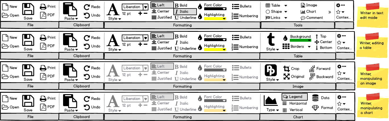
The contextual groups Notebookbar aims for consistency, which means also that it has to be as static as possible. Thus, Formatting remains available in all contexts, but gets disabled for objects like images. We also want to promote styles as the primary formatting tool. Having large icons for this leads the user to this function, which is not only valid for text (big A in the mockup at the formatting section) but also other objects such as tables (big T for table styles which have been introduced recently). To bring this idea more forward, we added an image style here having color modes like grayscale or watermark in mind.
Of course, the price to pay for various sized icons and text labels is limited space, and we had to remove some functions. That includes, among others, Find and Replace, Spellchecking, Non-Printing Characters, as well as Insert page breaks, Fields, and Special characters. Some could be added into the tools section, wherein the chevron indicator (») exemplifies how small screens or resized main window would behave in case of more content. But basically this variant of the Notebookbar is designed for beginners or simple tasks and should be as plain as possible.
Another challenge is to find good labels that are short enough to fit into the section. In the Chart contextual section, some labels were shortened, for instance Horizontal Grid, Data Table, or Format Selection. This section also has chart styles in a similar place as the Table and Image sections.
The goal is to have various toolbars for different users and scenarios, at best easily user-editable, and the user choose the appropriate at the right hand configuration section. It has (unlabeled) access to the configuration, a drop-down selection with a label below what is active.
Not only consistency at the different contexts is our goal but also familiarity over the programs. The Notebookbar for Calc and Impress looks very similar compared to Writer.
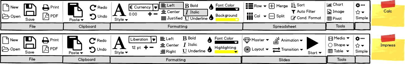
Likely a context dependent section is not necessary for Calc and Impress – chart manipulation, for instance, is available in the sidebar. The idea of animation and transition for Impress is to show the recently used options in this drop-down only, five or so, that overrides the factory setting.
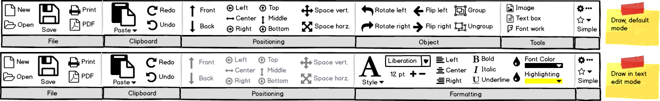
In case of Draw the focus is not the formatting of text but to position objects. While text can be added to almost all objects, the formatting is rather relevant for a text box. And even when a text box has no styling capability today the context dependent section would ideally correspond to what is known from Writer.
Alternative layouts
As discussed in the introduction, we can also place tabs on the Notebookbar. This layout occupies a similar space as the main menu (which is hidden with this layout) and classic toolbars and organizes all menu functions across the tabs. An implementation similar to the single line toolbar is also possible, which can be contextual and horizontally centered.

And of course it should also be possible to set-up configurations where the Notebookbar focuses on a special workflow like scientific writing.

Some crazy ideas were made in the community how the UI may look in a bright future. While it was far-fetched at the time being created the Notebookbar allows also these fancy configurations now.
The only limit is your creativity and the available list of functions known as ‘uno:commands’.
Experimental state
At this year’s Google Summer of Code, the Notebookbar was worked on by Szymon Kłos (aka eszka), continuing the development begun by Jan Holešovský (aka Kendy) and Samuel Mehrbrodt. We also made some configurations, that is the contextual group presented here as well as a contextual single line variant and the tabbed version. The flexibility of its development will allow the easy creation and testing of multiple implementations during the development cycle, something that wasn’t possible during OpenOffice.org’s Project Renaissance days.
The current implementation is in an experimental state, which means that you will have to unlock the menu entry first. This allows to switch the toolbar mode under View > Toolbar layout to Notebookbar. While the mockups have a dedicated section for the configuration that also allows to quickly switch the mode, this feature has not been finished yet. The modes are switched under View > Notebookbar.
Some of the implemented controls do not work perfectly, in particular that toggle buttons don’t appear toggled unless they are hovered over, drop-down menu lists are sometimes not filled or have entries that don’t function, section headers can’t be styled to have a good background color, and accessibility needs improvements (tdf#102059).
The classic toolbars are customizable and users can add or delete items from the pool of functions. This option is not available for the Notebookbar in this first stage of development; the only means of configuration is to deal with the Glade UI files. Eventually we hope to have a similar customization option like we have in Tools > Customization or we may possibly have an inline UI edit mode similar to what Mozilla allows for Firefox.
We are looking forward to your comments and ideas on how to configure a collection of toolbars. With a good set of options the individual configuration is less relevant.
PS: Learn more about how to make your own Notebookbar in the follow-up article DIY UI: How to create your own Notebookbar.
PPS: Mockups were done in Balsamiq and can be downloaded here.
Amazing to see Libre Office developers hearing cries of users. Now, if you would let users create their own groups and tabs, that would be so good.
those monochrome sketches are many many times better than the confusing ugly and unclear design historically used by LibreOffice .. keep it!
What could be really useful would be a hot-key orientated distraction-lesser focus mode that shows the document in full screen hiding the GUI icons and menus.
Have an option that when the user holds down any combination of the control and/or alt and/or super/option/window keys for any short period of time without hitting a shortcut key, a wide graphical representation of a keyboard pops up from the bottom of the screen with the current context shortcuts superimposed over the keys. i.e. Holding down the control key on the keyboard representation the “V” key would be superimposed with “Paste”
This would help train a user to use shortcuts avoiding the GUI & mouse or touchpad or touchscreen for most of the time.
Such a shortcut pop-up would be indeed great for familiarization. But once you know the shortcuts you rather not want to see the ‘wide graphical keyboard’. Most people are casual users not interested in learning efficient interactions. A very interesting solution has been done with the overlay of shortcuts at the actual UI control. So when you press Alt you see all possible key combinations. Unfortunately it’s limited to the graphical controls and lacks on ‘hidden’ commands that uses Ctrl (not necessarily distinguished by Alt-Ctrl).
This is a really great idea not only for this office suite, but in general.
Hope someone picks this up.
Maybe LO should collect statistics for most frequently clicked buttons and enlarge buttons and sections. In the same way it could reduce or remove commands triggered by shortcuts.
The redesign of menus and toolbars (https://design.blog.documentfoundation.org/2016/01/22/way-down-in-the-libreoffice-menus/) is based on user metrics done back in AOO times. And actually we considered to collect data again but the tender last year (https://blog.documentfoundation.org/blog/2015/02/24/tender-to-develop-and-incorporate-usability-metrics-collection-for-libreoffice-201502-02/) wasn’t a success.
First of all, the Design looks really good but there’s a small copyright problem in “Figure 1” because the “t” at table styles is the logo of Tumblr.
This particular icon comes from the mockup tool and is not available in the program, of course. Otherwise, as we know, resistance is futile, Tumblr… :-)
*there’s a “l” missing at the end of the name… :D
It is always so frustrating to search for operation that was there and moved to some other place, i moved from MSO because of this.
Please think about “Search action” functionality, that thing exists in tools like Eclipse/Intellij Idea (Ctrl+3, Ctrl+Shift+L in Ecliplse, Ctrl+Shift+A in Idea) and it makes life so much easier in many cases (ex: https://www.jetbrains.com/help/idea/2016.2/navigating-to-action.html)
Yes, pretty cool idea known from MacOS and Unity. It was requested in https://bugs.documentfoundation.org/show_bug.cgi?id=91874. However I believe this feature belongs either to the system or it has to be implemented as an extension.
Linked issue is about searching main menu only, and it is not that useful on its own. Once again, i ditched MSO after trying to migrate 2003 > 2007 because *it was hard to find required function* in their new “super-intuitive click-reducing” UI.
On the other side, switch from MSO2003 to LO was super-easy because basic functions were layed out at the same places as in MSO.
Then we have Eclipse & Intellij IDEA – i have no problem switching between them anytime despite different menus, icons and so on. Why? Because there is no need to guess action/option by icon and chaotically look trhu all the menus: i just need to press Ctrl+3/Ctrl+Shift+A, type what i want to do and select one of matched things in search results. Search results also shows where the thing is located, description, icon and hotkey just to let me know how to use this function more effectively(next time i’ll just use a hotkey).
So the main idea is about interactive contextual assistance, not just searching menus.
Imagine some workshop with a LOT of various tools: you can try to find that damn 2″ wrench on your own or ask workshop owner to fetch it for you.
Mike Kaganski(https://bugs.documentfoundation.org/show_bug.cgi?id=91874#c11) actually described the same idea.
I’m very glad you are trying this, although I fear casual users are largely uninterested in trying out UI options – overwhelmingly, What You Give Them Is What They Use.
But by the way, it is quite possible to have a UI that works like the old-fashioned menu/toolbar, for those who prefer that way, but also works like a ribbon, for those who prefer that way (and vanishes from the screen if you want it to, i.e. is also appropriate for smaller screens like tablets). All with zero setup – “out-of-the-box”.
I showed the design to Charles-H Schulz years ago, but I confess the ‘reading list’ he gave me for getting up to speed with “how to contribute to your UX process”
proved too much for my feeble self. (He felt that if I just posted it somewhere it might prove counter-productive.)
Anyway, it’s still at http://nickhealey.com/?p=52 if you are interested (and contains a clickable demo too).
Lol, good ideas never die. Those concepts were ventilated during the Project Renaissance, IIRC. Personally I’d never use the tabbed layout since the functions you need always are in a different tab. But it would be good to have your proposal realized with the new possibilities.
Thankyou for those kind words Heiko! Much appreciated.
I was just told that your “user requirements” were –
– work like a toolbar and menus, because half your users want that,
– but equally, work like a ribbon, because the other half want that(!),
– and do it out-of-the-box, without Settings or Setup, because all your (normal, non-techie, 90%) users require that,
and I was told your “company requirements” were –
– be suitable for small-screen use (eg vanish) as well as desktop –
– look modern, up-to-date, in our world of ribbons – but don’t just be a ribbon.
So, it’s a finished, complete design that attempts to deliver all those things.
If Microsoft had done ribbons this way, they would not have ruined the lives of Toolbar fans. (But that’s Microsoft for you.)
The Menu is a toolbar, except… It looks better and it functions much more intelligently.
The reason why LibreOffice is going this way, is because their users are exasperated with the Menu and Toolbar mania going on there as well. The Menus in LibreOffice run off of my Laptop Screen, and the toolbars can become incredibly bloated (docked in all sides of the screen, etc.).
Microsoft has the Ribbon pretty much nailed. It’s context-sensitive, and will surface an extra area depending on what you’re doing (Working on a Chart, Working on a Table, Working on Graphics, etc.). Microsoft’s solution to this exists now, and is a lot cleaner than what this pictures display – particularly for people who don’t use the apps maximized all the time (or on Ultra High resolution screens). When you select those elements, you see a differently-colored tab at the top of the ribbon. You select that, and all functions dealing with that are grouped there, intelligently.
Finding functions isn’t an issue anymore L2TellMe…
The Ribbon is nothing more than toolbars rearranged in a way as to obsolete the Menu Bar. If you use Windows, then you use Ribbons all the time. I don’t hear many people complaining about File Explorer’s Ribbon.
I think the complaints about Office was rooted mostly in disdain for its developer and the position they’ve cemented in the market with their software.
Finally! Very nice work. I’ve been using OpenOffice and LibreOffice for over 15 years, so I’m extremely accustomed to the traditional interface, but almost everybody else wants a ribbon. Even for my needs, I can see the tabbed interface (figure #4) being useful.
Taking advantage of the existing functionality, I have customized my toolbars with specific commands I frequently use. Is this going to still be possible with this new feature, or is it only going to be specific layouts that are possible.
The plan is not to remove functionality but unfortunately the current state has some regressions. It is not possible to enable/disable toolbar buttons like today, the customization is more difficult, and you are limited to .uno commands. That’s why this feature is in experimental state, and will likely receive heavy changes. We are aware of legacy features that need be kept, so the classic toolbar will always remain for old-school users.
Looks perfect! Keep up the good work and i hope we will see somo these in real life LO soon!!
If user can customize the GUI and not just visible buttons, but actually add tabs or add groups or make drop-down lists etc for wanted buttons, it would make LibreOffice amazing.
Per user, Per group, Per computer defined settings as options would be great.
> If user can customize the GUI … it would make LibreOffice amazing.
Amazing for you, perhaps.
But normal people just want the simple things to work easily, and never change and never go away. Normal users never ever ever customise the GUI (because, “what if I pressed the wrong button?”).
> Per user, Per group, Per computer defined settings as options would be great.
Yes! If you’re a techie! (And if it’s the 1980s!)
Or, maybe, just ask some designers to just make it work for everyone.
Because sometimes these designers actually take the time to understand the crazy lives and brains of *normal* people. And work out how to design for that.
Instead of extrapolating from “what techies want”.
(apologies.)
Why Notebookbar does not have New button in File tab?
To be honest I don’t remember for sure if this was done intentionally. But ask yourself how often you create a new document and if the space couldn’t be used better. This is of course not a strong argument since many other features are there for just familiarity.
I create a new document every time I create a new document. For people who work in offices, not as software developers, creating new documents is a primary function. NOT having an icon to create a new document in the ‘File” tab or menu is a major omission.
1.
How about adding smaller icon set? Not for sidebar just for toolbar.
I like to add all favorite command icons into fomatting bar.
2.
I am mac user.
LO’s interface is not so great since it is not native software.
But I think it’s really hard to change everything just for mac users.
How about deleting border between window bar and tool bar like firefox mac version.
It would be fantastic with lovely firefox theme!
We have 16×16, 24×24 and soon 32x32px icons for all icon set variants. There is an elaborated fallback mechanism when an icon in the selected set is not available. Icons smaller than 16x16px makes not much sense, in my opinion.
MacOS X as well as Unity on Linux (for example) are special. But LibreOffice aims to mimic the typical behavior at least. One drawback of the Notebookbar is today that it is not themable and doesn’t fit well into the system look and feel.
About the border I think this would also make W10 users happy. Let’s see what is possible.
Is there already an experimental dev build with the Muffin UI? As far as I could see the current daily build only has the standard interface.
The Notebookbar is included in all versions from 5.3. This official “fresh” version will be release within the next days. If you run a nightly build (aka master) it is 5.4. In both versions you have to enable the experimental features first under Tools > Options > Advanced in order to enable the Notebookbar at View > Toolbar Layout.
I suppose LibreOffice has to offer a ribbon menu option so as not to appear obsolete, but please retain the default “Classic” menu bar, and please keep it the default. As a long-time user of word processing software (going back to Wordstar), my personal opinion is that the horrible “ribbon” menu system is an invention of the devil, created to bring productivity to a screeching halt. More than 15 years after Microsoft first introduced this abomination with Office 2007, the only way I can get any work done in Word is by using an aftermarket add-on that emulates the traditional, “Classic” menu.
One of the attractions if LibreOffice is that it does NOT use the execrable “ribbon” menue system.