Libreoffice Draw was treated somewhat novercally in last time. But we didn’t forget it and started to pimp its look and feel. This design session was about moving the stencils from the shapes toolbar into the sidebar. And of course not only Libreoffice Draw benefits from this effort.
This article was posted first on 2015-Apr-02 at user-prompt.com (site closed now)
Topic: Shapes Sidebar Tab
Big Tickets/Feature Requests:
- Bug #87643: “SIDEBAR: New Shapes Tab and content panels”
- Bug #87892: “More shapes for LibreOffice draw are needed”
Issue/Problem
- Complex toolbars with menu buttons have in general the issue of missing direct access
- Addition of shapes are possible not from the sidebar
- Shapes toolbar has a limited amount of shapes (e.g. predefined shapes for BPMN)
- No means of easily adding new shapes to toolbar
- Shapes toolbar is hidden by default in Writer and Calc
- Not easy to see the full range of shapes at once
Screenshots of current UI

Features/Functional Requirements
- List of recently used shapes
- Search through shapes by name
- Have icon view and detail view with names
- Provide more shapes by default
- User can extend the current list of shapes
New design/Mockup
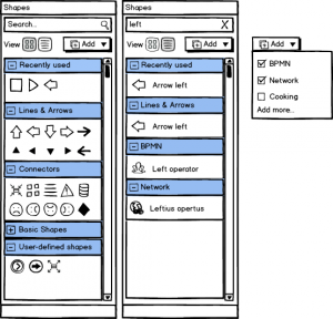
Option 1 (Accordion)

- Sections for every shape category
- Expanded by default but collapsible
- User-defined section for more shapes that can be loaded from repository via add button (button right hand at the section header); file with single shape or compressed list of files
- Load single files into user-defined section and provide drag ‘n drop to sort items into one of the existing categories
- Compressed list of items to create new category filled with those items
- Search (alternative view on right hand) works as a filter and reduces the content; only those accordion sections are shown that contains of icon named according the search
- Right hand view shows the viewing option to list items with names (detailed view instead of icon view)
- Recently used items is limited for two rows in default size
We discussed another flavor with fixed section above the user-defined categories.

- Contains a default shapes section that provides access to LO hardcoded shapes and more section to additional shapes
- Search and recently used items are available only in the more section
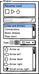
Option 2 (Linked lists)

- Similar to the gallery section; upper list contains of shape categories, below the items are listed
- This style has the same add, search, and recently used functionality as the accordion style
- Consumes less space
- Usability drawback of separating controls for one action
Conclusion
We present two and a half mockups on how to integrate shapes into the sidebar. By doing so we not only want to unify the look and feel of Libreoffice tools. We also want to get more space in order to add further categories of shapes. For instance there is an open source repository available from DIA http://dia-installer.de/shapes/index.html.en. And we want to ask you which of the following categories should be added by default into Libreoffice. Nevertheless, the idea is to implement a mechanism to download and install shapes on demand like templates. But that requires coding and takes some time.
Flowchart (7%, 49 Votes)
BPMN (7%, 47 Votes)
UML (6%, 42 Votes)
Network (5%, 32 Votes)
Cisco (Computer, Network, Switch, Telephony) (4%, 30 Votes)
Database (4%, 30 Votes)
Entity-relationship (4%, 27 Votes)
Electrical (3%, 23 Votes)
Logic (3%, 21 Votes)
Circuit (3%, 20 Votes)
Building site (3%, 20 Votes)
Electronic (3%, 18 Votes)
Function Structure Diagram (2%, 17 Votes)
EPC (2%, 13 Votes)
Civil Engineering (2%, 12 Votes)
Assorted (2%, 12 Votes)
Pneumatic (2%, 12 Votes)
Automata (2%, 12 Votes)
Digital Electric (2%, 12 Votes)
Gradient (2%, 12 Votes)
Value Stream Mapping (2%, 12 Votes)
Requirements Engineering (2%, 11 Votes)
Isometric Map (2%, 11 Votes)
Chronogram (2%, 11 Votes)
Central data processing (2%, 11 Votes)
Chemical Engineering (2%, 11 Votes)
Chemistry lab (1%, 10 Votes)
Renewable Energy (1%, 9 Votes)
Problem analysis (Jackson) (1%, 9 Votes)
CH-1 notation (1%, 9 Votes)
Gane and Sarson (1%, 9 Votes)
Optics (1%, 9 Votes)
HVAC (1%, 9 Votes)
AUTOSAR (1%, 8 Votes)
Racks (1%, 8 Votes)
Ladder logic (1%, 7 Votes)
Sybase (1%, 7 Votes)
SADT/IDEF0 (1%, 7 Votes)
Cybernetics (1%, 7 Votes)
GRAFCET (1%, 7 Votes)
CMOS (1%, 7 Votes)
Jigsaw (1%, 7 Votes)
AADL (1%, 6 Votes)
Lights (1%, 6 Votes)
MSE (1%, 5 Votes)
Scenegraph (1%, 5 Votes)
Living Systems Theory (1%, 5 Votes)

The first choice would be my choice : more on current GUI, and the search field is better place on the dialog box.
me to. first choice and maybe we can update also the shape sidebar, so that gallery and shape can have the same layout.
shape is now similar (treeview to subheader would be nice) and an search would not be an good idea in shape too.