
LibreOffice’s basic conception is to be not just a product, the office suite, but a community around it. So we do not only provide downloads and support for the development but also make it easy to join the project. As a consequence, the ecosystem and web presence has grown to a point where we think renovation and consolidation might be necessary. This report presents the result from the recent website survey.
Introduction
Some examples: Given that people check the homepage who have never heard about LibreOffice, they might want to learn about the difference between LibreOffice and competitors (Discover > What is LibreOffice?, though no comparison with other tools). Regular users are probably interested in the download, which is easy to find, but we show a lot of options not only targeting normal end users. Average users are seeking for documentation (Get Help > Documentation, pointing to another site with a different look and feel) or are looking for templates and extensions (Discover > Templates & Extensions loads a page where you have to click on the heading “Boost your creativity with templates” that opens a section, where a small inline link forwards to extensions). Contributors want to know where the next conference is (Events > Click here to view the calendar is not helpful to find https://conference.libreoffice.org/) or how to set-up the build environment (Improve It > Developers > Learn more… and you are at the wiki with a new navigation). In total we counted almost 50 different pages with information around the project.
But good user experience is not based on individual impressions, so we asked you for more input. And you delivered…
Some numbers
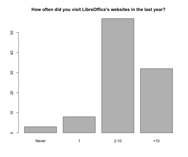
In total 794 people visited the survey of them 569 completed it. We asked first how often the site is accessed, what people are looking for, and if they succeed.
|
|
|
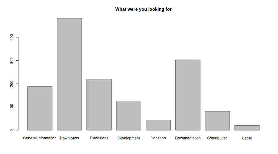
The “other” option was taken by 24 for release notes, news, social media, to report bugs, and to find the wiki. And luckily 90% stated that they were successful in finding the information.
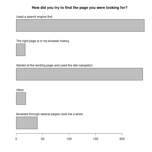
People use mostly a search engine, in particular with site specification, or start on the landing page and use the site navigation. They also create bookmarks or enter from other locations such as the implemented update reminder.
Raised issues
Most interesting part is what issues users had, and 162 replied to this open question.
No issue
The majority (n=44) is happy with the current situation or has minor issues:
The website is designed well and it’s easy to find the most important things, such as downloads and information on new versions.
Content
Many replies were about specific scenarios such as documentation (26), user support (5), and extensions (13).
The website I mainly use is ask.libreoffice.org, and while I am able to get some of my questions answered it doesn’t always happen. Also the documentation website is not always up to date.
Tutorials and documentation are GUI oriented and not problem solving oriented.
Some stuff are very hard to find in documentation since you should know the terminology to find it (tags and synonyms should help)
The user guides listed are for older version of LibreOffice than I am using.
Filtering the extensions using multiple tags … should be made possible.
Extensions are super old and there is no indication if they still work
I’ve been looking under the “Download” drop-down menu for an option to download extensions, but it doesn’t exist there. So I eventually found “Templates & Extensions” under the “Discover” drop-down, and the resulting page finally contains a link to the “LibreOffice Extension Center”.
Not all of the mentioned problems are actual issues since, for example, multiple tags are possible at the extensions site (admittedly not intuitive yet) and outdated content is up to the submitter. The idea behind the new site is to better involve the community in providing and maintaining content. However, it’s work in progress and only the foundation of a nice platform are laid.
Marketing
Many comments were made about a missing introduction intro the product (8) and too much marketing for the project (10).
I can’t tell from the main page what libreoffice is: does it have a visio equivalent? does it have an excel equivalent? Is it a urban hippie commune that trades vegetables at wholesale prices? What does it look like?
I get a clipart show of stock photos, and fortunately there are “Download” and “Support” links still visible. I think that a new user who never used LO, who wants to know what this software is, will not get sufficient feedback, seeing no interface nor capabilities.
Navigation
People search for download (14) and release notes (9) but both are hard to find. Trouble with the site navigation is the most reported issue (30).
The dropdown menus are hard to use and cumbersome, it is hard to find the page you are looking for (e.g. update notes) and sometimes the information is in the wrong page (very common in help.libreoffice.org, which is very unintuitive and hard to navigate and splits information between it and TDF’s Wiki).
It was difficult to find the download link to localised versions of LibreOffice. Even after knowing the process it’s still pretty cumbersome to actually do (Download page -> hunt for the “other language” link among the various other links -> find my language -> Download).
Having two downloads is a little confusing for non-tech people like my mother.
Not easy to find release notes for the current version
Not really an issue, but I do not understand why the “wiki” appears under “improve it” instead of “get help”.
Documentation for macro programmers has been distributed in many places.
Design
And last but not least many dislike the general design (17), in particular the green is a bête noire (11). People are looking for a dark mode (4), complain about slow loading and styling issues (8), and missing responsivity on mobiles (5).
While the landing page is great, most of the other web pages lacked a bit of consistency. I also found that the colour schemes used weren’t as appealing to the eyes.
Massive FOUC as the css/js load is annoying and in my eyes, unprofessional. All the green is a little overpowering.
This shade of green seems to be too aggressive and distracting, makes it harder to focus on the content.
Contribution to the project
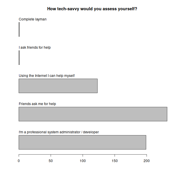
We also asked in what situation people use the application (almost even for personal, business and dual use), about their expertise with LibreOffice (25% basic, 65% intermediate, 10% expert level), and tech-savviness in general. The idea was to possibly split answers in beginners and experts. But unfortunately most participants are very interested in IT and proficient in LibreOffice.
People who answered the question whether they contributed to the project with yes (97) were asked a few more questions.
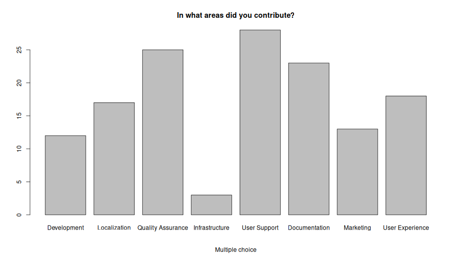
Almost evenly distributed is the frequency of contribution from once per week over month and year to non-recurring. Most contributors do user support, followed by QA and documentation.
Eighty percent want to “to support LibreOffice’s mission of providing free open source software” and 20% “to learn new skills” or “to meet new people in the LibreOffice community”. And only a few had a bad experience while contributing:
I was entirely neglected and repeatedly so disappointed that I gave up years ago trying to make any contact at all. I highly doubt anyone is going to actually read this survey, take any notice of my data or do anything regarding the point I made. I do though very much appreciate the FOSS ethic and the hard work that is done.
Most people answered overwhelmingly positive.
Super-friendly community, a lot of room for growth, a great place to learn, perfect project for almost any type of contribution.
Nothing to add here, you guys rock!
PS: Get raw data and analysis scripts here.
Just a quick suggestion. Rather than just ask for self-reported UI issues, periodic usability research would turn up most issues. A day or two every quarter would be enough. As a seasoned researcher, I would be happy to volunteer time.
Sure, that would be cool. But with limited resources we better focus on the product. We conduct follow-up interviews. Drop me a line if you want to get interviewed.