Font handling is a major topic for office suites and as a result, LibreOffice’s bug tracker has numerous reported issues and suggestions on how to enhance the workflow. In a past blog post, we presented a solution for font substitution and now it is time to talk about font listing.
Requirements / User Stories
All operating systems come bundled with a large number of default fonts, while software installations and users can install additional fonts. So a user’s system has many sans, serif, and mono fonts, as well as language-specific (like MS Yahei, Noto Sans Arabic) and symbol (like Wingding, OpenSymbol) fonts.
The font name combobox lists these hundreds of fonts, but would be more useful if it displays only those that users apply in their documents. So we need further supportive functions beyond the current auto-completion and find-when-typing features.
According the requests on Bugzilla there are two new requirements:
- Benjamin wants to hide individual fonts that are disabled in the system (tdf#77878) or not relevant in the context (tdf#88416) in order to have a smaller fonts list (tdf#91130).
- Benjamin wants to filter the font list according all/used/favorite (tdf#101748) and highlight the currently used fonts (tdf#90161) as well as locale (Chinese for instance) (tdf#114764).
Note: Some tickets contain solutions instead of the actual need that is used in those user stories. Thus, the relation between ticket ID and requirement is not explicit.
In other words, we need a solution to hide fonts that are not needed (not mentioned in the tickets, but likely required is an option to temporarily show hidden fonts, for example when editing formulas) and provide a better way to filter or highlight items on the font name list.
Proposals
Customization of the font name list will be done in the Fonts section of the Tools > Options dialog, where the installed fonts will appear in a new tabular list. Below we present three ideas of how this list can be customized by a user and how this customization will appear in the font name combobox.
Option 1: Favorites
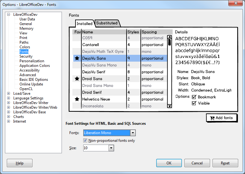
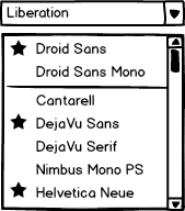
The idea is based on bookmarks known from Internet browsers, for instance. Favorite fonts are those that have checked at the Bookmark option. And these items are highlighted in the fonts list.
When the Visible checkbox is unchecked in the tabular list, a font will be hidden in the combobox but still shown if used in the document, like in the example Droid Sans Mono, or when the user types to search.
Whether Visible is on or off could be set initially depending on the system language in order to hide non-locale fonts.
Option 2: Tags
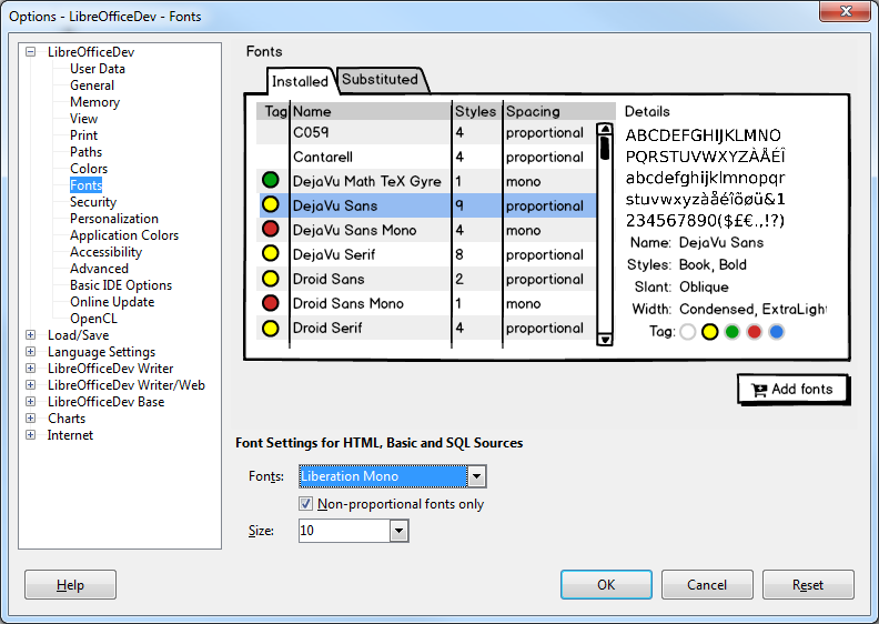
This option is inspired by a feature in the macOS file browser where you can mark files with a color tag and filter later by just this color. Though tagging is not limited to colors, it can also be done with labels.
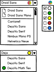
The user defines what color the font is tagged with (all fonts default to White, meaning no tag), and in the font name combobox an additional flat button/icon can be used to dynamically hide and show items that are tagged with the respective color. In the example, White (all untagged) and Yellow (sans and serif types) are active. Checking the green box would add the rarely used DejaVu Math font to the list. Of course this is just an example and the user is free to combine any tag, and the solution could also use labels instead colors.
Ideally, the upper section shows the fonts that are used in the current document instead of recently used as of today.
Searching the font name combobox should temporarily also show results that are hidden. In the lower example, only fonts tagged as Yellow are shown, but the search for DejaVu returns also the mono font, indicated here by its green dot. Fonts assigned to an excluded tag and hidden thereby would still be listed if used in the current document.
Option 3: Presets
The third option is the easiest to customize and its font name combobox has a similar look to the one in Microsoft Office.
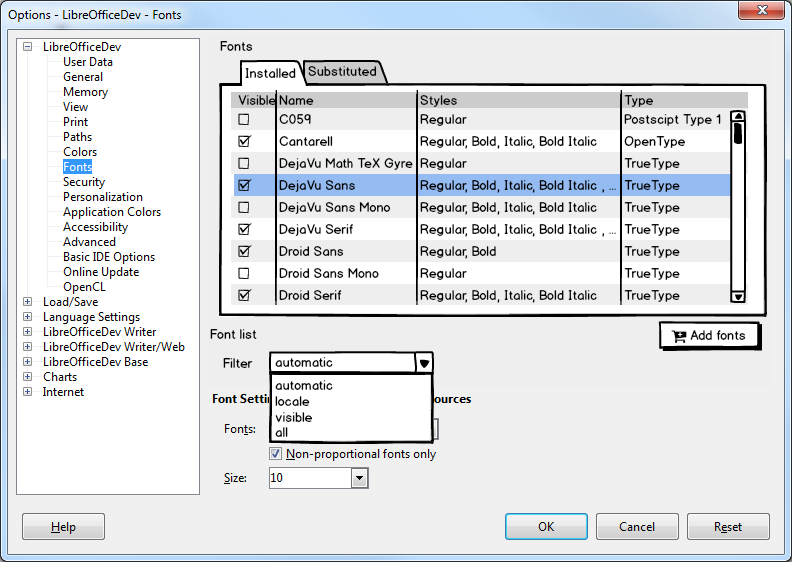
In this proposal, there are checkboxes in the font tabular list to show or hide individual fonts, as well as a dropdown with filter presets for users to easily select from. The filter presets filter the fonts in the font name combobox and work as follows:
- Automatic: This is the default preset and will display a predefined short list of commonly used and recommended document fonts and the preferred fonts of the user locale.
- Locale: This preset will display regional fonts specific to the user’s locale (e.g. showing Arabic fonts when in Arabic locale) and a predefined short list of commonly used latin/multi-locale fonts.
- Visible: This preset will display only the fonts that have the Visible checkbox checked.
- All: This preset will display all installed fonts, irrespective of whether a font has its Visible checkbox checked or not.
Note: The automatically generated font lists for the Automatic and Locale presets can be modified by turning off the Visible checkbox of any of the displayed fonts.
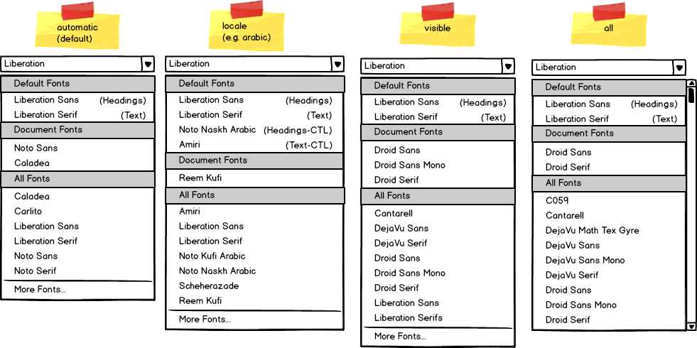
The font name combobox will be modified to replace the currently unlabeled recently used fonts and all fonts sections with labeled sections for Default Fonts, Document Fonts, and All Fonts. In Writer, Default Fonts will list the latin, asian and/or ctl heading and body text fonts defined in a document, followed by the font region and type in brackets (e.g. Liberation Sans (Headings), Noto Sans CJK Serif SC (Headings-CJK), Nachlieli CLM (Headings-CTL)). Document Fonts will list fonts used in the document which aren’t already listed under Default Fonts. All Fonts will list the fonts filtered by the filter presets in the Options dialog and the fonts in the current document. If the filter preset isn’t set to the ‘All’ preset, a ‘More Fonts…’ entry will appear at the bottom of the list, which when clicked will open the Character dialog’s Font tab, so the user can still select fonts that weren’t listed.
Summary
We presented three options to deal with large lists of fonts, with varying flexibility. What is your opinion? Do you prefer the current status quo refusing the proposals perhaps considering that fonts management should be done on the system level, or the simple favorite option with bookmarks, the tagging idea, or filter presets with section labels.
Many thanks to Áron Budea, Mike Kaganski, Thomas Lendo, and Yousuf Philips.

There are so many fonts for different locales. It is better to take different languages into account as well in this issue.
Besides the improvement ideas I think it is better to list the fonts of the users’ locale before others.
Different languages are taken into account with the locale preset of the presets option, where it only lists the fonts of a user’s locale (see Figure 6). So if you had the Traditional Chinese locale set and had the locale preset set, it would primarily list just the traditional chinese fonts you have installed in the All Fonts section of the font name combobox.
There is a big issue affect font listing, when I used Source Han Sans and Serif, all the font weights are splited as individual fonts, is there anyway to fix it?
Intentionally left this aspect out of the discussion since it’s rather an issue (the focus here is on filter mechanisms) . Recommended solution is to collapse all font variations and have only the regular in the standard list. See also https://bugs.documentfoundation.org/show_bug.cgi?id=66792
I suggest a “little” thing. Is it possible to have a checkbox option (disabled by default) allowing to hide all the non libre fonts if ticked?
Sounds to me like a very specific solution. With option 1 (bookmark the Libre* fonts) or 2 (tag it) it’s possible but not with option 3 (despite the section on top that you configure).
It would be difficult to get a list of every single libre or non-libre font to be able to provide this option 100% correctly, but could easily see a button next to the ‘Add fonts’ button labelled ‘Hide Proprietary Fonts’ or a ‘open source fonts’ filter preset to provide this feature.
moist
KISS : Keep It Simple Stupid
It’s better for coders and easier for users !
Tags and Presets are essential the same thing. With the preset concept a bunch of fonts is assigned to a specific “label”. If the label is chosen those fonts appear. The tagging concept works in a similar manner since fonts are also assigned to a label (or in this example a colour). The difference is that a tagging system offers much more flexibility with the same amount of user input since you have to assign fonts manually to the “visible preset”. To put it differently: You can have presets within the tagging concept since some colours (or whatever label you choose) could be predefined. Then the users could have more colour labels (or change the existing ones) if they want and gain a really fine-grained control over their font collection.
Therefore I would really like to see the implementation of the tagging system. However every design shown here is a huge improvement over the current situation :) .
Hi, I agree that any design here would be far better than the current situation :)
Meanwhile, I vote for the following: in the drop-down menu, show first the a) the recently used fonts and b) fonts used in the current document(s)
Please check https://bugs.documentfoundation.org/show_bug.cgi?id=119915