
When documents are sent from one computer to the next or opened on the same computer in a different operating system, these documents may not look the same unless all the fonts used in the document are available on the other computer or operating system. For this reason, exporting documents as a PDFs is so popular as it renders the document exactly like how it would be printed without any reliance on fonts. This proposal attempts to provide users with a user friendly way in dealing with missing fonts.
Open Notification
The first step to fixing this issue is to notify users when they open a document that contains missing fonts and are being substituted. This can be achieved with LibreOffice’s existing infobar implementation, which is also used to notify a user that they are opening a read-only document. In order to limit the occurrence of this infobar to only when it is really needed, the infobar won’t appear when only metrically compatible fonts are being substituted, which LibreOffice bundles.
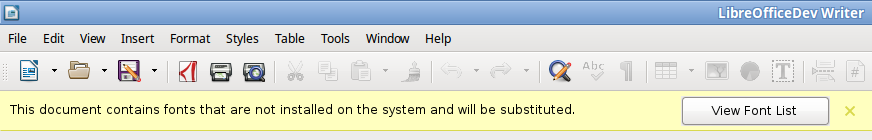
The user has the option to dismiss the notice or click on the ‘View Font List’ button which opens the document properties dialog (or alternatively a completely new one). The dialog will lists all the fonts used in the document (both in styles and applied through direct formatting), as well as indicate which ones are missing and the font that it is being substituted with.
Font Installation and Substitution
The fonts used in a document can be considered general document information and therefore perfectly suited for the document properties dialog (File > Properties…). The dialog has a Font tab that only has the option to embed fonts into a document, so it can be enhanced by listing the fonts and their font substitutes. We made two mockups on how it can be presented, shown in figure 2.
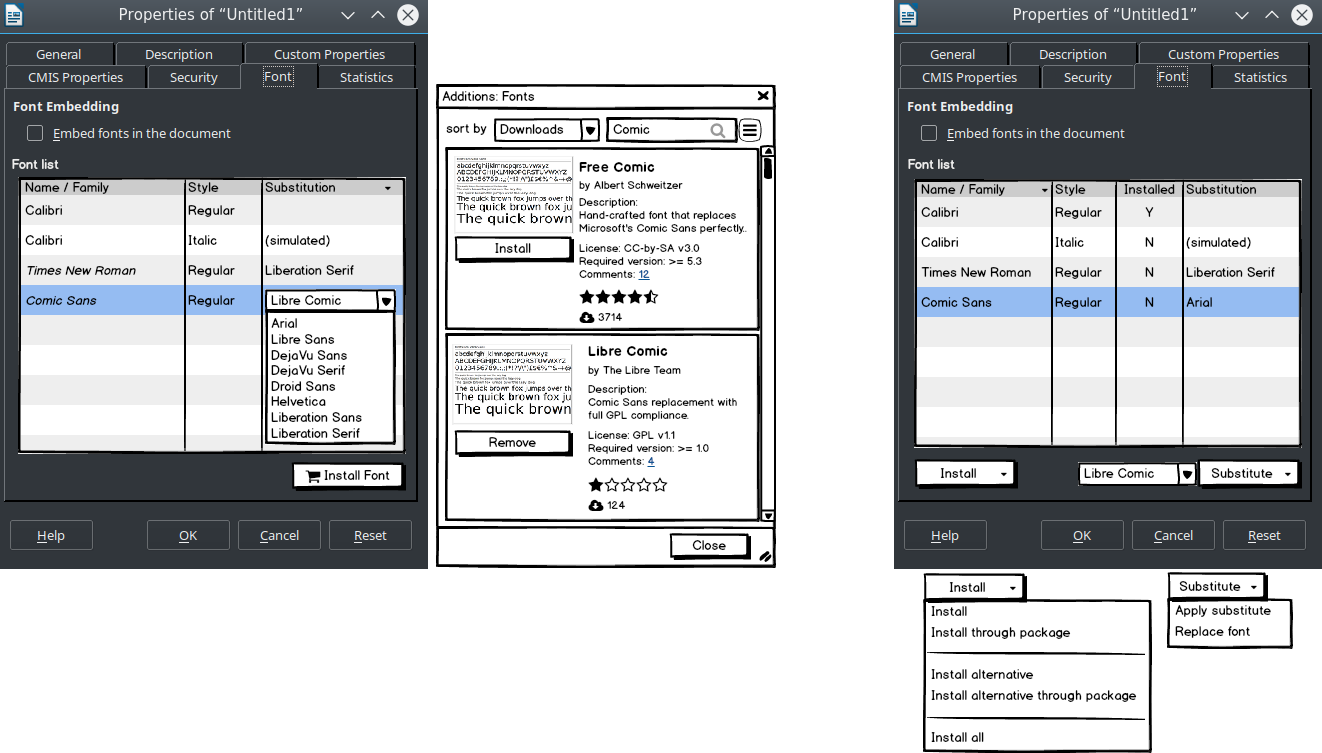
Both mockups display a font grid that lists all fonts in the document and gives an overview of which one are installed, which are being simulated due to a missing style of an installed font, or which font is being used as a substitute.
In the left mockup, the font list identifies fonts that are not installed by having their names in italic. When a row is selected, an inline dropdown list appears in the substitution column and is populated with all installed fonts to provide a means to define another font to be used as a replacement. The sort order may be adjusted to what is going to be substituted. If the user wants to install an alternative font, they can click the ‘Install font’ button which opens a dialog that an access the extension site filtered for fonts (a proposal for a generic approach has been made and is in preparation for a blog post). Searching this list should be easy, here exemplified with “Comic”, and installing allows subsequently to select this font in the substitution table. (Not all fonts need to be hosted on the extensions site; links are sufficient to forward to the right place.)
In the right mockup, the font list has an ‘Installed’ column to identify if a font is installed. When a row has been selected, a user can click the “Install” group button which opens a menu of items to install the missing font or an open source alternative. Linux users will also be able to install the original or alternative fonts through their package manager. The “Install All” menu item will iterate through the font list and install any missing fonts from their original sources. Additionally they can apply a different substitute font to the currently selected font grid row by clicking the ‘Apply substitute’ entry in the “Substitute” group button or replace all occurrences of a font with another font within the document with the “Replace font” entry.
Behind the scenes
In order to provide the necessary functionality to install a font and its alternative, as proposed in the right mockup, this functionality needs to reply on a configuration file. This configuration file will be XML based and will catalog fonts, their open source alternatives, and their download urls. The XML structure will possibly look like so.
<font>
  <family>Times New Roman</family>
  <license>Proprietary</license>
  <style>serif</style>
  <bundled_with>Windows;Windows 3.1</bundled_with>
  <download_url>https://sourceforge.net/projects/corefonts/files/
    the%20fonts/final/times32.exe/download</download_url>
  <package>ttf-mscorefonts-installer</package>
  <substitute>
    <family>Liberation Serif</family>
    <metrical_compatible>Y</metrical_compatible>
    <download_url>http://downloadarchive.documentfoundation.org/
      libreoffice/old/fonts/liberation_serif.zip</download_url>
    <package>fonts-liberation</debian_package>
  </substitute>
</font>
Indication of Substitution
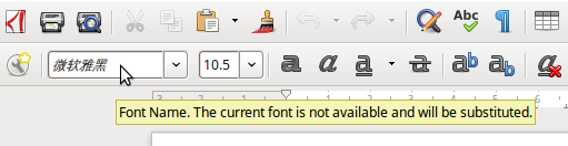
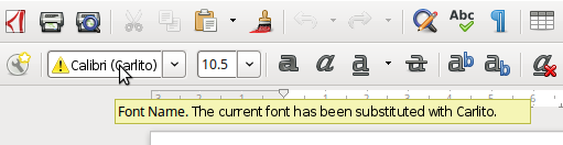
Presently, the only visual indication in the font name combobox that a font is being substituted is that the font name is italic. There is another visual indicator in the form of additional text appearing in the tooltip, but this is easily ignored as the tooltip only appears for a second before the control is clicked.
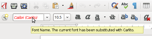
 In order to better indicate the substitution of the font, we have to make a bigger change to the displayed text, like changing it to red (tdf#96872), and also indicate the font that is being used for the substitution, both in the font name and the tooltip (tdf#61134).
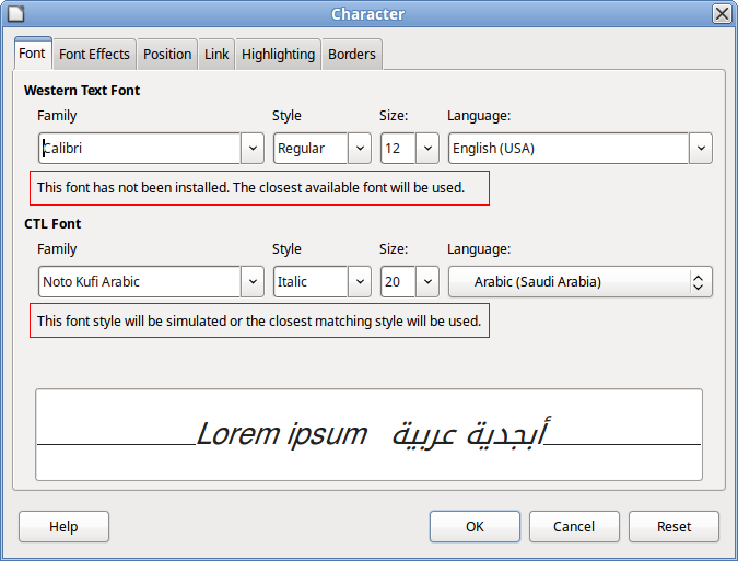 Similar to the toolbar, the Font tab found in the character and style dialogs also need improvements. The text labels ‘This font style will be simulated or the closest matching style will be used.’ and ‘This font has not been installed. The closest available font will be used.’ that appear under the font family drop down listboxes in the dialogs need clearer indication than simply being in the same simple style as when it says ‘The same font will be used on both your printer and your screen’. Either the text style needs to be changed (italics, bold, or red) or a warning icon would appear at its start.
Conclusion
The styling of text with the use of fonts has been around since the invention of the Graphical User Interface (GUI) and thanks to the availability of the internet, documents with styled text are being seen and shared on an ever growing daily basis, so we need to make it easy for users to see the documents they open in the same format that the author created them in.
I think that this is almost a perfect solution. However, I would like to ask you to use an icon and not just a highlighting color to indicate a missing font. As a colorblind individual, I often cannot see a different color but I will see an icon. Other than that this solution is awesome looking.
I have wanted something like this for years.
Good point.
Also I am not sure how far LO will go with Skinning options in the future (or may already do so under Linux), but IIRC on Firefox there where Skin Themes that changed the colour of the text boxes. Having a red background skin to the combobox would make red text unreadable.
On a sidenote, if it is not to intrusive. May I ask how you do highlighting/text colouring as a colorblind person? Is there a version of the Colour Palette (dropdown list) that allows you to use Colour names, or Hexadicimal Colour codes?
I can distinguish some colors (red and black being some of the hardest). When I can’t I use hex input whenever I can. And I will search the Internet to figure out which color I need. Or I will use one of those color picker applications where you just click on the color you like and it makes the same color.
I also just stay away from the colors that I don’t see. It makes it easier.
I vote for using icon for substituted fonts. For me it is more logical and intuitive.
How it will looks like when I will try to select different fonts?
Does the icons will be displayed also in the list?
Red color of font means some critical error.
Selecting different fonts would work as it does now, by leaving the field blank. The font list only shown installed fonts in it, so the icon wont appear in the list. The red color also wouldnt work if the background color of the field isnt white, so a bit more thought would need to happen if a font color would be used.
It’s a very good solution. But I can think of two scenari which don’t seem to be covered here:
1. Embedded fonts which are not present on the system. Especially when only the part used has been embedded. They will not be substituted but can pose a problem if you want to modify the text.
2. When you can’t install fonts because you don’t have admin rights (it’s the case with windows 7, dunno for newer version). Does the installation can be specific to libreoffice (such as with portable libreoffice) and how to inform the user of that?
Anyway, thanks for the work.
1. Embedded fonts in a file has been working in Libreoffice since 4.1
2. On linux, there is a user fonts folder were non-admin users can place fonts, but not sure how it works on windows, but if there is a means of utilizing a font in Libreoffice from within a user folder, it will be taken.
I think it refers to the methods used by other software to embed fonts. For example, MS Office allows you to embed fonts for a document to be viewed but not modified, then: the system will detect that font is not installed and will provide for download?
If a document is only to be viewed and not modified, it is more practical to send a user a pdf, where fonts dont need to be embedded. But suggesting a user to install an embedded font is definitely something worth considering for Libreoffice to do.
You should read the reference report first. Microsoft provides this behavior to avoid distributing licensed fonts, so a user can share a document with those embedded fonts -Maintaining design- to be viewed by another user, but if you can modify it using their own fonts. It is more practical to import or rewrite a PDF file.
I wish everyone used free content, but can not control the behavior of others.
Note: Currently LO can distribute licensed fonts, even unintentionally.
It is a very good improvement, however, it is not enhancing or improving other currently libreoffice methods already available, For example, add a check box in the save dialog for embedded fonts:
https://bugs.documentfoundation.org/show_bug.cgi?id=95062
… and associated problems:
https://bugs.documentfoundation.org/show_bug.cgi?id=65353
https://bugs.documentfoundation.org/show_bug.cgi?id=83675
https://bugs.documentfoundation.org/show_bug.cgi?id=69060
https://bugs.documentfoundation.org/show_bug.cgi?id=72456
… also in PDF
https://bugs.documentfoundation.org/show_bug.cgi?id=50879
Besides the option it is something “hidden” does not work as well as a user would expect.
Embedding fonts isnt the focus of this proposal as most users dont embed fonts in their documents and Libreoffice’s font embedding capabilities has a number of issues, as you have already linked to.
Sure, I would think that users do not use this feature because it is controversial embed fonts because it is a distribution method as the case may be illegal but it is not, this method is not used because this feature is not very visible and who achieved use it, lo oks like their document quintupled their size or dont work as it should in other places, using LO or other office software.
Why I think it’s important ?, because I work in schools and with people where the internet connection is poor or unavailable no and other alternatives offer a method for maintaining the document layout despite encouraging only the use of fonts available on the system.
Most users dont use this feature as it isnt enabled by default in Libreoffice or MS Office and embedding fonts can bloat a file for little gain, as most fonts are multiple times larger than the document (e.g. one of my odts is 400KB and Liberation Serif is 1.4MB) and would negatively affect users who already have the font.
It is more beneficial to the schools with poor or no internet access to install the fonts used in the documents once on their system rather than getting multiple documents with the same fonts embedded in them.
I didnt talk about if enabled by default, but the UI in MS Office makes it more accessible this feature and is curious that you can add a password from the save dialog but not from document properties. I’ve seen different scenarios that is widely used, especially for presentations where the use of another format, aka PDF, does not solve the problem ( and downloading fonts at the moment is usually not an option, due to lack of internet, administrator rights, office software, etc.)
On increase in size, I do not mean the normal increase include the fonts used, but about the bug is in including 2 or more fonts that are not used in the document.
Again, in school we used fonts are added to computers, but we can not do much for personal computers or exchange with other institutions, are not in a bubble.
I had a problem with metrically compatible fonts in Impress. The header was larger with Liberation Serif than with Times. So maybe notify anyway?
Try with Google Croscore fonts. Tinos (Times New Roman), Arimo (Arial), Cousine (monospaced), Carlito (Calibri) and Caladea (Cambris).
The Liberation fonts are the same ones from Google.
“As of July 18, 2012, Liberation Fonts 2.00.0 and above are a fork of the Chrome OS Fonts released under the SIL Open Font License” – https://en.wikipedia.org/wiki/Liberation_fonts
I know, but I had a similar problem and was solved by changing font.
Maybe issues like this should be reported over here: https://github.com/pravins/liberation-fonts ?
Great, now can you set the application to default to the standard fonts for the OS, and simply substitute when people view it on another platform – or, even better – use default fonts that are available on multiple platforms. Two issues:
1. If you create a LO document, it will by default use Liberation Fonts, which causes issues when you share to people on Mac or Windows Machines without LO installed (the fonts need to be substituted), and
2. For some reason, using these Liberation Fonts completely destroys performance on my machine.
My solution was to just buy WordPerfect Office Home & Student (since I don’t use this for professional reasons on my personal machines) for my Windows Notebook and save to DOCX from there, while just using iWork on my iMac. It’s always deeply discounted on Amazon.
An option during setup to *not* install the LibreOffice fonts would also be very welcome.
These fonts are problematic, but from an interoperability and performance standpoint – at least for me.
Almost forgot… LibreOffice Writer has an dialog in settings to set the default fonts for the application, but this is missing in Calc and Presentations. Why the inconsistency. In this case, it seems really odd; as this isn’t necessarily a component-specific type of setting niche…
Definitely a good point. It seems the issue has already been reported – https://bugs.documentfoundation.org/show_bug.cgi?id=33743
Using the standard fonts of an OS wont make document look the same on other OSes, so that couldn’t be a default option for LibreOffice, as it strives to not only have the documents contents always accessible, but also that the contents appear the same, and that cant be achieved with proprietary fonts. But of course this default setting can be changed by the user. About the issues
1. The same scenario happens when a document is created for example in MS Office and uses the Cambria or Calibri fonts and then is opened on Linux or Mac machines without these fonts installed, so this isnt a negative point towards using Liberation Fonts.
2. I’d recommend you submit a bug report about this performance issue of using the fonts, so that it can be looked into. – https://bugs.documentfoundation.org/enter_bug.cgi?product=LibreOffice&format=guided
This looks good, but I would make the tooltip text more clear for users that never heard about font substitution.
Instead of “Calibri: The current font has been substituted with Carlito”
I would write: “The font Calibri is not installed on this system, it has been replaced by the font Carlito. \n Font replacement might result in a broken layout of your document, with unintended line- and page breaks.”
What’s missing is importing a powerpoint (.pptx) document which has embedded fonts already. LibreOffice should be able to use them, rather than substitute. As of my v5.2.4.2 Sept 2017 it isn’t using pptx embedded fonts.
I like most of this solution modulo the following comments/suggestions:
1. The extant fonts table should include percentages of the chars, words, lines, paragraphs and/or screen area using each font. Why does this matter?
1.1 Sometimes a font is only used by accident in some orphaned style which doesn’t apply anywhere, or only applies to some odd spaces somewhere
1.2 The importance of a substitution is proportional to its prevalence.
1.3 Some documents may have dozens of different fonts/font variants, and without the prevalence we won’t be able to sort them properly. Which also brings me to…
2. Need to be able to change the sort order of the substitutions.
3. “Install via package” should be the default, rather than just “install”, and should be placed above “Install” in the drop-down list (unless the OS in question treats fonts separately from packages).
4. OriginalFont (SubstituteFont) is a bit confusing, suggesting that the parenthesized text is an observation/explanation regarding / variant of the out-of-parentheses text. I’d consider something like “OriginalFont (substituted)” or “OriginalFont -> SubstituteFont”.
5. The font substitution catalog will be either huge or lacking. And probably in both cases the choice of what’s the “real” or “best” alternative may be rather controvertial (among people who care about fonts and typesetting anyways).
6. It’s not clear what the _principles_ for substitution should be.
Regarding “6”, I think the best is to look for metrically compatibility first and then design similarities later.
Examples:
Arial Arimo
Calibri Carlito
Cambria Caladea
Courier New Cousine
Heuristica Utopia
Times New Roman Tinos
Only if a system doesn’t have Courier New or Cousine to substitute each other they should be substituted for another monospaced font, Consolas or Inconsolata, for example.
PS: It seems I can’t use “” with “–” between them.
Arial — Arimo
Calibri — Carlito
Cambria — Caladea
Courier New — Cousine
Heuristica — Utopia
Times New Roman — Tinos
Definitely prefer the icon!
I prefer the icon approach next to the “original font (substitute font)” on the font name box.
Also, it would be great to extend the default substitution table. Please check “https://bugs.documentfoundation.org/show_bug.cgi?id=64509”. I can help with the font pairings (I even gave some of them there already), but I don’t have the expertise to upload a patch to the vcl.xcu file myself (I submitted it as a text file to that Bug ID).