Java has the Duke, SUSE is known for its Geeko, KDE is going with Konqui, Krita welcomes you with Kiki, and Mozilla frightens the user with a Tyrannosaurus Rex. All major applications are known by a mascot.
 The Document Foundation has a unique branding with a clear and nice icon which cannot change. Therefore, it is probably the right time to get a mascot for LibreOffice.
Metaphors
We have started by asking on the mailing lists some input about the concepts associated with LibreOffice.
- Freedom/Openness
- Dove like bird, through occupied by Apache OpenOffice (and disliked by some)
- Hummingbird: Light, free, fast, with colors that remember also the LibreOffice colors
- Dragonfly: is a beautiful animal with many colors which we can find all over the world, is a fast and agile flier with a robust body, and a symbol of courage, strength, and happiness (unfortunately, the dragonfly is used at DragonFly BSD and Opera Dragonfly)
- Speed/Improvement
- Fast birds, smart and not aggressive, hunter
- Bird of prey (raptor)
- Pegasus, Phoenix
- a Gazelle
- Intelligence
- Cuteness / Seven lives
- Louse/Virus: it irritates sometimes, but you can’t get rid of
- Tardigrade (‘pudgy wudgie’): also known as water bears, they are adorable, and also perhaps the most indestructible creatures known to man
- Rock-hopper penguin: it’s very cute with orangey-red-yellow tufts out of jet-black ears, they are impressively determined, despite the comedy-value of the way they waddle and bounce they achieve incredible feats of athleticism such as jumping higher than their own height from a standing start
Competition
The task is simple: design a new identifier for LibreOffice Community and ideally provide a name and a description to understand your idea. There is no restriction whether it’s a true mascot or just a symbol like Java’s Duke. You are also free to find other metaphors than those listed above.
LibreOffice has branding guidelines, for instance regarding colors, but you may also suggest an update there.
The design should be completely new, even if based on some initial artwork (in this case, the license of the initial artwork must be CC0). The design should be available in two colors (to reduce printing costs, if necessary), and in full color.
Results will be filtered by a commission named by the Board of Directors (BoD), and voted by the community. The final decision about the design and the name will be confirmed by the BoD.
Authors of the top three proposals will get the following prizes:
1st: Slimbook KATANA Intel i5 (https://slimbook.es/en/ultrabook-katana-en)
2nd: Nextcloud box with Raspberry Pi 3 (https://nextcloud.com/box)
3rd: Nitrokey Pro 3 (https://www.nitrokey.com)
Remarks: Winnings from competitions can be a taxable source of income depending on your state law. Legal recourse is excluded.
To share your proposal please use our Nextcloud instance https://nextcloud.documentfoundation.org/s/l58GED3Ngq92Rge with a clear identification of <date>_<author>_<name>.png (e.g. 20170629_htietze_grumpycat.png), or submit your artwork per E-mail to contest@libreoffice.org. You can submit as many ideas as you want, but we may refuse input in case of very close designs.
All submissions should be provided under CC0 to maximize their use by the community. Learn more about LibreOffice’ licensing here.
Please submit your ideas until 31th of August.
Proposals
So far we received a few examples.
© CC0, Andreas Kainz
© CC0, Nicolas Vrithoffe
Here is my version, Andy
http://imgur.com/a/6qmli
i do like your version Andy! Nice and clean!
The best option so far, imho!
Nice one and mostly unique. I love it.
Can do in paper and afterwards scan it?
Thank you
Sure, no limitation to your creativity.
I like very much the hummingbird, he is light, free, superfast and colourful.
For me, it’s the best choice :)
I can’t draw, but someone please do an Armadillo or a HoneyBadger as the mascot please! Keep the reward.
Should I include the text portion of the submission (name, description, idea) as a part of the image, or perhaps write it in the e-mail itself?
Both should work; just make clear your artwork is properly assigned to your name. If you want to write an extended description, you better do that per mail to content@…
What professional program has a mascot ?
MS Office has mascot ?
Gimp has mascot but photoshop hasn’t ; which one has pro image ?
If you want to keep a serious image, keep a serious logo.
@riton MS had Clippy… ;) (a bad example of mascot through !)
I agree with you @riton, a mascot isn’t always a good thing for a professional product. But a mascot isn’t a logo and will NEVER replace it. A mascot is Tux for linux, a character that lives its own life without the product. I think it could be fun to design a mascot or a character that embodies LibreOffice.
Krita?
It’s a professional open source painting application.
MicroSoft (or more precisely Windows 10) does indeed have a mascot. Her name is Touko Madobe and she was created to cater to the eastern audience.
Hummingbird is the clear front runner Andy Betts version is clean and colourful
I love that Hummingbird!
can i upload multiple icons or only one?
oh god… sorry. i just saw that i t is possible.
There is my contribution made on inkscape { http://i66.tinypic.com/2yu0ghk.png }
Sorry, for some reason tinypic is not working … my bad … { http://imgur.com/a/juYf9 }
Nice butterfly, I definitely like it. But please share via the official channels so that we have all submissions together. The LibO nextcloud instance is linked in the blog post together with an email address. Thanks for your work!
Hell yeah !! But first i will do some improvements … :-)
Hi! What is the deadline please ?
Thank you
Hi,
This is the proposal I just sent by email :)
http://imgur.com/azGjSPp
I like the idea of a hummingbird !
Hey, do you have any feedback ?
;)
>Hey, do you have any feedback ? ;)
It’s a nice geometrical, low-polygon symbol. Will be a tough competition of the hummingbirds; yours is a sleeping beauty, kind of chimera with a robin.
Thanks a lot !!
I’m working on a mascot with more personality, like kiki or Konqui.
Just to be sure : you need a mascot, right ? Not a logo ?
I would use a https://en.wikipedia.org/wiki/Coelacanth. It is an prehistoric fish that just won’t extend. For edges we thought that it was extended, but it wasn’t. It is still doing well on remotes places in the ocean. This type of fish is also considered is an important species in history of evolution, because the fins are “made of bone”. (I’m sorry not native english, I couldn’t find the right words.)
For me, the fish would represent a community that never will extend, no matter what others think or say. It also shows reliability. No matter what the fish will always be there. It probably will survive us.
Here are better pictures:
https://nl.wikipedia.org/wiki/Coelacanten
https://duckduckgo.com/?q=Coelacanten&t=ffsb&atb=v56-1&iax=1&ia=images
Hi everyone, this is my proposal:
http://imgur.com/a/EcZiN
Nice idea. Please upload it to the Nextcloud mentioned in the posting.
I’ve send it for mail the same day I posted here. Thanks.
Hallo Andreas Kainz,
obwohl Dein Name für mich deutsch klingt, weiß ich nicht, ob du Deutsch sprichst, deswegen werde ich meine Meinung zu deinem Entwurf auf Englisch ausdrücken.
Hi there, first sorry for my bad / poor English
I love a lot LibreOffice. I like the flower bird of Andreas Kainz, but in my not so humble opinion LO is a big piece of software, we need also a bigger bird.
What about an eagle or an owl? Would not this be a better idea?
Office — owl — wisdom
I love wolves, but they are not so peacefull :)
How about this sweet little owl :-)
http://imgur.com/a/4Y5ij
Nice one
Simple and Nice! In LO-green
Here comes Opus!
http://imgur.com/a/iTWMf
My bird is cyberbird. http://rgho.st/8CQmfsLBK
My humble intent. It is simple, in LO-colors and looks friendly;
https://imgur.com/a/N5CvT
Please, let me hereyour opinion, I know that I am no Inkscape-Guru. :)
Let me know, if you like it
Personally, I wouldn’t vote for a smiley. It has no particular meaning for LibreOffice and is annoyingly omnipresent. From the technical perspective it looks good, and if you don’t feel comfortable with Inkscape why not give Draw a chance? :-)
Hi Heiko,
thank you for your comment. The problem is I am a design-minimalist, not a designer, but I will try to retouch it a bit, so that it become “more meaning”.
I like LO because of its user friendly “old” interface, as oppossite to the stupid MS-ribbon :) This could be the secret, not so obvious, meaning of the smiley. A mascot can be everything possible not only an animal, depends on point of view.
Cómo hago para que mi propuesta tenga la licencia CC0?
How do I get my proposal licensed CC0?
It’s a statement that you give implicitly with your submission. Learn more about CC0 at https://creativecommons.org/share-your-work/public-domain/cc0/.
@ Heiko Tietze
I created these:
https://wiki.ubuntu.com/One%20Hundred%20Papercuts/Branding
Which inspired these:
https://google.es/search?q=ubuntu+origami&tbm=isch
I liked to create a mascot for you, but I think that the CC0 license is too naive. Except if there was some reason I didn’t know of for using that one, I would rather prefer the CC-BY-SA 4.0 license. So all derivative work is warranted to be libre.
I think that non copyleft licenses are perceived as a cheap non paid workforce alternatives to higher quality paid software. Instead of that my purpose is to make libre content the standard, so I liked to see my work only used in libre works.
First idea:
https://i11.servimg.com/u/f11/16/19/87/90/yeye10.jpg
>Which inspired these:
>https://google.es/search?q=ubuntu+origami&tbm=isch
…including hummingbirds. Awesome! But how about a dragon-fly?
I think you aren’t responding to my post, but to someone else’s.
I need opinions on my contribution.
http://imgur.com/VyTWc95
Nice geometrical, low-polygon design. The font doesn’t look like the default (https://wiki.documentfoundation.org/Marketing/Branding#Fonts) and your blue to green gradient conflicts with the primary color. Finally, your bird is in heavy competition with the others.
Footnote: My comments here are personal opinion only and absolutely not relevant for the competition. Just to make that clear :-).
I have taken logo from official website and just removed the document icon. It would be helpful if any color pallet is given.
I changed colors, taken from libreoffice branding page. Please let me know i am going in right direction or not. i am designing other animals too so it would help me.
>Please let me know i am going in right direction or not.
Hard to say if this logo has the potential for being appreciated by the community as the LibreOffice mascot. While your colors are from the standard palette now, the design becomes a bit boring. What I meant was basically the unpleasing combination of turquoise to chartreuse gradient together with the default green. But it’s all up to your creativity.
Thank you for your reply. i am going to take a look at that.
Fixed Colors
http://imgur.com/UWCvJE7
Mascot without text
http://imgur.com/nx4seCV
The problem I see in these contributions is that people aren’t designing a mascot, but a logo.
Your are right, I just seen the Konqi https://en.wikipedia.org/wiki/Konqi it is really nice. Something like this can / has to do a “professional” designer.
Sorry to say this, but I dont like it. The best I have seen here is the first proposal of Andreas Kainz. Your bird, looks like a geometrical version of it and I dont know anything about the color-theory, but it looks really bad.
Thank you for your feedback. I am definitely going to improve it.
I think that as logo is very good, but as I said not as a mascot. A mascot needs to evoque some kind of sympathy.
Good luck!
Everyone loves giraffes. Here is a nest http://68.media.tumblr.com/94158aa618d9be67941166096463d4c6/tumblr_os9xx8L8Ur1teaqs3o1_500.png
Actually cute!
Hello! This is my version of the mascot. I think what the Dragon means a lot of great opportunities and that you can look at things from the other side. Find something impossible seemed to be something for us plain and simple. This talisman can be as a defender and guardian for Libue Office. I hope you enjoy it. Thank you for your attention
This my mascot: http://i.imgur.com/RvzniDt.png
I like it, it is nice and sweet!
But, what is it? :O
This is Dragon)
Please submit via email and nextcloud as requested in the blog post.
I have made my submission via email to contest [ at ] libreoffice.org last saturday and don’t know if it has been received or not. This days with spam and blacklists… I am worried it may haven’t been received by you.
Can you confirm it?
Thanks in advance,
Néstor
>Can you confirm it?
Yes, we received a first submission and a follow-up correction from someone with your name.
Thank you so much Heiko. :)
My second proposal !
This time, it’s more like a cartoon character. I keep the hummingbird theme ;)
http://imgur.com/SNLtoMe
Hi Juliette, I like your bird. :)
:D thanks !
I went through some suggestions, and I think they are based on pictures that are not under a free license or the original pictures are only re-colored. You will take this into account when choosing a mascot?
E.g.: https://s-media-cache-ak0.pinimg.com/736x/0f/2f/1f/0f2f1fd8c5d5d05a535ba3df8516e1d9.jpg
http://www.flaticon.com/free-icon/butterfly-shape-outline-top-view_42250
Or I’m knitting?
Can I send more suggestions?
Thank you for info.
Best regards
Petr Motycka
Hi
I’m not an expert. I uploaded two images which I wanted to combine, but didn’t know how to. A secretary bird supposed to hold a feather. call her Maggie.
I’m a Manjaro user.
Toucan beautiful, easy to tame and he is recognizable)
http://imgur.com/4VaER50
Awesome.
Hi Arthur, I like your tucan :)
Another one toucan=)
http://imgur.com/kR9eaqR
slightly modified
http://imgur.com/kjbwrNj
Nice work Arthur !
Thank You
My suggestions: 1. Chromatic Peacock 2 No Background (https://openclipart.org/detail/234331/chromatic-peacock-2-no-background), 2. Peacock (https://openclipart.org/detail/127357/peacock), 3. Happy pencil (https://openclipart.org/detail/101707/happy-pencil), 4. Professor Book Funny Book 1964793 (https://pixabay.com/en/professor-book-funny-book-1964793/), 5. Manager Project Idea Job 2031920 (https://pixabay.com/en/manager-project-idea-job-2031920/)
Do you really want to contribute with the work from others? Hope you just wanted to comment with design ideas.
Yup, just my two bits. I have no intention of competing with someone else’s work.
Here is my cosmot
https://drive.google.com/open?id=0ByoLGD0vLEJMTy1rRUJJLUM1TWRDVERpcFZiVmhycHhRWGxv
I sent it via my email.
As it should be a mascot and not a logo, I propose the Secretary Bird for obvious reasons. Check: https://en.wikipedia.org/wiki/Secretarybird for quick reference.
Might not be has cute as a humming bird, though search for images and maybe make it beautifull, I am by no means a designer.
For instance:
http://media-cache-ak0.pinimg.com/736x/a9/e2/b0/a9e2b070b0f1eb4f9eb3d4fb8d57b8a8.jpg
Also, I think the Ibis has something to do with scribes (check Thoth) in ancient egypt (maybe it should apply to Scribus, I don’t know if there is a mascot for that project).
Well, I like mascots, though keep it professional. I have a personal experience installing a GNU/Linux distro back in 2004 and the user was really insecure of seeing so many mascots and also some colloquial language in messages.
More on the Secretary Bird, some links:
These are not my designs and I think I am not submitting any, since I am not a designer and don’t have the skills, I really will like LibreOffice to have a mascot, so I am just giving you guys some ideas.
I think this bird:
– As it has several feathers in its head, each one could have a color: blue, green, orange, yellow, purple for writer, calc, impress, draw, base… add more colours if necessary.
– Also it can have an elegant outfit, as the body feathers are black and white.
– Cool name such as: “Belo” or…
– cute one:
https://image.shutterstock.com/z/stock-vector-vector-cartoon-cute-animal-mascot-funny-colorful-cool-illustration-of-happy-secretary-bird-484034803.jpg
https://image.shutterstock.com/z/stock-vector-secretary-bird-vector-illustration-71074303.jpg
https://image.shutterstock.com/z/stock-vector-secretarybird-isolated-on-white-background-vector-187597694.jpg
https://image.shutterstock.com/z/stock-vector-vector-illustration-of-a-secretary-bird-sagittarius-serpentarius-598830962.jpg
https://image.shutterstock.com/z/stock-vector-cartoon-angry-secretary-bird-ask-a-question-it-should-be-in-questioning-pose-volume-vector-386777944.jpg
https://image.shutterstock.com/z/stock-vector-cute-funny-cartoon-style-coloring-secretary-bird-illustration-568212760.jpg
Anyway, this is my take, if anyone like this idea, feel free to submit it yourself, as I have mentioned, I am not into designing or drawing, I just wanted to share my thoughts.
could I take part in this competition from Iran or its just for natives?
You are as ‘native’ as everyone else. Be very welcome whether you live in Iran (explicitly because of your ancient culture), in the U.S, or at the north pole. However, I’m not sure if there are import restrictions for computer technology, in case you win the competition. But we will find a way.
really thanks for your nice comment,its my pleasure to take part in this contest whether win it or not.
Is it a logo or mascot?
i love to see all of the submissions in the comments it lets me know what i’m up against :D good luck to everyone ;)
Hello! I am Rony Velazco sent my proposal on July 19th, to contest@libreoffice.org but the box does not give any reception response, just in case, I also uploaded it to the cloud, I hope it has arrived by some means. Thanks for any reply.
Can confirm your contribution. Thanks a lot.
Thank you very much! For your attention, and prompt response.
have a nice day
Here is my proposal
https://plus.google.com/u/0/photos/photo/106939885318861437293/6446392268639654018?icm=false&authkey=CIuQ0IHovt6vsgE
The LibreOwl.. Hope you like it :D
I really like your Owl, Andrea. In my opinion, it’s the best submission of those submitted to the thread up until now! :)
really thanks Tony :D
Hi Andrea,
I like your owl, but I would make its body a bit more oval / less circular.
thanks for the suggestion :) but I love the circular body :)
but really thanks for your suggestion!!!
Nice one, Andrea! Expressive and cute. It is also one of the best executed proposals in terms of design.
Be sure to make it also work in B/W (or two colores), as it is a condition asked by the team.
Really thanks Jorge!! ???
Yes, I think it work in B/W.. now I’m not at home.. when I came I’ll upload here ?
Contratulations to all designers for you effort, but When i need inspiration or pefection in my degsins (I am not designer) I use this web because in it can be found great quality works.
https://dribbble.com/search?q=mascot
I don’t know but was anybody suggesting a “Book Worm” already?
Sorry, I can only contribute the idea not a visual.
Some inspiration for the visual wiz out there:
https://www.google.de/search?q=bookworm&safe=off&source=lnms&tbm=isch&sa=X&ved=0ahUKEwjR59f7lbvVAhWGWRoKHZaLBggQ_AUICigB&biw=1920&bih=950
Looking forward to what comes out of the process
Hi guys,
All looking very nice. Do you like my simplistic yet iconic ‘Vive’ Libre Hummingbird?
Check it out on my pinterest and I’d love some feedback!
Cheers,
George (23) from London.
https://www.pinterest.co.uk/pin/309904018100072333/
Hi George Mander,
I dount like it, it is too minimalistic for me.
I’m not an artist, so my rendition of a chameleon is rudimentary, at best. However, I chose the Chameleon for several reasons:
Insight
Change
Stability
Patience
Curiosity
Sensitivity
Perception
Resourcefulness
I think it personifies LibreOffice.
What about this guys, this is penguin named LOPi (LibreOffice Penguin),,, ^_^
https://drive.google.com/file/d/0B0hgdvDMXBK-TnJSZmZwb2hFcWc/view?usp=sharing
I really like the owl design that Andrea posted, but it looks a lot like other owl logos out there (Google “cute owl logo” and you’ll see what I mean). Is there anything you can do to differentiate it?
I don’t know how to differentiete an Owl to other owl :)
if you watch my G+ account https://plus.google.com/+AndreaDelSarto88?hl=it
you can see what this owl can do :)
I think your design is very similar to this work.
http://www.freepik.com/free-vector/set-of-owl-characters_1080548.htm
Hello!
I just sent in my submission via email, as well as the drop-box to be safe. Could you confirm you received and were able to open it okay?
Thank you!
Chase
Confirming your submission though I have no idea how to deal with ai files. Have neither tested with Draw, Inkscape, or Krita nor checked anything else yet.
No issue – I’ll reformat as a PDF and send that way instead. Thank you :)
I mailed my submission in the mail. Hope it reached you. Please acknowledge. Regards.
/confirmed
Hello.
I have mailed my proposal in the email: contest@libreoffice.org. I hope that you have received it.
Best wishes,
Olena
Resubmitted!
Hello.
I just mailed my proposal into the email: contest@libreoffice.org. I hope you have received it.
Best wishes,
Musteey.
Here is my contribution:
https://drive.google.com/file/d/0B0ExCT5FPyFOWlo1Z2g5VFhScDg/view?usp=sharing
Please submit to the Nextcloud instance and send an email to the address mentioned in the post.
Sure! Thanks for the reminder!
Hi! I wanted to share an idea with the community before officially submitting it. I’m wondering whether the design will be used as submitted or it will go through a graphic and conceptual refinement process. Are you looking for finished artworks or for ideas?
Anyway, here is my proposal, taking a different approach (it’s not an animal):
https://www.dropbox.com/s/c33rnczav65l3wb/libro_libreoffice_01.png?dl=0
Its name is “Libro”, and it’s cute and smart. It means “book” but also sounds like a variation of “libre”. It takes inspiration from the application icons, and as it’s not a fixed drawing but an expressive character, it could create different interactions with the user in the website, the documentation or even the applications: warnings, help, application status, etc. As a “book”, it can be a manual, a diary, a set of documents, an essay, etc. resembling some of the uses of LibreOffice. Its arms and legs are made of paper, and it’s also full of paper sheets that appear around the borders when it gets excited.
https://www.dropbox.com/s/c33rnczav65l3wb/libro_libreoffice_01.png?dl=0
I still have to review the colors to fully adapt them to the branding guidelines. I’m also trying to give it perspective to show more clearly that it’s a book, but for the moment the result is not good enough for my taste, and I still like better the simple, flat look of the previous link.
https://www.dropbox.com/s/v33gltgkq0mnz7g/libro_libreoffice_02.png?dl=0
Do you like the approach? Any suggestions on how to improve it?
Oops, I see now I duplicated a link for no reason. That’s what got it caught as spam.
Hola Jorge, debido a tu nombre supongo que hablas español. Por desgracia he de decepcionarte, no me gusta tu intento, ni siquiera es un “mascot”, pero esto puede depender de punto de vista. Mi propuesta tampoco lo era. De todos modos, yo borraría las piernas y brazos que no quedan bien. Fíjate en los trabajos de otros, hay algunos mucho mejores.
Saludos de Rosario, Argentina
Hi! I’m from Venezuela and I have 16 years old, can I participate?
Of course, you are welcome to submit your proposal until end of August.
I posted yesterday a comment with two links. Can you check it wasn’t detected as spam?
Approved the alleged spam
Thank you!
Here’s my attempt, I’ve already send an emails containing the image :)
https://nktien.deviantart.com/art/Libre-Office-Mascot-Competition-699034377?ga_submit_new=10%3A1502839582
Also, I’m not very sure on how the license work do I just attached it to the image?
By submitting your proposal to this competition you agree with CC0 license. Nothing else to be done from your side.
Hi,
There’s already some cool designs !
The hummingbird seems quite popular but I went for the owl :P
Here is “Moonie” :
https://paint-n-code.com/static/images/notes/20170816-scario.frannely-moonie.svg
I am unsure if posting a comment is enough to participate, so I also mailed it :)
Hi, I’m currently working on a design for Libreoffice’s mascot. May I ask your reason of the mascot must be licensed under CC0, but not GFDL/GPL/LGPL/MPL/CC-BY-SA, just like Libreoffice itself and its logo? The Libreoffice community doesn’t need CC0 to use the mascot, if you look at Wikipedia, CC-BY-SA and GPL work for them pretty well.
My concern is, as a mascot, they are supposed to be part of a project’s trademark — so far as I know, that’s the way many other FLOSS mascots were treated. By CC0 the mascot, the design is made available to be used as ANY OTHER PROJECT’s MASCOT. How is the mascot still represent Libreoffice in that case?
I’ve just read CC0 FAQ and it answered my question. Sorry for asking too early without researching thoroughly! I can totally accept CC0 now.
Just curious, what did you found out that needed CC0 :P ?
For example, when a shop uses a CC0 LibO mascot as the base of their promotional material, they can do it without distracting people with the unwanted credit line. If someone draw a fanart of a CC0 LibO mascot, they can determine what license they use for that fanart. I think this is a higher state of freedom.
CC-BY and CC-BY-SA, by their nature, is a deal breaker because they introduce legal obligation to credit the original artist, which brings in unnecessary message for the end-user’s purpose. On top of that, and CC-BY-SA also force people to give away the result. CC0 frees the user from that obligation and thus enables (and encourages) the user to use them more freely.
It’s understandable to question: “why is giving people credit feel so hard”? I think the answer is that our world (people’s average moral level) is not there yet. It implies that our society cannot give us true security with its current level of productivity, and many feel the need to give themselves more protection even if it means to violate other people’s interest.
Back in the renaissance, there was no copyright, and it was a better time to discuss and share our knowledge. Copyleft is a legal weapon to force people to share, but it’s still not the ideal free state. I think the free culture movement aims to reinstate a public-domain-all-time state.
I think free software tools are built to help people to unleash their creativity, and therefore using CC0 is the best, the most consistent way to realize this objective.
I’m curious too, what was your question, if I may ask?
Hi Andres :),
I usually use CC-BY-SA for my works.
As I understood from the FAQ of CC0, this license means no attribution (not sure I got that right however).
https://wiki.creativecommons.org/wiki/CC0_FAQ#Does_CC0_require_others_who_use_my_work_to_give_me_attribution.3F
I know for Krita the splashscreen does display the “Art by Tyson Tan” text.
So the CC0 means we will never see the name of the creator of the mascot ?
I think CC0 means “you do not have to credit me”, but you still can if you so desire. However, according to CC0 FAQ, “you still can’t use my CC0 works as your trademark unless I say so”. That’s why I think it’s OK that free software mascot is CC0.
Honestly, I personally don’t want to be credited all the time, if it’s awkward to do so, I’d rather they just use the artwork. All and all, I think it depends on what your initial motivation is. I just want to help, so as long as it helps, it’s fine. The red-line is, however, some one claim that they created my work, in that case, it’s a lie and it’s not okay.
Indeed it seems more appropriate for an art program like Krita to mention the artist than for LibreOffice :P
But I was still curious about this CC0 thing since it’s the first time I see it.
Thank you for the explanation :)
Hi!
Just wanted to check.
I submitted my entry via NextCloud and Email.
Is there a need to attach the entry in the comments here as well? (I can see a lot of people doing the same)
No, you don’t need to submit your proposal anywhere else.
Hi, I was wondering if you received my proposal. I sent it through email and uploaded it.
Yes, received in perfect shape with no damage.
I have not seen any reference to the Secretary Bird, which I would have thought would be of interest. Check
http://animals.sandiegozoo.org/animals/secretary-bird, or
http://www.krugerpark.co.za/africa_secretary_bird.html for some inspiration
Hi, can you confirm that you recieved my submission? Thank you :)
If you send an email to the given address without error message you can usually trust in the process. Otherwise it’s helpful to tell the who, when, what, where etc. you want to have verified.
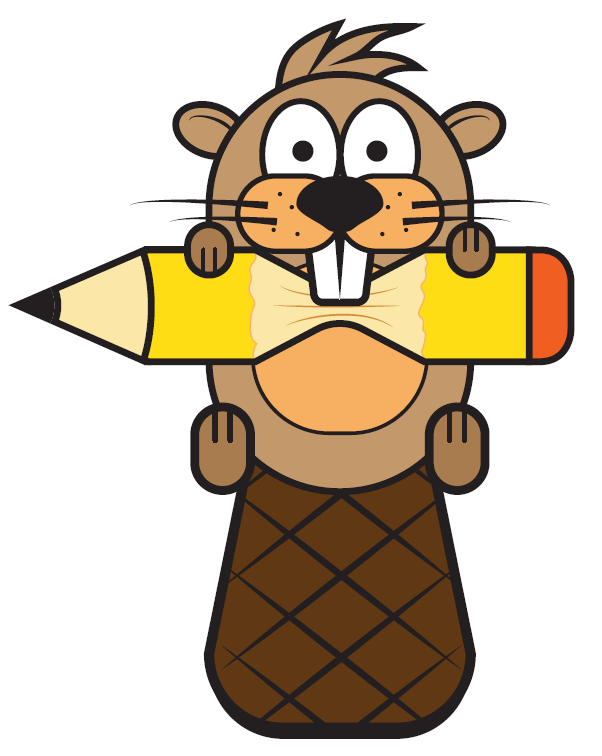
Here comes my version …Named “Libo” an intelligent beaver , who can change the course of rivers, can modify their living space in a few days….
https://drive.google.com/file/d/0B8hs_XrQyHL6SzJXelU2N0hrMzA/view?usp=sharing
Sorry for uploading the wrong one..its none other than “Libo” the Rock-hopper penguin, who is willing to be the mascot for Libreoffice..
Thank you, and don’t forget to submit over the official channels.
Sir, Mascot is different from Logo right? I am bit confused with some of the submissions…so please give me an advice.
One more submission from my side..
https://drive.google.com/file/d/0B8hs_XrQyHL6NVJRM0Yxa1JxXzQ/view?usp=sharing
Hi, I submitted on the 11th of August. My name is Ana Félix and my email is static_kat@hotmail.com . Can you confirm? Thank you :)
Yes, your submission has been duly received. Makes it easier, btw., when using the real name in sender.
The hummingbird looks good, but it should have a flat graphic style. If you advise yourself from a marketing expert it is better.
I submitted my 3 mascots on August 13th. My mail if eferryday@gmail.com and my name is Ferry Hidayat. Please confirm my submission, Thank you,,,
Hi there!
I submitted my entry via e-mail and just wanted to check if you have received it.
Thanks
Hi there!
I submitted my entry yesterday via e-mail and I just wanted to check if you have received it.
Thanks
Many thanks for your submission.
Hi,
My name is Tyson Tan, I’ve uploaded my LibreOffice mascot proposal and emailed a copy to you. The pictures were big and my network condition has been unstable, may I ask if you have received and can open them without damage? Thank you!
Many thanks for your submission.
Hello all,
Here is my humble attempt. She is called Atra – short for ink in latin [atramento] :-).
http://imgur.com/a/BXso1
Thanks for the opportunity. I submitted it through nextcloud, too. Comments are always welcome.
Thanks,
Akash Kodela
Hi
shall i include a separate description regarding the RGB colours used and features of the mascot as a separate png in the submission. That is: png of mascot in colour,
png of colours used, png describing features and line drawing of mascot .
Or do you want me to only include one png of the mascot?
Hello, I’m commenting here to ask whether my submission has been received? I realize that no error messages means it is likely fine, but I would like to double check here regardless. Thank you for the opportunity!
Yes, Blinky has arrived.
Hi, have you received Thomas , my mascot, for the submission ?
Hello! My apologies for bothering with my worries, but I was just wondering if I actually managed to submit my entry correctly and if you all received it on your end? I submitted under the name of Yakra, and…. well… was wondering/hoping that I didn’t end up sending/uploading it to the wrong place!
Hello, I’m commenting to check if my entry was received. I submitted through nextcloud and email just to make sure.
I accidentally sent you a job without wings. Here’s what I got
http://imgur.com/a/4L2Fe
Hi there,
it would be great if you cloud confirm me, that my files arrived
All who asked lately: Yes, your contributions have been received safely.
Sorry to bother, just commenting to check if my submission got sent correctly and if the licensing was ok. I wasn’t really sure how to mark it as CC0. Is it just a statement or did I have to do something else?
Thanks.
Slightly improved version. Thanks for the contest, the very participation in this event is very interesting.
http://imgur.com/a/InUcj
“The design should be available in two colors (to reduce printing costs, if necessary), and in full color.”
Does grayscale count as 2 colors? Thanks and goodluck everyone.
Hello people,
I am a bit late but here are my proposals:
https://www.dropbox.com/s/78km8zw3igku92u/20170830_Lucut%20Bogdan_Colibri.jpg?dl=0
https://www.dropbox.com/s/95z6ykv6d686019/20170830_Lucut%20Bogdan_Dragoffice.jpg?dl=0
https://www.dropbox.com/s/i1ti7f7uaj08y2r/20170830_Lucut%20Bogdan_OtterLibre.jpg?dl=0
Thank you!
Bogdan
Hi! I sent yesterday my design. But I need to verify if I sent correctly. I live in venezuela, and internet its slow and sometimes dont work. Sorry for my bad english.
Please accept it.
Hello. I have send mi mascot this afternoon using nextcloud. It’s on date? Thank you.
Good luck.
Hi, I sent my proposal yesterday. Could you let me know if you received it? Could be in PDF file or just PNG file? Thank you for all.
Hi,
I uploaded my design & sent in email too.
Hopefully you received it.
Thanks
Submission phase has ended now. We received almost 300 images (including who asked for confirmation). Thank you all for the awesome proposals! Next step will be the community voting.
I forget to put a name in my mascot:( Can I resend?
Hi,
Can you please send a link where I can see the others designs and vote? Thanks!
Bogdan
Hi Heiko, I sent an email now for just complement my proposal with more PNG and SVG files that I forgot to include in main message. That is ok?
Community voting? I think that os not good idea. Will win who has more friends, not the best.
In my opinion, the best way is a jury made up of the most prominent members of the community.
Regards.
> Results will be filtered by a commission named by the Board of Directors (BoD), and voted by the community. The final decision about the design and the name will be confirmed by the BoD.
It’s right there in the original blog post. Keep in mind that the final decision isn’t made by the community, but by the BoD.
Oops. Everything cleared up. Forget my comment. Vote for me ;-P
In the event that it is decided by popular vote. It is best to raffle gifts between participants. After all, the best prize is to have your design as a mascot of libreoffice.
[Backspace][Backspace][Backspace][Backspace]…
Oops. Everything cleared up. Forget my comment. Vote for me ;-P
Hi! I submitted a proposal a few days ago by email. But now, after reading the comments I’ve noticed you’re asking to submit proposals by email and uploading it to Nextcloud, but the description of the competition says proposals have to be submitted to Nextcloud OR email. Is it ok if I just sent my design by email and didn’t upload it to Nextcloud?.
Hola. Según entiendo las propuestas para participar se envían al correo, pero para compartirlos con la comunidad se suben a Netxcloud.
Saludos.
Gracias por tu respuesta! saludos!
Here is the design I sent:
https://drive.google.com/file/d/0BxzxcfnMxz7SbERMUXRuLTNBdjg/view?usp=sharing
It mainly represents freedom, evolution and innovation.
And here are some sketches of my mascot to show its cuteness and flexibility:
https://drive.google.com/file/d/0BxzxcfnMxz7ScFVEVzB3OHFwSzQ/view?usp=sharing
Let me know your opinion on my design please! Saludos a todos :)
Hello,
Do you know when or how community voting will happen?
Thanks,
Chase
¿Alguien sabe cómo va el concurso? Cómo vota la comunidad y eso.
Gracias por cualquier información
Hello,
Do you know when or how community voting will happen?
Thanks,
Chase
Proposals are still under examination. It will take at least another week.
About the decision you will report in this article? Can I work after the end of the competition if it does not suit you?
Of course you will get informed about the results. And you are very welcome to work on design topics independently from this competition.
Hi friends, does anyone know when the community will vote?
Hi guys! we can’t wait for the community votes selection, do you have any news?
https://design.blog.documentfoundation.org/2017/09/28/libreoffice-mascot/
The penguin design is stolen.
http://www.canstockphoto.com/happy-cartoon-penguin-rockhopper-30574817.html
Wow, now no matter what mascot they use they are idiots for dismissing this one:
https://tysontan.deviantart.com/art/Libbie-the-Cyber-Oryx-706906560
I mean, this is the complete package. Dunno what you are thinking not using this.