
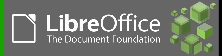
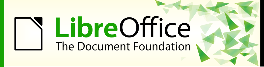
We asked recently for branding proposals for the upcoming release of LibreOffice. The task was also announced on the job board of the Open Source Design group and we got a couple of replies on their discourse forums. Below you we show the motifs embedded in the splash screen.
Motif #1

Motif #2
Motif #3

Motif #4
Now it’s up to you to decide what design you like most.
Many thanks to Jan Dittrich from the Open Source Design community for the awesome ideas.
3, 2, 1, 4 in order of preference :-)
2, 1, 3, 4 in order of preference. Each has merit
1 evt 2 als alternative
1 and 3 are cute.
1 & 2.
Should be changed and the logo. With a new one, something special.
I like Motif # 2 — Figure #2: Cubes on gray background: clearly, laconically, pleasantly, reliably & persuasively.
Don’t like: Motif # 3 (Figure #3: Hexagons). Sorry, but background under the inscription looks as if it is dirty :(
First logo good too
4 Branding is meant to make things recognizable. So choose one and stay with it until there is a compelling reason to change.
From best to worst: 1,3,2,4
I don’t like the yellow-ish background of the 4th one, it looks like the old beige PC towers ^^
#1 is really the best
A preference order would be better than just picking one.
1, 4, 2, 3
Another 1,3,2,4 here!
I like the first one because of its colors. But the 3th one is more modern like apps. So I prefer the 3th. Maybe it is possible to give the user the choice. Implement them all and make it possible in the preferences to to chose which one the user wants to see.
1, 4, 3, 2
I like Hexagons
1, 3, 4, 2
I like the little extra colour in #1
I vote for the 1.
In order y prefer: 1, 4, 3, 2.
The #2 is to dark, i don’t like to see dark color when i go to create something, is so sad for me.
The #4, #3, represents libreoffice office logo whit his original colors, but the white in the background i don’t liked, but liked more than black xD
The #1 is for me a perfect combination, the background in light green , and his composition is good for see in the init of libreoffice.
1, 3, 4, 2
3,1
For me 3 and 1 (in this order)
2,3,1,4
3, 4 in order of preference.
#1 and #2 looks great!
Do not use the 1º, it does not pass credibility, and it does not seem interesting…
I’m going to say I think your results are biased by non randomized selection order. A correctly done vote would avoid any unconscious bias resulting from the order the options are presented in.
2, 3 or 4 is better..
1
#1 is excellent, for sure. However, https://design.blog.documentfoundation.org/wp-content/uploads/sites/2/2017/06/Motif1.png is very different than https://wiki.documentfoundation.org/File:Libo6-splashscreen.png — I feel that the latter looks amateur in comparison, there is too much aliasing on the lines, some aren’t lined up perfectly (non-matching border widths), and I really don’t like the cubes. Is the splash screen going to be one not listed here?
We had to rework the idea a bit. It begins with the label underneath the brand name that shouldn’t be there. And when you remove it, the horizontal line with the right object is missing. Furthermore, all the power of Draw should be used, hence the cubes are intentionally chosen. Actually it were cubes before but rotated and pitched slightly different. About the aliasing issue we definitely need to look into it. The issue is here https://bugs.documentfoundation.org/show_bug.cgi?id=113276