LibreOffice takes accessibility seriously, and we want to make our program as enjoyable for users with disabilities as it is for everyone else. That means we care about motor impairments and, for instance, we always provide different ways for interacting with the software. And, of course, accessibility covers a wide range of visual handicaps related with color blindness, which are taken into account to ensure that information is not only coded by color, and also to account for cases of complete blindness, where a screen reader is necessary.
Not every modification in the past went well, and we are facing some issues with the latest version. For instance, Jean-Philippe Mengual mentioned at the LibreOffice conference in Brno that it is not possible to access styles in the sidebar. While we have human interface guidelines (HIG) for the sidebar UI, it lacks on advices regarding accessibility. Therefore, the UX and the accessibility teams analyzed the current state regarding keyboard navigation and summarized the outcome into a draft that should be added to the sidebar HIG.
A lot of good ideas were discussed, though mostly discarded. For example, the access to relevant content could be simplified when some less important features are excluded from the the navigation sequence and thereby ‘hidden’ from the screen reader. The striking argument is that disabled people work together with normal users and potentially face a situation where an unexpected state occurs. So one axiom is to make all functions accessible. Another rationale is to make simplicity paramount before consistency or clearness. Having different shortcuts for parts of the UI that technically do not belong together might sound reasonable but complicates the interaction. And finally, we do not want to change the learned interactions and keep things as much simple as possible.
Guidelines
Activation
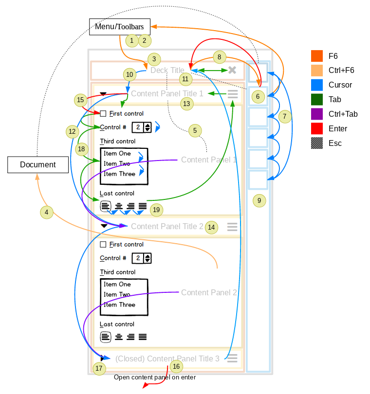
- Activate the accessibility mode with F6.
- Navigate using F6 starts at the main menu, followed by the open toolbars, and finally the sidebar.
- On the sidebar, land first on the open deck‘s title bar, or the sidebar‘s tab bar when the deck is closed.
- Leave the accessibility mode with Ctrl+F6 and go back to the document position where the navigation has started.
- Use Escape to go back one step in the navigation, meaning from the content to the content panel title and then to the document.
Tab bar
- On the tab bar, land on the tab of the active deck or the tab of the first deck when the sidebar is closed.
- Jump to next/previous tabs with arrow keys including the configuration button.
- Jump to the title of the first content panel using Enter. In case of no content panel go to the first control with Enter.
- Expand or collapse the deck with space but stay at the tabbar.
Deck
- Cycle through the content panels (e.g. Styles, Character, Paragraph etc.) per arrow up/down.
- Make all parts of the deck accessible including the deck title.
Content panel title
- Traverse the content panels of a deck using the arrow keys when the focus is on the content panel title or through Ctrl+Tab/Shift+Ctr+Tab on any position in the content panel.
- Make all parts of the content panel accessible including the content panel title and the options menu.
- When jumping to the next content panel land on the title.
- Jump to the first control of the content panel using enter.
- Expand the content panels automatically on enter when collapsed.
- Expand or collapse the content panel with space but stay at the title.
Content panel
- Within the content panel navigate between controls using tab/shift+tab.
- Use arrow keys to access controls that are part of a collection such as toggle buttons, lists, dropdowns (e.g. bold, italic, underline etc.).
Visualization
The figure illustrates what is defined in the guidelines. Markups with numbers should help to find the respective advice.

Discussion
First of all we would like to thank Alex Arnaud from the Hypra team for contributing with his expertise. But as usual there may be aspects that we haven’t addressed or that might be solved better. So please speak up now and share your experiences with us.

the access to relevant content could be simplified when some less important features are excluded from the navigation sequence and thereby ‘hidden’ from the screen reader. These are the most relevant shortcuts i have gone through. https://microsoftsupport.co/blog/windows-10-error-code-0xc00000f/ help me to get all the keyboard shortcuts.