The management of various objects is crucial for LibreOffice Draw, especially when a drawing or a diagram becomes complex with a lot of shapes and groups placed on different layers with an elaborated stack order.
Improvements for the handling of layers was not only requested in the survey about Draw, but is also evident in the enhancement requests at the LibreOffice bug tracker. For instance, the interaction with hidden layers has room for improvement, setting layer exportability is requested, and to easily gain access to visibility and locking is needed. The meta ticket tdf#99648 collects all bugs and requests regarding layers.
There are also many requests about improving object selection and organization. For instance, how multiple objects are anchored, the ease of selecting stacked objects, how the multi-selection is visualized and the ability to find shapes by attribute or format. The meta ticket for object selection and alignment is tdf#100155.
This proposal aims to solve both topics by enhancing Navigator’s capabilities.
tl;dr: → Summary
Current State
While there are valid requests for the improvement of layers, many stem from the fact that ODF, and thereby LibreOffice, handles layers differently from other tools. The common SVG file format has no defined layer element, but SVG applications like Inkscape defines layers as “a type of object group” and the order of the layers affects which objects appear above others. The ODF specification states similarly “Layers group drawing objects. Assigning a shape to a layer does not change its rendering order as defined by its draw:z-index attribute.” From the LibreOffice Draw Guide: “Layers in LibreOffice Draw allow you to assemble elements on a drawing page that are related…. Layers do not determine the stacking order of objects on your drawing page…”
So the first suggestion is to rename layers to something like “collections”, to remove the misunderstanding that arises because it doesn’t affect the layering of objects.
Objects have a tab order that defines the sequence they are selected when pressing the Tab key. They also have a stacking order that defines which objects appear above others (also known as z-order), as well as information about its assignment to a group and layer (being in a collection) – all completely independent from each other. Due to this flexibility, an object can be grouped over different layers/collections, which can make it hard to understand the structure of a drawing.
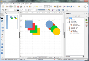
The layers/collections are represented today in a tab bar in the lower part of the document view area. In figure 1, two layers/collections called Circles and Rectangles hold the respective shapes (get a copy of the document to test yourself). The Navigator in the sidebar (or as separate panel) lists the named shapes and groups. Notice that yellow and blue objects are grouped while residing in different layers/collections.
The Navigator provides no interaction with objects except for selection on double-click when it has a user defined name (tdf#62851). However, selecting an object does not result in the appropriate selection at the Navigator. The toolbar above the object tree is used to navigate through pages (though tooltips says ‘slides’) and to either show all shapes or only the named ones. The dropdown below the tree lists the open documents and allows users to see the structure of an alternative document by selecting its entry.
Multiselection is possible in the document area when Shift is pressed, but similar to single selection it is not indicated in the Navigator. Clicking through a stack of objects is done with Alt being pressed (or Shift+Alt for the reverse order).
To manipulate layers/collections, a context menu appears when right clicking the in tab bar. As a shortcut, Shift clicking the tab toggle its visibility.
User Stories
- Benjamin wants to add objects to create a drawing.
- Benjamin wants to delete objects that are obsolete.
- Benjamin wants to group objects to arrange them together.
- Benjamin wants to easily modify the stacking order of objects to not cover a certain object.
- Benjamin wants to lock objects to ensure it remains at the designated position.
- Benjamin wants to rename objects to make it easy to identify.
- Benjamin wants to search by name for an object in large drawings.
- Benjamin wants to load drawings from the past with full backward compatibility.
- Eve wants to have all freedom of collections to create advanced drawings.
- Eve wants to search by attributes in order to find objects by their properties.
- Eve wants to hide collections that are currently irrelevant and distracting.
- Eve wants to disable printing/exporting for collections that aid during the preparation process.
- Eve wants to select all objects on a collection to selectively modify many objects.
- Eve wants to tab through objects to access the content of a drawing without using the mouse.
Proposal
The proposal intends to be simple by default and powerful when needed, as the LibreOffice vision postulates. The basic idea is to have all features for object arrangement and selection in one place, the Navigator.
Easy mode
In this default mode for Navigator, all objects are listed, and not only when its name has been changed. The first item is the topmost in stacking order and groups are indicated by hierarchical indentation. The selection of objects in the drawing area selects the respective items in the Navigator and vice versa, for both single and multi-selection. The tree behaves as known from file browsers: single click selects an item, ctrl/shift click allows multi-selection, double click starts the default function, which is inline renaming. A context dependent menu gives access to all related functions. The menu entry ‘Lock position’ would be a shortcut to the object properties and locks the position and size of the object.
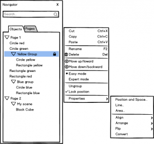
Drag ‘n drop of objects within the tree supports grouping and sorting: when the object is dropped onto another both are grouped. If it is dropped in between, the item moves to this position changing the stacking order (and ungrouped if the item was grouped before). Pressing Shift during drag ‘n drop duplicates the object.
The development has to take care of 3D scenes (e.g. sphere, cubes, or into 3D converted objects): moving objects between scenes should be possible, similarly to ordinary shapes, but not from or to groups.
Expert mode
Collections and objects are both visible in expert mode and the hierarchical view is maintained in context of the current page.
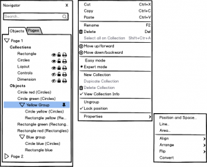
On what collection an object or group is associated with can be read from the caption (the context menu is a good place to switch this hint on or off). Dropping an object onto a collection would replace the current behaviour of dragged them onto the respective layer tab. Collections provides the functionality for its objects to be visible, locked from editing, and part of the output when printed or exported (the latter would be a new feature).
During the discussion we considered to have these features also for objects and groups, but doing so means to extend the ODF specification (which some trouble) but even more relevant, it make the easy access less simple. Another problem would have result from the indeterminate state of a collection being hidden, for example, and a subjacent object switched to be visible.
The context menu needs to be designed carefully, and functions that are not relevant in the current selection should be disabled. For instance, a group is not related to a collection so the menu item ‘Select all on current collection’ is disabled. But when the menu pops-up from ‘Circle yellow’, it may provide this feature that allows the selection of all circles, in this case.
Search/Filter
The filter aims to make the search in large drawings convenient. When, for instance, “rect” is being entered all objects that do not contain this text in their name are hidden. Additionally, the search can be done in an advanced mode with key:value combinations like type:rectangle, color:red, linecolor:#00FFAB, or linestyle:dotted similar to what is known from Google. The control should provide autocomplete features to assist function lookup.
Generalization
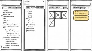
The concept is not restricted to collections and objects in Draw. The Navigator is a very powerful widget and should not be limited to just visualize content. It should behave like normal tree widgets with node interactions and context menu options, instead of a clumsy toolbar. The Navigator is enhanced by tabs (whether realized as real tabs or via small toggle buttons) giving access to the different views of the document.
Search is a key and powerful feature and that allows you to search for paragraphs with a certain style per style:Text or for certain comments when this tab is active date:yesterday.
The page pane in Draw and also the slides pane in Impress would be obsolete (or rather replaced by an alternative), as a pages tab provides the thumbnail view of the document. Users will still have the ability to reactivate the panel that are used to it.
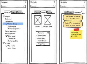
Headings are separated in Writer from other objects, such as tables, figures, etc., a thumbnail page preview is added for consistency with other modules, and, as an example illustrated in figure 4, comments are shown.
Summary
To solve issues with layers (which we suggest to rename to ‘collections’) and object management in LibreOffice Draw, we propose to improve the Navigator by making nodes interactive and having simple and expert views. The UI is designed with a clean and consistent concept and a couple of convenience features.
We discussed the idea of simplicity controversially. While the mockups do not have a toolbar (in contrast to the cluttered Navigator in the current release) and all functions are available in the context menu. Some in the UX team want to retain a toolbar to provide direct access to important management functions like node duplication, stacking and deletion.
What do you think? Would you prefer to use easy or expert mode, and why?

Hi,
Thanks – impressive overview of the situation and good thoughts for improvement I think. Few notes:
“Due to this flexibility, an object can be grouped over different layers/collections, which can make it hard to understand the structure of a drawing.”
We count four types of ordering, that are independent: tab-order, z-order, possible grouping, and possible layer/collection.
I would tend to use grouping to make it possible to move/order objects together. And a layer to make it possible to hide objects.
So for me they have a different use and I’m sure if I’ll get confused.
Side note: “The dropdown (Navigator) below the tree lists the open documents and allows users to see the structure of an alternative document by selecting its entry.”
It also allows to insert copies of objects from another file.
“The page pane in Draw and also the slides pane in Impress would be obsolete (or rather replaced by an alternative), as a pages tab provides the thumbnail view of the document”
In some cases I expand the width of the slide pane, to have a good view of the page/slide. Thumbnails would not suit that use, I’m afraid.
To rename layers to collections looks sensible. OTOH collections and groups have some similarity too. Thus maybe another even better idea pops up :)
Good work!