In the last couple of weeks, we have run surveys for Writer and Calc in order to gather user feedback on optimizations we were making to the toolbar and applications. So here are the results of our recent survey analysis for Impress.
This article was posted first on 2014-Dec-27 at user-prompt.com (site closed now).
Results
The survey was started by 140 people and completed by 96 participants. Thanks to Kevin Suo from LibreOfficeChina.org we were able to present the survey not only in English, but also in Chinese, wherein 27 Chinese participants completed the survey.
We started the survey with matrix questions. That is a type of question where participants read a headline and would answer the question on a couple of items. The answer was given in this test on a six-steps Likert scale to force a choice. The following graphics show the result as deviation from the average which could be treated as expectation value. The whiskers denote the 95% confidence interval.
Matrix questions
To learn more about what users do with presentations we started with the question about how often users format objects.
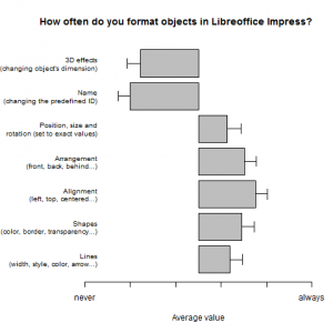
(Whiskers in this and all following graphics denote the 95% confidence interval.)
Obviously, 3D effects and the object’s name are rarely changed. Both functions are not easy to access or have alternatives. All other features are used rather frequently.
A difference between Chinese and English speaking people cannot be proven (F=2.291; p=0.131).
The next question asked was about the properties that are usually modified.
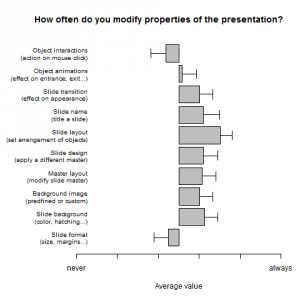
In general, users change all properties regularly except the Slide format (dimensions of the slide, margins, etc.) and interactions with object (mouse click actions). The most often accessed property is the Slide layout (arrangement of text boxes and graphics on a slide).
There is a clear difference between language groups (F=7.365; p<0.01). The effect can be tracked down to a difference for the features Slide format (T=2.23; p<0.05) with an average result of 2.92 for en to 3.94 for zh (scale was from never=1 to always=6), and tendentially to Object interactions (T=2.05; p=0.054; m(en)=2.79 vs. m(zh)=3.88). This means that the Chinese participants use both features more often.
The last question on the first page of the survey was about what objects are added to presentations.
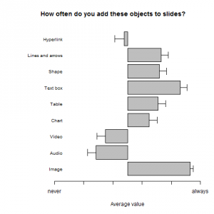
Of course, almost all users add Images and Text boxes to presentations. On the opposite, audiovisual material is not so often integrated.
There is a difference between Chinese participants and the rest (F=12.33; p<.001). The difference emerges for Audio (T=2.47; p<0.05; m(en)=2.13 vs. m(zh)=3.19), Hyperlink (T=2.37; p<0.05; m(en)=3.05 vs. m(zh)=4.12) and tendentially for Chart (T=1.86; p=0.073; m(en)=3.93 vs. m(zh)=4.56). Again, the Chinese participants do use those features more often.
Preferences
Similarly to past surveys, we want to know how people interact with the application. So we asked how participants add new slides.
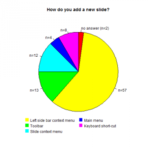
The majority of users right-click in the left side pane and choose New slide from the context menu, which is not surprising as this is the only method of creating new slides in most presentation tools. This workflow is followed by access via the toolbar, then the slide context menu, and then via the keyboard. A differentiation between languages makes no sense here (and lacks on the low number of participants).
To optimize Impress‘ sidebar, we want to know which sidebar tab is the most important for participants.
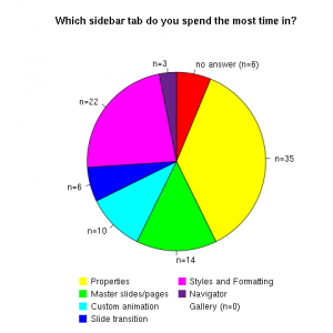
Here we find rather equally distributed replies. Either participants‘ workflow varies heavily, or they do not know for sure where they spend the most time or have no favorite respectively.
To get insights on user’s needs for the toolbar, we asked what features they want to see added to it by default.
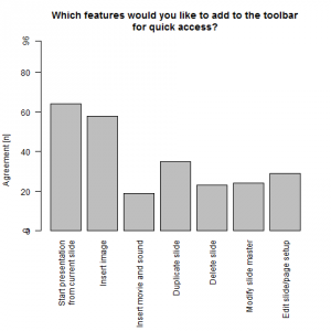
Unlike in the previous surveys for Writer and Calc, there is not as many changes that are urgently desired by users. Most interesting to participants is to Start presentation from current slide and Insert image, while other options are only desired by about a third participants.
Free text comments
We asked ‚Which five slide transitions do you use the most?‘ to get a clue on what transitions are the most relevant for users. The following list is roughly ordered by the number of replies:
- None
- Fade Smoothly, fade through black
- Push, box, cover/uncover,cut through Black
- Wipe, dissolve, rochade
With ‚Which five object animations do you use the most?‘ we took a closer look on how objects are animated. The replies are quite similar as for transitions.
- None
- Fade in/out, appear
- Fly in, zoom, wipe, dissolve
- Boomerang, swirl
We finished the study with the question ‚Do you have any recommendations on how to improve Libreoffice Impress?‘.
- Nicer selection of default templates
- Improve the UI by removing clutter in toolbar and context menu, ability to hide the menu bar, and more clearer indication of basic options and features
- Improve responsiveness and stability
- Bug fixing (especially for tables)
- Improve import/export compatibility
Discussion
Libreoffice Impress is a program with less functionality compared to Writer or Calc, and survey participants use most of its functions regularly. The least used features include multimedia objects and 3D effects, but this probably is only because of implementation flaws (which should be solved when OpenGL rendering is fully implemented). Participants also recommend improvements on the user interface and functionality, which we plan to look into based on the results of this survey.
A number of improvements to the toolbars and context menus have recently been added to Impress, which will be visible in the upcoming 4.4 release in January/February 2015. The biggest takeaway from this survey is that users of Impress are eager to make presentations, but wish for LibreOffice to come bundled with a nice and elegant selection of templates. The Document Foundation has just launched a templates competition to have creative members of the community submit templates that will be selected for inclusion in future releases. So be creative and send us your templates. The best ideas will be included in future releases – and you may win a T-shirt too.
And as always we like to hear your opinion on this study as well. What do you think?

We asked ‚Which five slide transitions do you use the most?‘ to get a clue on what transitions are the most relevant for users. The following list is roughly ordered by the number of replies:
Fade Smoothly, fade through black
—
But there is a bug on this transition, so I stop to use it… 99685
https://bugs.documentfoundation.org/show_bug.cgi?id=99685