
![]() The LibreOffice application icons are undoubtedly awesome. But over the years they have become a bit dated and do not fit well into the zeitgeisty icon design. Plus, the set has no good main icon, which is in particular an issue on macOS where this icon is shown on the launcher bar.
The LibreOffice application icons are undoubtedly awesome. But over the years they have become a bit dated and do not fit well into the zeitgeisty icon design. Plus, the set has no good main icon, which is in particular an issue on macOS where this icon is shown on the launcher bar.
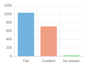
Many proposals have been submitted and finally the TDF members elected one concept in a first poll. Now we like to involve the larger community into the design work. The question is whether icons should be flat or have some gradient. Please use the following link to vote.
https://survey.documentfoundation.org/776711 (poll expired 2022-Jul-25)
Further comments are still very much welcome. Do you have a suggestion?
Hello. I voted for the poll. Also, I shared this news with our friends both on my own platform and on platforms belonging to LibreOffice Turkey and Debian Turkey. I wish you successful work. Greetings.
https://www.getgnu.org/yazilim/ofis/libreoffice-simgelerine-oy-verin.html
https://blog.libreoffice.org.tr/2022/07/15/libreoffice-simgelerine-oy-verin/
https://forum.libreoffice.org.tr/viewtopic.php?f=2&p=3115#p3115
https://forum.debian.org.tr/index.php?topic=11359.msg29309;topicseen#msg29309
This would only be change for the sake of change, not because there is anything wrong or “dated” about the brand icons. From day one of LibreOffice being founded we have been fighting for our “page” icons to become recognized in the same way as the OpenOffice.org “seagulls” icons were and (currently used by Apache) are.
This is just one more of the multiple reasons I resigned as a member of the LibreOffice project.
I disagree. The current icons are an eyesore. They do not fit into a modern desktop. The proposed ones seem much better, especially the flat ones, I voted for. And they are still “page” icons, clearly recognizable as an update of the current ones, so your efforts are not lost. I am glad, and you should be too, that the project gets good quality voluntary design contributions.
This ultra-conservative attitude is holding us back, Dave. The sheet was never iconic as seagulls are. I always complained that this branding caused a conflation of app and MIME type icons (which are the same in LO), and in addition, the TDF made a baffling decision to use the same logo for both it and the LibreOffice project. Come on, FFS!!
I like them, especially the flat ones, and hope to see an icon update soon in Linux distributions.
However I would also like the community to consider another icon set I found. The same set is appears on these 4 pages:
https://www.deviantart.com/magog64/art/Libreoffice-Gnome-Icon-205219113
https://www.gnome-look.org/p/1108506
https://www.gnome-look.org/p/1011937
https://github.com/Bonandry/my-od-collection/blob/master/icons/bonandry-gnome-icons-for-libreoffice.tar.gz
They are made by Andrea Bonanni, and apparently GPLv3 licensed.
I am currently using them on my Debian 11 Gnome 3 desktop, and they look good and fit nicely with the other app icons, unlike the old ones.
I find it difficult to understated why you feel it to be critically important to abuse me with comments like “This ultra-conservative attitude is holding us back, Dave”, because I express my opinion, or maybe you believe I am not entitled to one.
I would be fascinated to know how you construe the notion that changing the icons take the project/software forward in some miraculous way and keeping the existing icons holds back any kind of progress.
You may notice that this blog is a vote and I have been denied a vote by the divisive nature of the blog, which offers a choice between two proposed designs. Why divisive? The result can and probably will be interpreted to mean that all those who voted want the change and all those who didn’t vote don’t care if they are changed or not.
Being in a position that I don’t favor either design, the only option I have is to comment my opinion.
We run a first poll among the TDF members with three options: this and another design and the existing icons. It was a tight win in the end and about 1/3 of the members concur with your opinion.
This posting was primarily meant to involve the larger community and to give the designer input for the fine-tuning. Your input is very welcome and supports the guideline as stated here https://wiki.documentfoundation.org/Design/Guidelines/Branding.
Apache’s seagulls are better compared with the failed effort to find a mascot. I don’t think we should stir up this story. Adolfo commented why we plan to change the application icons. And btw., me haven’t seen those icons on the desktop for several years since Linux/KDE uses a different set anyway, see https://kdeonlinux.wordpress.com/2015/03/25/breeze-love-libre-office/
Hm. I’m impressed. There have been many nice and good proposals for new icons and an open decision process. Now, after an update to 7.5.1.2 I got these really ugly icons. Very sad about that. Then they are not consistently used like i.e. on the splash-screen where there are still the old beautiful icons. Hm …