-
Don’t substitute templates by sample documents
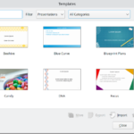 Templates contain generic content and structure, and are meant to create multiple documents. In contrast, a document is intended for a single use. While both types are more or less the same, the advantage of templates is the handling within the program (→Template Manager). Furthermore, you probably focus more on the essential aspects of your presentations when you create a template. If you load the sample document from last year and modify it, the cleaning-up takes some time- and you will probably not remove all the styling and formatting mistakes made in the past. Not to speak about the danger to overwrite the source document.
-
Don’t replace master slides with sample slides
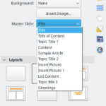 Master slides are the blueprint of your slides. It may or may not contain images, shapes, text etc. that constitute the layout of a slide. Typically, one master slides is dedicated to the title of the presentation, another could introduce sections, has more or less artwork on it to make the presentation rich in variety, etc. And while you could just copy/paste a slide and modify the content, these slides wont adopt later changes to, for example, the font name and size. But it does when changing the master slide.
-
Use styles wisely
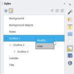 Without styles an office suite would be just an editor. Styles define the text attributes for title, subtitle, background object, and all outlines. These outlines are hierarchically organized, meaning if you change the font of “Outline 1” it’s derived down to “Outline 9” (and might be overwritten there). Only by using styles, you get a consistent appearance.
-
Use document properties and variables where possible
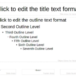 Some text boxes are defined as AutoLayout- you cannot remove it. And please don’t move it out of sight but pick a certain layout in the actual presentation that hides those text boxes, for instance “Title Only”. While the capabilities of variables are limited in Impress, there are still some fields available. If you insert your name on the title slide, for example, use a variable to take the data from Tools > Options > User Data.
-
Think first before you click
- While it’s tempting to take one of the past presentations and strip out everything that’s special this is seldom a good idea. Better start from scratch and plan your presentations. Think of what purpose it has, who the audience is, what different master slides you may need, etc. Also consider who is using the template (is it only for yourself or will it be shared). Use a consistent design, for instance a special color swatch that is applied everywhere.
-
Consider accessibility
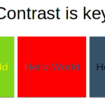 It’s always a good idea to use a contrastchecker to ensure background and font colors have a high enough contrast for everyone. Colors should convey information, use it carefully and consistent. Keep also in mind that people may need larger font, at best sans serif. Don’t have too much text on a slide but also not too many distracting pictures.
-
Share with the community
- LibreOffice is a community project. It’s made for you and made by you. Everyone can contribute not only with code but also with nice designs. And you can share the templates on our extensions site. In this case you should consider localization and internationalization. While a fancy font on your computer might look good, it’s probably not installed on the other system and your design becomes broken. And, of course, don’t use proprietary pictures. Ideally, you clear all language specific content and replace the text by Lorem Ipsum content.

2 thoughts on “The Dos and Don’ts of Impress Templates”
Comments are closed.