
The LibreOffice community regularly publishes new releases, and the latest version, 6.1, is released in August 2018. The design team worked hard to make this release as shiny as it deserves; here’s what we did.
Background images
LibreOffice ships some images by default to fill the background of shapes. Those are accessed via Sidebar > Gallery or when you change the area properties under Bitmap. We felt that those images were outdated and replaced many of them.
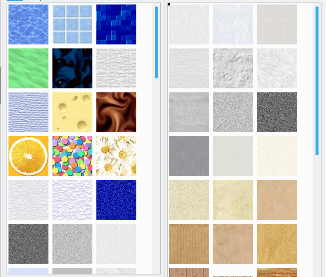
Users who need the legacy images, for example in documents that just link them, can install the extension from https://extensions.libreoffice.org/extensions/legacy-gallery-backgrounds.
Standard color palette
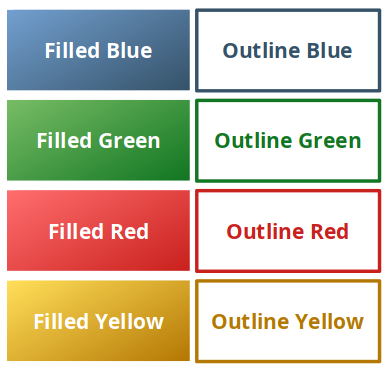
Although we introduced a new standard palette in version 6.0, not all users were happy with it. It started with the discussion whether Violet and Purple are appropriate terms, but we quickly realized that pure colors such as red (#FF0000) were missing. The new palette starts with the primary colors red, yellow, and blue (RYB) and has secondary / tertiary colors in between. The brightness is then reduced systematically based on established models.

Gradients
And when default colors change we would potentially end up with hex values on the gradients if #76AB08, for example, is not assigned to a name any more. Furthermore, we had the impression that gradients haven’t been done with much love in the past. The new collection puts more focus on pastel tones and the various features as you easily can add your own gradients.

Drawing styles
Shapes can have a style in Draw but the predefined options weren’t really useful. So we introduced some new styles and removed the not so relevant ones.
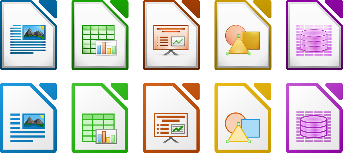
Icon themes
Several changes have been made regarding the shipped icon themes (being announced in the main blog post). The themes HiContrast, Industrial, and Oxygen don’t contain SVG variants of the icons and have no active maintainer and were removed. Newly introduced was Karasa Jaga as n alternative to Oxygen, and Colibre, which aims to fit into Windows 10 look and feel. Those who mourn about the old themes may download it from our extensions site where they have been laid to rest.
Last but not least, the app icons were refurbished to accommodate the zeitgeisty flat appearance and to comply with the predefined branding colors.
Notebookbars
Although much work has been done, the Notebookbar is still in experimental status as we not want to fully release it before we are completely satisfied with its quality and level of polishing.
For the release 6.1, the Tabbed variant received a lot of improvements in particular; it takes now less precious vertical space by using only two instead of three rows, all buttons have icons, and the arrangement of functions were reworked. And of course many bugs have been fixed too.
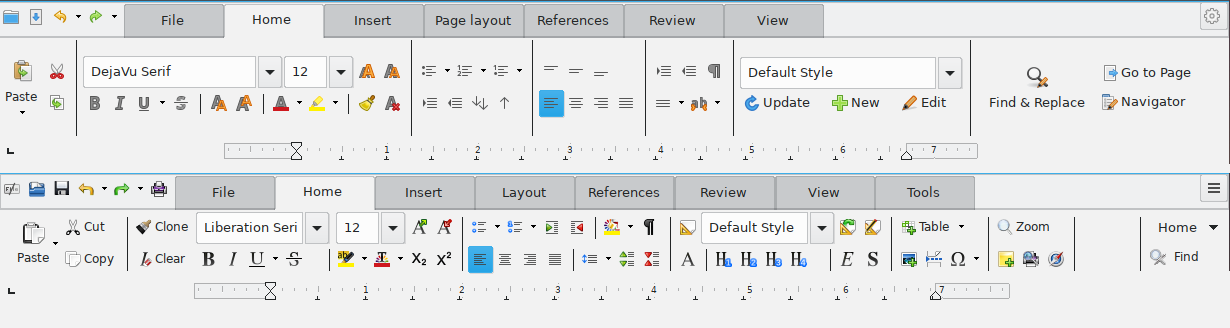
We appreciate your feedback and suggestions about the Notebookbar variants; to enable it, check experimental features in Tools > Options > Advanced.
Workflow
Numerous bugs have been fixed and new features and options were introduced to support the workflow, To randomly pick a few:
- It is now possible to generate a signature line using Insert > Signature Line.
- New “spell out” chapter numbering styles (One, Two, Three…)
- Image handling in Calc has been much improved
- Standardization and enhancements for keyboard shortcuts on macOS, e.g. the customization of Ctrl is now possible
- Some main menu entries were renamed, added or moved for better consistency over the modules
- etc.
Have a look at our release notes to find your favorite new features.
Numerous volunteers were involved in this work, thanks a lot to everyone. And you can contribute too for the next release! Check our Get Involved site.
This is amazing. These little changes add up to a whole new experience with Libreoffice!
I love it.
But… On MacOS, LibreOffice 6.1 has drop the full screen feature, like all other MacOS Apps. NeoOffice does it well. It’s also Open Source. Can’t both team talk to each other and fix this ?
Before, in full screen mode in MacOS, Writer had a small black bar on top of the Menu bar. This bug was years old. Never got fixed. And now, the feature is just gone. Very sad.
You mean this? https://bugs.documentfoundation.org/show_bug.cgi?id=76476
Exactly.
NeoOffice does it well.
Project needs designers… Desperately.
Every 6 months a new icon theme… Just use the standard system fonts on the respective OSes, FFS.
Also, default to using Times New Roman on macOS nad Windows. On Windows Machines, especially, I had some serious lag in scrolling and typing using the fonts they set as default… and there was no way to easily change the defaults in components outside of Writer (Calc, Impress).
Will continue to pay for Office 365. For something I use so much (and look at for hours out of my day)… it has to look good.
This looks like a bad GTK port to Windows or macOS.
This is odd. StarOffice used to look Native on Windows, but it seems to have regressed as the input from the F/OSS community increased.
Office 365 is a great product, and of course you are right with the more professional design- Microsoft has so much more resources in this area. And when the open document format is supported well, you are not locked in, so everything is fine. The good thing with open source is that you can use the tool you like most.
As a user of LO since its inception and as a fan of the EPUB format I only say: CONGRATULATIONS! These changes are necessary and wonderful and bring new innovative airs to a suite developed entirely in the spirit of the FLOSS movement.
This is an outstanding release! I’m really happy about all these little design-related changes that make the overall experience so much more pleasant. My favorite addition during this cycle is definitely the Colibre icon theme. Gonna use it on my KDE desktop. Thank you all for your hard work. It is really appreciated. :)
KDE runs on Breeze, so you better go with this theme. But happy that you like it and perhaps KDE takes over the Windows-inspired design in the end… ;-).
Thanks for this awesome intro to 6.1. Awesome new features especially the brand new Icons and Notebookbar. It looks more organized now. Downloading the 6.1 AppImage version now.
I like all of these new features. Especially the drawing styles. Great work everyone!
Have you considered reducing the Notebookbar implementations to one by default and ship the rest as extensions? I think it will be hard enough to support third party integration of extensions (e.g. Zotero) with two standard implementations (classic toolbar and one Notebookbar style). Or how do you want to deal with this?
Yes, and I would strongly vote for this. But apparently the idea never got into Bugzilla. So please file an enhancement request at https://bugs.documentfoundation.org. Thank you!
I have two suggestions.
1. Please add “alignment guides”. Every popular software have this feature. Helpline and grid are not sufficient. Especially “auto focus” for the middle point.
*And object’s default color (Dark blue #729FCF) is really ugly.
*Arrow’s head is too big.
2. Navigation bar(arrow button) should be hidden if I want.
When I click heading list on the navigation panel, small navigation bar suddenly appears and it is really annoying me. This problem makes me keep using OpenOffice as main tool.
Thanks a lot, user input is always very welcome.
#1: You are welcome to comment on https://bugs.documentfoundation.org/show_bug.cgi?id=100141
“Object’s default color is ugly… Arrow’s head is too big”: Very personal opinion (and unfortunately not so simple to change, at least the default color) and easy to deal with (we provide a lot of customization);
#2: Please file a ticket if there is no one yet
With an autofilter, when a filter was set, the arrow on the filter used to be a different colour. Now there’s just a small dot. It makes it hard to see at a glance which columns are filtered. Could you reintroduce the colour change as well as the dot please?
It’s blue with a dot for me, see https://imgur.com/NT1iEcg. Please file a ticket (https://bugs.documentfoundation.org/enter_bug.cgi?product=LibreOffice;bug_status=UNCONFIRMED;version=?) if you think there is need to change something and include some system information (copy at least Help > About: “Version…threaded”).
See also https://wiki.documentfoundation.org/QA/BugReport on how to file a ticket.
I’ve installed Legacy gallery Backgrounds extension on LO 6.2.4.2, but all the gallery images failed to insert into documents, and it require to insert as object. What’s wrong with it?
Solved the issue in 6.1 (https://bugs.documentfoundation.org/show_bug.cgi?id=120718) but for some reason it’s broken again. Will look into it.