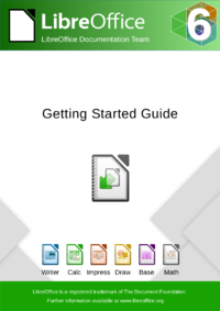
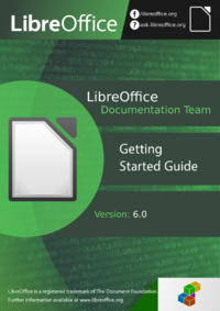
The new release 6.0 of LibreOffice is just around the corner. And we also want to update the documentation for this release. We have three proposals for new covers and would like to know which one you prefer.
Please vote by clicking option 1, 2 or 3 below and submit per “vote”. In case you think one of the designs is great but needs some tweaks please vote for it and comment what you want to get improved.
The deadline for this poll is the 19th of November.
| Option 1 | Option 2 | Option 3 |
 |
 |
 |

1) It was difficult for me to decide between Option 1 and 3, Option 2 is too dark. At the end I voted for Option 1, which is more “classical “.
2) Please, we need a complete manual (at least Writer and Calc) for 5.4+, not just Getting started. All the complete manuals are very old, for version 4.x? In newer versions 5.x there are new icons, reorganized menu items, a lot of new functions without any documentation.
The documentation team is working very hard bringing Getting Started completely up to date. The others will come later. We need more people to help! https://wiki.documentfoundation.org/Documentation
Voting isn’t possible with Firefox (at least on Android).
I’ve had the same problem.
Option 3 is more clean.
*clearner :)
I voted for Option 1, the square (containing an icon) at the bottom right is inconsistent with the background of the page.
excuse me, I voted for Option 2
I voted for Option 1.
Option 2 looks nice, but it lacks Libre Office 6 logo and I agree that the icon in the bottom right doesn’t look like it belongs there.
Option 3 is ok, but I liked the green heading of the first option, and I prefer the traditional icons over these “cleaner” versions.
Option 3 more clean and ‘Modern’
Option 1. Clear, clean and positive looking
Why is there no option – none? They all seem a design mess.
Every e-based book store shows many computer manual book covers as they are designed nowadays …
The design for the cover page should not iterate from the old design that was flawed in the beginning.
None is not an option. Either it’s one of the three or you submit another cover than satisfies everyone.
Voted 3 but it’s not clear if this also implies a change in the LibreOffice icon set – otherwise why show icons that are not the official ones?
To vote in Firefox you need to disable tracking protection (click the shield in the url bar).
2 looks nice, but is the back ground source code? If so it might give the impression that it is a guide for programmers, or something very technical.
Option 1 for me – possibly Option 3. Not Option 2
Option 2 has a wrong “f” logo:
https://en.facebookbrand.com/assets/f-logo
Don’t get this.
Option 3 for me, but I prefer the thumbnails of option 1 in it.
Option 1 for me with the addition.
*** clicking on the picture did not lead to a “vote” option
Option 1 for me with the addition.
Hej Diego,
What do you mean with “with the addition”?
Option 1 for me with the addition.
Change title from
“Getting Started Guide”
to
“Suite Getting Started Guide”
The options for voting are below!
I vote for option 1.
Me too
Option 1 too.
Option 3, but with the icons used in Option 1.
Option 3 looks best for me (voted), but would be better with traditional icons (like in option 1) and light footer (without green rectangle in background).
Option 2 is too dark and too complicated.
Option 2 is more beautiful. I voted option 1 though because it shows the products (write, calc etc) I liked that. Well done.
Branding and ease of view is very important. From that perspective, I choose option 2. LibreOffice is in your face, it is a brand. And people will know from the word “office” that it is an office suite.
Option 3 looks nice, but I think it would look better if its “Getting Started Guide” text and the logo beneath it are moved a little to the top, like in the option 1.
I would say Option 3, but I would suggest:
– Moving the “Getting Started” text higher (much higher than in Option 1), so that it is near the top logo.
– Making it larger (maybe just slightly smaller than the LibreOffice logo text). Maybe try a light font weight with it
– Left aligning it
My favorit is the Option 1
Option 2 is too dark and crowded.
And as Marcos wrote:
“Option 3 is ok, but I liked the green heading of the first option, and I prefer the traditional icons over these “cleaner” versions.”
None is perfect (which is ok, since only God creates perfect things).
IMHO the Option 2 would be better BUT
— place the box of 2 right top below the whole title box to the right edge of the cover
— place the colorful “6” logo from the rightupper corner of 1 or 3 to the same place of 2;
— reorder the title stripes as follows: (top) “Getting Started Guide”; (middle) “Version 6.0”; (bottom) “LibreOffice Documentation Team”
(I would done it for you if proposals have been available inhigher resolution.)
(I do know judging is easy, creating is hard.)
Option 3, but with the icons used in Option 1.
Thanks to the design team for creating such attractive options and asking for our input.
Is it possible to share larger versions of the images so we can see them better?
Sure, get the sources from our wiki https://wiki.documentfoundation.org/Documentation/Covers_60
option 3 if icon of version 6 matches with the ones on the cover ….
I can’t vote. When I click on an option, it opens up a new tab with the image (which, btw, is too small to analise it).
IMO they’re all nice, but I like #2 the most and voted for it.
I preferits option 1.
I prefer option 1. It is more in keeping with the covers traditionally used, but with a new look. The original icons are recognized and should be retained, rather than the strange ones used in option 3. Option 2 is too much confusing detail and is unlikely to be useful for the other guides.
Option 1 for me : it looks more professional, brighter and more attractive imho.
BTW I managed to vote with Firefox 56 / Linux by authorizing “polldady” in Ghostery.
There’s no option to vote when browsing with privacy settings set to on.
Obviously option 3.
1 Looks ok, but it feels too classic with its old icons, the gradient green and blown out white.
2 Is just way too much green and the color tones don’t match, issues with paddings, and the image on the bottom right looks like a clipart being added at the last moment. Unprofessional.
3 Option 3 is clean and got a much more modern feel to it. Could possibly make the bottom green section smaller, maybe just using a line as the upper one, or maybe even remove the green color at the bottom. Nothing important. Looks pretty good as is.