Enumeration of lists is one of the most struggled features in LibreOffice Impress. That is clear from the issues reported on Bugzilla tdf#103364 and tdf#103369 with over 100 bugs and enhancement requests, but also when asking users. A usability test was conducted at the city of Nantes revealed some of the major problems that we want to tackle now.
List level
The first task for the users was to create a bullet list and to promote/demote some items according a given example. All subjects used the tab key to increase the level but some failed to ‘revert’ this operation, since backspace deletes the bullet and not the ‘inserted tab’ (Google Docs deletes the bullet and unlists the line, and while Microsoft Word demotes when backspace follows directly after tab but removes the bullet after any other input, Microsoft Powerpoint works exactly like Impress and never demotes on backspace). The supposed way is via sidebar or toolbar (maybe also per context menu) where four arrows allow to set the level and position of the item.
Participants criticized, after they were shown the feature, that the icons are not clear enough (arrows are quite unspecific), also stating that the spatial distance to the list buttons distracts from the common functionality.
Not reported by the users but found in the close scrutiny are inconsistencies to Writer with different shortcuts (the level can be adjusted per tab/ctrl+tab in both Impress and Writer, but only Impress has alt+shift+left/right as its primary shortcut) and the paragraph indentation changes the level only in Writer.
While there are numerous ways to improve usability we have to consider the needed effort and consistency in the user interface. So the recommendation is:
- Harmonization of shortcuts
- alt+shift+left/right/down/up should be added to Writer
- Consistent indentation functionality
- demote/promote per paragraph indentation should be dropped in Writer;
- indentation of paragraph should be restricted to spacing before the bullet (or numbering), meaning
- buttons to increase/decrease indentation have to work in Impress too (today pressing the buttons has no effect but the indentation per spinedit works)
- Improvement to the user interface
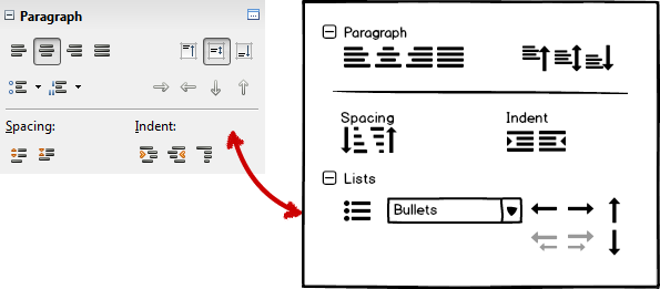
- better organization as shown in figure 1 with a dedicated section for lists, and icons closely attached to the list style with positional cues

Modification to the list style

After creating a list with bullets, subjects were requested to change all items on the second level with a defined indentation and a different symbol.
All participants tried the split button ‘Toggle bulleted list’ in the sidebar first, though this affects only the current selection. The same is true for the dialog Numbering and Bullets, which was the second idea during the test. Participants eventually used Clone formatting to accomplish the task, except one who was familiar with styles and went to the Edit styles dialog. In this dialog a clue is missing on what scope it works, i.e. selection, slide, presentation. Plus, only the ‘customize’ tab shows on what level the modification works (usually all respectively ‘1-10’). Much of the misconception comes from the fact that Impress has only one list style, which is defined in the slide master.
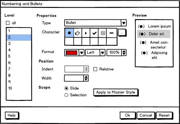
The recommended solution is to rearrange the control in the dialog (figure 3). The level shows the actual selection (second level in the example), and all levels is moved above list to get a prominent place. The middle column gives access to the properties, depending on the chosen type.
While the current dialog provides quick access to a couple of predefined bullets, numbers, or symbols it is unclear where those presets apply to. We suggest to remove the tabs and have everything on one page. Additionally, the scope is introduced where users can decide whether the modification applies to the current selection or to the whole slide. If the modification should apply to all slides that use the current master slide, then the ‘apply to master style’ option is provided via dedicated button. When this dialog is started from master slides respectively as style definition the scope feature should be disabled.


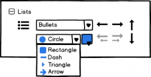
Additionally to this elaborated dialog, a quick access to the bullets (or number) style should be possible in the sidebar. That could be done by an extra dropdown. In figure 4 the new sidebar deck from above is continued with access to the object variants. The modification would be applied to the selection only.
Copy/paste of list items
In the next task, participants had to copy an item from the list and paste it somewhere else. This is surprisingly difficult because when the textbox is not in edit mode (the frame around is not active) you easily move the frame instead of selecting text. Looking into the issue it seems that the space between the bullet and the text is not accepted correctly. Solving this issue should improve the workflow significantly.
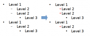
Figure 5 illustrates the current and intended behavior. Direct text selection is only possible at the blue area. Clicking at the bullet, shown here in red, works as frame selection similar to the area on top and ends in moving the textbox instead of selecting parts of the text. The behavior is indicated by the ‘move’ cursor. Suggestion is to add the hatched area to the accepted space for edit, ideally including the bullet itself.

Once the text is copied, its style is not used during the paste operation. Actually no properties are taken at all. For example, if document A has red bullets defined in the master slide and document B has blue bullets, pasting A into B ends up in black bullets. This issue should be solved. User likely expect the full style of the origin (applied as direct formatting when the master is different), but there might be also situations when the opposite is true and the target style should be used. The solution could be to have a paste special option with ‘paste with source style’ (the default for just paste), ‘paste with target style’, and ‘paste with no style’.
Conclusion
Bullets are a major issue in Impress. Based on the results from the usability test we suggest to clean up the properties dialog as shown in figure 3, to introduce a content panel in the sidebar where the current selection can be quickly modified, and to solve a couple of issues in the code. The result should make the workflow intuitive and easy. Is there anything missing that you can think of? Let us know in the comment section below.

In Fig.1 are you sure about the spacing icons, they are exactly the same as sort icons :
http://fontawesome.io/icon/sort-amount-asc/
I don’t catch either the meaning of the icons 2 smalls grey arrows
Fig.3 I love the idea to remove tabs, the scope is great, “apply to master style” may be a third level scope after Selection, Slide , the whole document (same as apply to master style)
Good job
The idea of separating selection and slide was that the two are direct formatting while master is a style. And applying to the whole presentation would be the same as changing the master, or at least having the same effect. The ODF definition for lists is in Impress/Draw is not really straightforward.
Of course the icons are just placeholders.
I cannot understand the meaning of
* demote/promote per paragraph indentation should be dropped in Writer;
* indentation of paragraph should be restricted to spacing before the bullet (or numbering), meaning
An example of what is deemed bad (and should be dropped, and why) would be good for non-English-speaking like myself. And why something should be “restricted”? Will I be unable to control that using a paragraph/list settings?
My Russian is unfortunately limited, so let’s better stick to English :-)
To change the level of an enumeration you can use the promote/demote buttons. In Writer it is also possible to do the same with the increase/decrease indentation (buttons directly underneath the Indentation label in the sidebar). We suggest to remove this functionality for consistency with Impress and for a clear scope of functions.
Indentation should work as expected in both modules, i.e. “moving” the bullet by the given value, which is the fact in Impress but not Writer. But that’s another story.
The question was different. If I use styles to configure the lists, then now I do not need to use either a tab or a button. The style specifies all the parameters.
But you do the statement:
“demote/promote per paragraph indentation should be dropped in Writer;
indentation of paragraph should be restricted to spacing before the bullet (or numbering)”
This statement can mean changing the behavior of styles.
Currently, a list marker is the first element in a paragraph.
Your statement may mean that the position of the list marker can not be set using the style. And besides, it will entail not compatibility with all previously created documents.
I would like to know how to number from this position.
Bug 113930 – EDITING: Bullets and Numbering incorrectly change tab positions
https://bugs.documentfoundation.org/show_bug.cgi?id=113930
Bullets and Numbering do *not* change the tab positions in Google Docs and MS Word. In LO Writer, Bullets and Number *do* change the tab positions. Suggested to have an option in the dialog boxes shown in your Figures above to have Bullets and Numbering independent to Tab positions.
Thank you