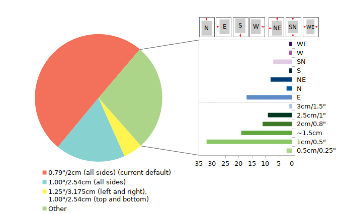
Earlier this year we run a survey about default margins in LibreOffice Writer. The results should prove that the default settings are what users apply in most cases.
For the first question, What should LibreOffice Writer’s default page margin should be?, participants could choose from a couple of presets but also specify an exact value for Other margins.

About 50% (n=258) are happy with the current default of 2 cm, ~20% (n=91) use an imperial default of 1”, and 5% (n=25) default to 1” but with additional space on the left and right in their documents. The remaining 27% (n=140) of participants use Other margins, mostly with smaller distances to all corners (1 or 1.5cm). Many precise values were entered, and when aggregated it’s mostly to get more space at the left side (n=17), called E for east here. For example, “1.00” left 0.79” right top and bottom” or “2,5 cm (left), 2 cm (right, top and bottom)”. Another part (n=8) do not only get more space on the left but also on top of the page (called NE in figure 1). For example, “For A4, 3cm (top and left), 2cm (bottom and right).”. Less often people want to get more space at the right (W or WE), or move the content to the top and bottom (S and N).
When asked Why do you prefer this page margin? first of all metric vs. imperial system were stated as reason (75% use A4 by default, 25% letter format). Also important is to comply with standards like APA (American Psychological Association) or MLA (Modern Language Association), or to use margins known from other tools. Printer capabilities limit the minimum margins that are set to save paper. Larger margins are required for notes and for the binding of pages. Finally, visual appearance, symmetry, and readability are mentioned.
Many user are happy with the default and do not change it. But there are also similarly many that use different margins with every document or quite often, at least.
| Option | absolute | percent |
|---|---|---|
| With almost every document | 116 | 23% |
| Daily | 8 | 2% |
| Weekly | 47 | 9% |
| Monthly | 86 | 17% |
| Never or maybe once in a year | 145 | 29% |
| Never, as I have set my preferred margins as default | 104 | 21% |
We asked “Do you know how to set a new default page margin?” to learn how difficult it is for users to do so if they wanted to. The result with Yes=352 (50%) and No=152 (20%) (the remaining 30% gave no answer) indicates that at least half of participants are aware of the ability to do so, but that there is also room to make it easier.
On the question “Do you have any recommendations regarding page margins?” it was suggested to have more than one default, to accommodate regional settings, and to follow the canons of page constructions by Van de Graaf or Tschichold, as well as other known standards. Utilizing the most amount of available space on a page and taking care of the environment was highly repeated. Last but not least, participants wish an easy to use interface.
Conclusion
In order to make it easy for users to switch to common default margins, we consider to include templates like
- ‘Small Margins’ (A4, 1cm)
- ‘LibreOffice Margins’ (A4, 2cm)
- ‘Common Margins’ (A4, 1”)
- ‘Old Common Margins’ (A4, 1.25”)
- ‘Book’ (A4, 3/1cm inner/outer, 1cm top/bottom)
- ‘US Standard Letter’ (Letter, 1”; includes a full template)
- ‘APA Style’ (Letter, 1”; including APA specifications)
- ‘MLA Style’ (Letter, 1”; including MLA specifications)
If you can create a template for any of these and think it should be bundled with Writer, please do contact us, and also upload them to our templates site.

Very interesting! I’m very happy with your suggested solutions.
Hi there,
this is a typographic question, I think you should ask a professional about this, not the community in general. There are some rules. I dont remember now, but in general: long lines on a A4 with small margins left and right are difficult to read, because the reader has to pay much attention to jump from the end of a line to the start of next line. So in A4 the default margins should be bigger, like 3 cm or even more, which reduces the length of lines.
Here’s a detailed typographical guide to margins: https://practicaltypography.com/page-margins.html
I would prefer the TDF employee that my donations are funding to be working on bigger design issues than page margin preferences. There hasn’t been any visible progress on MUFFIN in almost a year now. Meanwhile we pay for someone to conduct surveys on something that people will set to MS Office defaults or whatever their school/company will tell them to set it as. Doesn’t seem like a good use of a tight budget.
same as msoffice.
lot of people come from this suite, and must find the same configuration as far as possible, imho.
I don’t understand why you combine A4 with imperial borders? But ok, I don’t understand the imperial unit system in the 21st century at all…