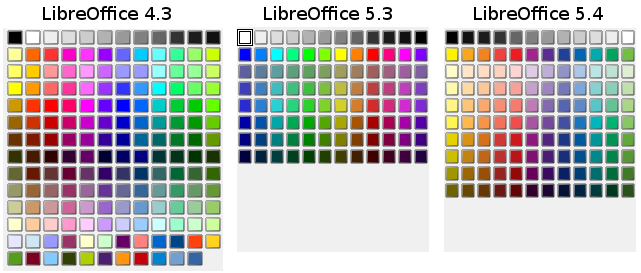
With the latest update of color palettes announced in New Color Palettes in LibreOffice, we also introduced a new standard palette that had room for improvements. Users complained about supersaturated colors, insufficient differences, and missing bright colors. So we asked for input on the design mailing list, and received three new palettes, which are shown below.

Survey
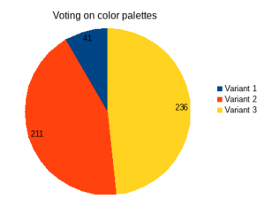
We ran a survey with the three palettes shown in figure 1 and received 488 votes, with almost a 50/50 split for variants 2 and 3. People obviously appreciate the better organized layouts.

Users were also given the chance to comment on their choices, which revealed interesting insights. First of all it, was suggested to not have fully saturated colors on top in order to foster good design with less strong colors. However, others recommended to go with exactly this layout. Well defined pastel colors were requested as well as dark variants and from the comments it was clear that a good organization of colors is wanted.
Standard color palette
We decided to go with variant 3, which is based on the RYB color model. Some small changes were applied to realized user requests.
The palette starts with a black to white row, followed by the base RYB colors row – yellow, gold, orange, brick, red, violet, purple, indigo, blue, teal, green, and lime. After that, there are four rows with brighter colors and then four rows of darker variants.
Having the full-saturated base colors at the top or middle of the palette was debated, and retaining them at the top was preferred, as it is the same with most competitors.
Since this new standard palette as well as the tonal palette have 10 rows, we increased the number of visible rows shown in the color picker from being dependant on the system theme to always show 10. The final layout from figure 3 will be available in the next version 5.4.

Many thanks to Thibaut Brandscheid and Yousuf Phillips for the contributions.

Hi :)
It would be very kind if you could give us a download link for the new palette, so that we can install it also on older versions of LO and on AOO.
You may download it from the patch (https://gerrit.libreoffice.org/#/c/36202/) and place the file at the right folder. Which is a non-trivial task. Check the New Color Palette post for more info.
Thank you very much!
The problem is that I use the colours as searchable labels for language analysis. By removing colours from the standard palette you break my method, as LO/AOO does not allow to search for colours which are not in the standard palette. Therefore I created a compatibility palette including all the classical colours from AOO (I guess they are still the same like in StarOffice) and the new RYB palette from LO 5.4:
https://www.file-upload.net/download-12435176/LO54RYBAOO.soc.html
In order to install them in AOO Linux, copy the *.soc file to ~/.openoffice/4/user/config and name it “standard.soc”.
@Xanadu, you can maybe make this available on the LibreOffice extensions site?
https://extensions.libreoffice.org/
I deleted the old file above and created a new palette, including all the standard palette colours from:
StarOffice 7
AOO 4.1.3
LibreOffice 5.3
LibreOffice 5.4
Download: https://www.file-upload.net/download-12436788/LO54RYBAOO413LO53SO7.soc.rar.html
Having past configurations stored somewhere is a good idea. But the better way to share palettes is via extension, as explained in the previous blog post.
@Xanadu: uploading this as an extension would be really usefull for some people
https://wiki.documentfoundation.org/Development/Extension_Development
Great work.
I’m also really appreciating the ability to easily switch palettes. It used to be a pain to manually edit standard.soc anytime I wanted to add a batch of custom colors for a project.
Any possibility of being able to custom size the palette drop-down? I have some palettes that work on more columns than LO provides. I don’t mind the vertical scrolling, but even that would be nice to eliminate for quicker color selection and overall viewing.
>Any possibility of being able to custom size the palette drop-down?
No chance, and actually I’m not aware of any picker that provides means to resize. Suggested way to deal with the problem is to organize the palette so that it fits into the given number of columns, e.g. with white-space items.
For the record, the color picker used by native Mac applications is resizable and where swatch boxes are shown, they flow accordingly.
Thanks for the white-space tip, but unfortunately, that doesn’t work as LO ignores any block of consecutive color definitions which are repetitive. So two blocks of ‘white’ right next to each other are ignored and the next color definition is used.
Why is there ‘no chance’? In older versions of LO you could resize the colour palettes, which was very useful for people with poor eyesight. These palettes have well-thought out colours, but I want to see them in a resizable, perhaps even redockable window.
This was long overdue. Thank you!
While you’re at it, I would also suggest to revamp the stock presentation templates. These might have been in style for geeks in the early 2000s but otherwise look horrible and unprofessional today.
We run small competitions in the past and actually added some of the new templates to Impress. You are very welcome to submit better templates, Joe.
Hmm, I upgraded, now my previous palette is gone.. and my productivity too. I’ll have to create a custom palette now.
But I am not yet ready to get used to the new naming and colours, I have to type text. So how dow I get the old palette back?
Ah, found it. If you still have your old profile data, you can copy the original palette to the new profile with a different name.
The palette is called standard.soc. Rename it to libreoffice-4.soc or something else, then copy to ~/.config/libreoffice/4/user/config (or your own location of the profile)
Done. Start libreoffice and select the palette..
Pfew.. now on to the next bug.. all SVG exports are fully corrupted after upgrading (on Ubuntu 16.04, LO 5.4.3.2)
Even if my comment come later (from far), I would say that some users needs to use their own colors (palette). It’s possible to same them but hard to import, and complex to change it (importing to writer, impress and calc seems to be not the same file : *.soc and *.sog).
Finally, can’t easely let LibreOffice evoluate without loosing our presets for palette : it’s too bad.
When it”s imported, it’s easy (too easy on a wheeling mouse) to change the palette.
Help us to change that, thanks.
I’m really sad you removed the 4.3 color palette, so I wrote instructions on how to get it back in LibreOffice 5 or 6 or later. https://superuser.com/questions/1395184/how-to-restore-libreoffice-4-color-palette-highlight-colors-font-colors-etc/1395185#1395185
– Gabriel Staples, http://www.ElectricRCAircraftGuy.com