
In March 2016, we asked the community how they use the sidebar and how they feel it should evolve. About 290 participants answered the single choice questions and around 100 answered the free text question. All in all, users want as much freedom and flexibility as possible.
Results
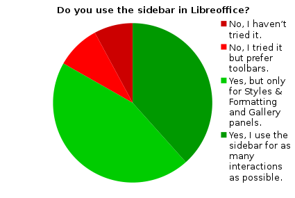
In general, the sidebar is well accepted with the majority fully or partially utilizing it. Only 9% tried this alternative workflow but refused it in favor of the conventional toolbars.
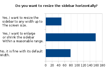
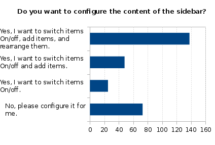
When asked about the individualization, most participants (70%) would keep the sidebar attached to the default side, whereas resizing and configuration is highly appreciated (both ~75%). Participant also want all changes to be user-driven, in that the sidebar should never jump or resize automatically when the content changes. (Learn more about the actual results at https://wiki.documentfoundation.org/Design/Whiteboards/SidebarUsage).
|
|
|
The preference of manual customization of the sidebar is supported by the answers to the open free text question, wherein users often said something similar to:
“Give users more freedom of choice either by allowing:a) A separate floating/dockable dialog/window for all sidebar components as is currently the case for the Navigator (ie. F5 opens Navigator independently outside the sidebar).b) Sidebar components to be disconnected/dragged from the sidebar to be a separate floating/dockable dialog/window….” |
Of course there are also some participants who appreciated simplicity:
“While I think certain extra functions could be useful in the sidebar (eg change tracking) I also think it could end up too cluttered. Finding the right defaults to not overwhelm the user will be hard, but allowing extra panels to be switched on/off could be a way to slowly introduce new panes and find the popular or most useful ones.Also I am surprised how quickly I started using it, so it is reasonably intuitive already. Try not to lose that.” |
Issues
Nothing comes for free, so if new features are introduced, the functionality may be incomplete.
Resizing
When resizing a container, we have to take care of the controls (e.g. button, input field) included in it that are being cropped. There are two ways how toolbars handle controls that extend beyond its size: either wrapping the controls in a toolbar row below it or hiding the controls and place a clickable chevron button at the end of the toolbar that indicates additional items are available and provides access to them via a drop-down menu (as implemented in LibreOffice). This approach works for containers like toolbars that have simple controls, but a container like the sidebar that has labels, larger controls spanning more than one line, as well as controls placed in sophisticated arrangements, makes the automatic cropping difficult. One option is to use a horizontal scrollbar to reach the cropped content, but this hinders usability.
Configuration
While some users want to enhance the sidebar to literally replace toolbars and dialogs, some participants even asked for the ability to have it as a floating window on the second display, others want to keep it simple and prefer a limited functional scope. The rule of thumb is “a design for all fits none”, so we need to allow the configurability of the sidebar. However that should not be done in the same way as a toolbar, with its simple options to show, hide, insert, delete, and sort items. Rather we would need a visual designer that is easy to use, so the average user can handle it.
Familiarity
Many participants complained about the flickering and jumping of the UI when the context switches. The decks contain properties and functions that are not always valid. For instance, the paragraph style content panel is relevant for all text, but the controls for the vertical alignment are only relevant and shown for tables. And when the context is changed to something else like graphical objects, the full sidebar devolves into something else. A suggestion was to just disable the non-appropriate decks and options. Although this sounds like a reasonable approach it doesn’t work in general. An example is the styles and formatting tab that is valid for both types of objects, but the content differs substantially.
Conclusion
As outlined in the call for participation, we should reframe the guideline for the sidebar based on the results. A working concept is the foundation of good design. This is also acknowledged by the participants:
| “I like the idea of having a toolbar for functions, and a sidebar for properties. Toolbar should be fixed and program specific, sidebar should be dynamic and change its content according to selection….” |
However, the maximal flexibility as requested by most of the participants makes it necessary to adjust the guidelines.
The preliminary HIG for sidebar(s) was drafted some time ago (see this blog post) but some aspects did not meet general acceptance. Based on this survey we will update the guideline (the introduction remains as it is):
General
- Provide access to frequently used features in the sidebar. Make sure to have all features in the dialogs.
- Panes (aka decks) are switchable via tab buttons and via keyboard shortcut.
- Provide means to configure position, size, and content. Allow to detach the panes (decks) into separate (floating) windows.
- Do not crop controls. Define one minimum width depending on the content of all tabs.
- Make sure the size does not change depending whether the vertical scrollbar is shown or not.
- Do not hide controls that are not relevant in the current context within the content panel. Rather disable those properties.
- Do not hide content that is out of context. Rather place them in a separate tab/deck.
- Define sensible defaults but allow as much flexibility to the user as possible.
- Do not touch user-defined settings. Any properties that was changed manually must stay as it is independently from the system state.
Organization of Content
- Avoid vertical scrolling by having content fit into deck height (in respect to LibreOffice’s default resolution of 1280×768 pixels). In the case of too many options, consider splitting them into different deck or (preferably) split over more content panels within the same deck.
- Prefer controls where the setting is one click away (e.g. list box rather than drop down or direct access to recently used colors in addition to the widget).
- Prefer mouse-driven graphical widgets in favor of controls that require the input of an exact value (e.g. an image’s transparency with discrete steps via sliders).
- Consider introducing presets of properties comprising of the most relevant settings. For instance, one page margins with all four values.
- Take care of the appropriate tab sequence to support accessibility.
Appearance and Text
- Prefer the use of a grid layout with one or two columns.
- Align elements to fit the deck width. Left align labels and place the input control right of the (localized) label. Do not place the label above the input control.
- Label control groups in the sidebar, preferably when the content panel name is not clear enough or when many controls are included.
- Use indentation to indicate the organization for labeled sections.
- Provide tooltips with all controls to support accessibility.
As a final statement we should aim for full customization including an option to store different presets so the user can easily switch between settings. But that’s all still up in the air. What do you think?
Appendix
Raw data: https://wiki.documentfoundation.org/File:2016_Sidebar.csv.zip
Textual analysis: https://wiki.documentfoundation.org/File:20160331_SidebarSurvey-TextAnalysis.ods