Introduction
With the release of LibreOffice 4.4 last year, we began making incremental updates to the main menus, with the major overhaul happening in the upcoming 5.1 release. The work is guided by LibreOffice’s new Human Interface Guideline (HIG), which has given us the core framework, however some questions have arisen challenging the reasoning of our work. So this post is a summary of what we changed, primarily focused on why we’ve done it – and a little outlook of what is planned for the future.
TL;DR: The main menus were changed to improve usability with the goal of consistency, clarity, and completeness. So try it out and let us know what you think.
Human Interface Guidelines
The HIG states the following about the menu bar:
- Provide access to all commands within the main menu.
- Do not have more than 10 menu categories within a menu bar. Too many categories are overwhelming and make the menu bar difficult to use.
- Use standard menu categories if they apply to the application: File, Edit, View, Insert, Format, followed by the application specific item and after that Tools, Window, Help.
- Seek to have no more than 20 items within a single level of a menu and use submenus to assist in this limitation. Add separators between logical groups within a menu. Seek to organize the menu items into groups of 7 or fewer strongly related items and use separators between these logical groups.
- Do not use more than three levels in a menu.
- Unify the location of menu items between modules/applications, so users can find the same item when switching between modules.
- Place items only in one location within the menu, except for special circumstances (e.g. Styles & Formatting appearing in the Styles menu in Writer).
- Sort items according to the frequency and importance of their usage on the first level, while keeping logically grouped items together (copy/paste, add/delete, etc.)
- Show icons for the most important items. Do not show any icon if the OS has set this option (e.g. Mac OS X, Ubuntu/Unity).
And some advice how to label functions and submenus.
- Turning on an item in the menu should always enable the option. Negative options create a double negative which can be confusing. For example, use ‘Show hidden files’ instead of ‘Hide hidden files’.
- Use singular form in labeling when applicable (e.g. Insert > Shape, though multiple shapes are listed under the submenu, a user can only select one item).
- Standardize on the verbs used – Show and Hide, Enable and Disable.
Some new guidelines have been used that are not yet defined by the HIG, but will be added soon.
- Use ‘or’ or ‘and’ when grouping entries, depending on which is more applicable (e.g. ‘Footnote or Endnote…’, ‘Header and Footer’) (Remark: this finding was discussed in tdf#95280)
- Use descriptive labels to reduce ambiguity (e.g. Table and Index -> Table of Contents and Index) (see tdf#96253 for the reason)
Changes to the Main Menu
To be in accordance with the HIG, in particular with the number of items per menu, the grouping and sorting needed an update. Tedious searches through the menus for a particular function should be minimized by consistency and familiarity. Another goal was to harmonize the menu bars over the different modules/applications. Besides the HIG, the modifications are based on the user metric statistics done by OpenOffice, analysis of a number of competing office suites, reading user feedback, and watching user videos.
Writer
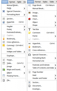
As stated in the guidelines, items should be grouped logically. An example is File > Reload and File > Version, with both of them being related to opening a document. Therefore these items were moved upward to the respective position. Furthermore the frequency of usage should be taken into account for the sort order of items. For instance, the insert action is closely associated with adding elements to a document, so Insert > Image, Chart, among others, were moved upward in the same menu. Image was hidden under Picture submenu and Chart was previously hidden behind the Objects submenu, but as images and charts are frequently inserted into documents, these items are now found in the first level. Those rather small-scale changes were applied to many menu items in order to improve the menu structure.

Although we attempted to keep the old arrangement this was not always possible. The Edit menu contains a lot of entries, which made it necessary to move or group items into submenus. That included moving Compare Documents into Track Changes, and creating a References submenu for Footnote/Endnote, Index Entry, and Bibliography Entry. With these changes the structure should be more concise, though there are still too many entries below Edit.
Another large-scale change involves moving items from one menu to another. This happened with Format > Styles and Formatting, which now opens the sidebar’s Styles and Formatting tab on and off, and it was moved into the View menu with the other sidebar related functions. The same is true for Format > AutoCorrect and Edit > AutoText, both of which can now be found under Tools. Sometimes it is not easy to find a good solution, like with the example of Table Boundaries under Table. Moving this item to View was attributed as ‘dumping all under the same place’ (tdf#86647). Those hard decisions were discussed extensively in the UX team.
We had also to rename a couple of functions for clarification and consistent wording. Edit > Changes is now called Track Changes, the item Insert > Indexes and Tables was renamed to Table of Contents and Index, and Table > Heading Rows Repeat is more consistent labeled as Repeat Heading Rows.
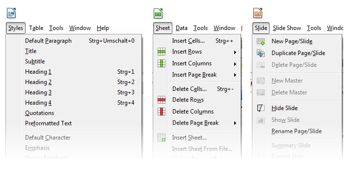
Meanwhile, a new Styles top-level menu was introduced to bring to user’s attention the importance of styles, give them menu access to frequently used styles, and allow them to be see their accelerators (shortcut keys).
Calc
Calc underwent an even larger changes than Writer. We added a Sheet menu with all functions related to sheet manipulation and management, and since all of the functions were moved from existing menus, the changes will have an impact on users who are familiar with the older menus. The new Sheet menu contains functions from Insert that are related to sheet management such as Page Break, Cells, Rows, Columns etc., as well as delete functions previously found under Edit.
In order to place related functions together in an appropriate position, inserting a pivot table was moved from the Data menu to Insert, while pivot table management functions were left within the Data menu. Splitting the functions of the pivot table over different places is controversial discussed in the design team. The advantage of an action based position at Insert is opposed by the drawback of not grouping related functions.
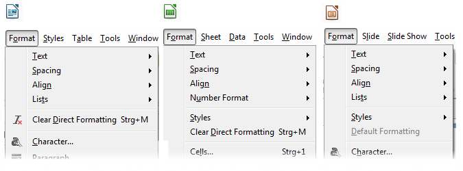
The function Format > Change Case can now be found below the new Format > Text submenu (this happened in all apps), and the Tools > Protect Document submenu was removed in favor of moving its contents (Protect Document and Protect Sheet) into the first level.
Some reorganization was done for the Format and Data menus, mainly just changing the position of items. Again the goal was to have frequently used items above the others and to group functionality. Furthermore we wanted to harmonize the menus for all Libreoffice programs, as discussed in tdf#85945 (Improving the File menu).

Impress
Similar to Writer and Calc, we have introduced a new menu in Impress: Slide. This new menu aims to consolidated slide management with properties, which were previously found scattered across different places such as Insert > Slide, Duplicate, Expand and Summary, from Edit > Delete Slide, from Slide Show > Interaction, Custom Animation, Transition, Show/Hide. In addition to gather these items together, we also added new entries that weren’t previously found in the menus, like Display Master Background and Set Background Image.
The former View > Master menu was split up so access to all types of masters is available from the first level. Formatting a piece of text was not available from the menu in previous versions and if you wanted to make characters bold, for instance, you had to use the toolbar or open the character formatting dialog. The updated Format menu is consistent across apps and offers access to Text, Spacing, Align, Lists, and Styles.

Discussion
Not all changes can be presented in detail here. Moreover we do not want to discuss the reason why every menu item was moved or renamed. This posting is rather about the foundations. Our goal was to improve accessibility in terms of a) the number of items per menu, b) grouping of functions that belong together, and c) sorting items so that the most often used are found at the top. Most, if not all, of our menus are overloaded. So functions that are used rarely have to be placed in submenus, and those that are more relevant are placed at the upper level. Furthermore, the modules/applications of the Libreoffice suite should all have a common look and feel. That means to have a similar organization in the menus, as much as possible. And finally some items were renamed in order to clarify the underlying functionality.
Of course not every user will be happy with these modifications, as change is always hard to embrace, especially when you are used to a particular workflow. So for that we apologize! But most users, especially the not so tech-savvy and the newcomers, should benefit from the streamlining, and those who wants to stick to the old organization for whatever reason may customization the menu to their liking in Tool > Customize: Menus. Nonetheless, feel free to discuss the changes, as no work is ever completely finished on the first try. Thoughtful and clear ideas are always welcome.
Outlook
Most of the work has been done for the main three modules/applications, but the other apps are still upcoming, including Draw (tdf#95827). There might be an occasional misplaced item, and some discussions on the bug tracker are still in progress. There are for instance the enhancement regarding adding page numbers (tdf#86630), shortcuts to insert and delete rows and columns (tdf#86049), formatting text as embossed and engraved (tdf#86853), and additional functionality like completely hiding the main menu (tdf#90195). But in general the modifications are done.
Some items are not well named with camel cases (e.g. AutoFormat) or have unclear captions such as Object or Field. On the other hand, as long as no better term is found the known labels are acceptable. Another area of contention is assignment of accelerators and formal short-cuts. Work for GTK+3 on Linux (tdf#92630) and Windows (tdf#54169) affecting visibility of accelerators (and their behavior) is leading to some annoyances when assignments are duplicated.
As always documentation is required, and there is a lag in accomplishing corresponding changes in the built-in and Wiki based help. Fortunately, the menus are mostly self-explanatory, but there is remaining work to be done in bringing all forms current, i.e. tool-tips, Wiki help, and the published use guides.
And in the course of implementing a new configuration for the extended toolbar there will be probably also room for the main menu. Such a configuration would provide much more flexibility with options to save and load different setups. So stay tuned.
References
For more details and discussion about the reorganization, read tdf#91781 for Writer, tdf#91820 for Calc, and tdf#91857 for Impress.

+100 for adding “Page break” to the “Insert” menu in Writer and for moving the “Insert -> Image” entry some levels up :)
Like the changes, thanks for all your work!
Yep! Like those changes a lot. :)
Thanks so much for *NOT* switching to the ribbons nightmare.
Maybe it’s because English is my native tongue, but but the verb-action form of menu organization (for example, “Insert->Columns”) is a *lot* more intuitive than “Sheet->Insert Columns”, since my first thought is “I want to *insert*” something, not “I want to do something to *the sheet*”.
Yes Insert -> Columns is definitely easier, but the opposite action of deleting a column wasnt Delete -> Column, but instead was Edit -> Delete Column. So its easier to have all of these related actions under one menu rather than scattered across multiple ones.
Edit is still a an action verb, so moving “Delete Column” to Edit is understandable. But a “Sheet” menu makes me think “formatting” instead of “action”.
Also, people who have been using LO since the Star Office days have much muscle memory in looking in certain places for things.
Yes edit is an action verb, but if we move all editing functions into the Edit menu, it would be huge. Give it time and you’ll get used to it, just like you are used to all Table operations are all in one menu in writer.
Change is normally hard at first, but becomes easier over time. For those who dont like the new arrangement, they can always customize their menu (Tools > Customize).
Amazing work. Thanks for the write up!
Wonder if in all this rearranging somebody deactivated the File>ExitLibreoffice menu choice? A bunch of us have filed bugs about that, but it’s not yet fixed in 5.1.x or in a 5.2 beta I tested. So I, at least, reverted to 5.0.5.2 which works as expected. It’s a show-stopper bug for me. Otherwise, when I tried 5.1, it was pretty well laid-out.
I liked, in the past, doing Insert–> Row(s) instead of Sheet–> Insert Rows
For me, it was more straightforward and intuitive, and now, it’s gone.
The menus are editable now, so you can always change it to how you prefer it.
It’s great that there has been an effort to clean up the menus in LibreOffice. However *PLEASE* review also from the point of view of keyboard shortcuts. The latest menus are very hard to use with good-old ‘alt-A-B-C’ type keyboard shortcuts. For example Alt+I+D is mapped to three different shortcuts, which is confusing and unnecessary.
Perhaps it might be possible to write a script or something that helps us to avoid redundancy in these shortcuts.
Also where possible, it’s great to keep compatibility with the shortcuts from earlier versions.
We do try not to have multiple entries with the same shortcut, but sometimes its not possible with all the commands we are adding to the menus. If an entry hasnt moved from the menu it is in, then most likely it will still have the same shortcut.
Moving “Delete Rows” from the Edit menu was stupid.
Wow, I just discovered where the Insert row command has gone.
I actually added a toolbar button because it was gone of the Insert menu.
Highlighting the Sheet menu after the install until we click on it would have been useful to make us notice that new menu.
Think about it next time or maybe do it anyway on the next install for the other users: You could check during a month if the user clicks on the menu and highlight it if not, because the user probably hasn’t noticed it.
Can page set up be moved under the File menu like in MS Office and other programs. Also can the Office 2013 them be installed in Libreoffice as a theme in a future distribution? It is a nice professional looking theme and I always add it to new installs from Deviant Art.
http://charliecnr.deviantart.com/art/Office-2013-theme-for-LibreOffice-512127527