Introduction
As in many other dialogs, Libreoffice provides a lot of functionality for tweaking the hell out of areas taken up by shapes, charts, frames, etc. You can have a solid background color, with or without transparency/opacity, you may fill areas with gradients that in turn have several options, it can be assigned to hatchings, patterns and bitmaps, each with numerous options again, etc.
Area settings may be done in its own dialog, for instance when you add a shape and start the area properties dialog from context menu, or as part of a style such as paragraph style where area has a tab with similar but not equal features.
Putting all peculiarities together, the area settings needed some love by the UX team.
Issue
- Current tab is not intuitive due to its dynamic content
- Controls are not appropriate to the function, e.g. color drop-down vs. color picker
- Some of the newly introduced features for the sidebar are not available
- All-in-one area tab for modifying object fill (tdf #94551) is needed
Current State
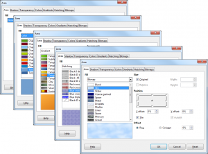
To revisualize the current state just add a shape, right click it and choose Area from the context menu. In figure 1 the basic access to options via drop-down is shown in the Area tab. Please also take a look at the different tabs and notice the difference to the basic settings.
Solution
Our proposal is an evolution to the existing dialog, without the loss of any features. First of all, we have two basic levels of navigation: the parent options from paragraph style, for instance, plus the general access to shadow and transparency, both relevant for all types of area fill, and the kind of filling such as none, solid, gradient etc. These two levels need to be represented in the dialog by different controls: tabs (as today) for the parent options and toggle buttons for the area specific settings.
In order to harmonize the dialog layout and the workflow we propose to have always access to a couple of preset. The details for the selected preset (respectively the referenced object when the dialog is being opened) can be changed in the content area (Options). Users may save changes as new presets that would be available in other documents. And as third part of the UI there should be a WYSIWYG preview.
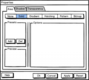
- Selection of type of area fill (none, solid, gradient…) per toggle button
- Left columns with
• Presets, along with functions to add/delete user-defined options
• WYSIWYG preview - Right client area with options to tweak all properties
- Common functions for dialogs plus Apply, which adopts the settings to the document while the properties dialog remains open
An alternative layout could focus on the preview. Not only the presets get more space but also the preview has its own column.
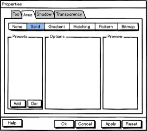
The drawback of this solution is that a) resizing more than two areas is awkward (although these types of dialogs wouldn’t be resizable), b) the space for the content area would be reduced in favor of the preview, and c) such a layout wouldn’t be an option for a default solution (we try to have a default layout that makes dialogs familiar). The two-column solution leads to more whitespace in the content area, which is not bad from the design and usability perspective.
Advantage of the three-column solution is that some types of area fill do have only a few options. The space is occupied better. And since the preview has a separate column it’s more in the focus.
Solid fill

- Palette comprises of colors from the default palette selected below
- Active shows the actual color as in the referring object, or is empty/grayed out in case of a non-solid style
- New shows the color that is being modified on click via default color picker
- Both active and new allow also to read and set RGB or hex values
Gradient
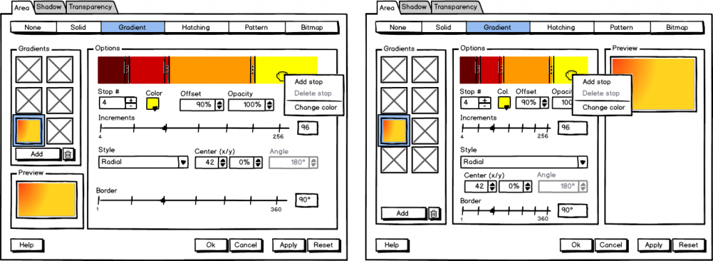
- User may choose from one of the predefined gradients
- Options allow to modify
• stops including color and opacity (the number of stops define how many colors are used in the gradient; with offset or the visual equivalent of sliders the slope of those colors/stops my be changed, for instance to configure a perfect sundown with small portions of yellow and red and larger in blue)
• increments (aka sampling points) that define the final resolution of the gradient
• the style how this gradient affects the area along with secondary options such as center, angle and border
Hatching
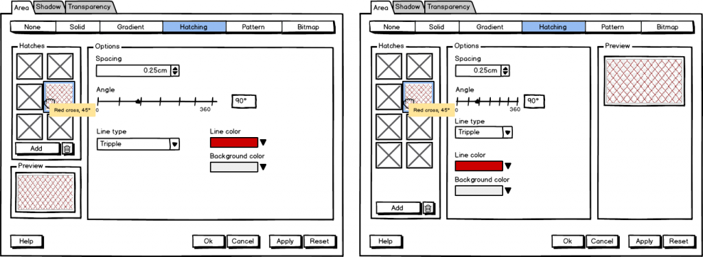
- Layout should be self-explanatory
(Having a dedicated widget to enter angles as today (that are not adopted to the exact value input) seems to be an overkill)
Pattern
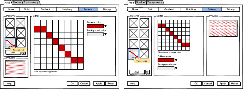
- Patterns are created by toggling color bits on/off
(Currently, the pattern editor is placed at the bitmap section, available when the image is set to ‘blank’- this is a prefect example for inconsistency)
Bitmap
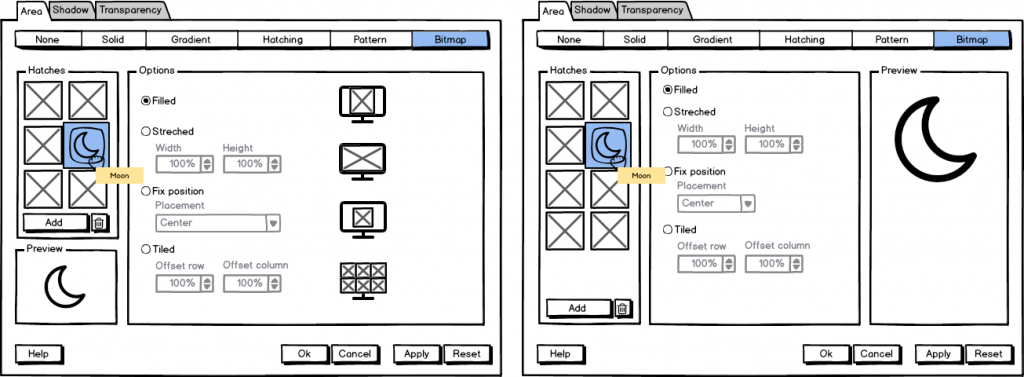
- Users can select from the standard bitmaps or load own images
- Options how to place a bitmap (such as size, position, repetition etc.) are shown today only at the first area tab, and with a mutual dependency that is not very intuitive
- Suggestion is to have some kind of wallpaper-like placement, which might be a restriction in a few cases
Sidebar
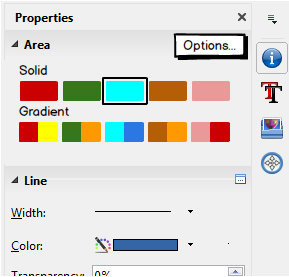
Of course, frequently applied properties should be available from the sidebar. But it make no sense to replicate each and every setting here; and the controls should also get adopted to the specific use case- that is to quickly change a property. That’s why we suggest to have a picker for recently applied colors and gradients only- but with easy access to the dialog where all options are available. (If there is no recently applied property the predefined set of colors and gradients is shown.)
By the way: that’s the way the sidebar is supposed to work in general.
Discussion
Open for discussion is the question if there is need for more quick-access features at the sidebar. If people often switch between, for instance hatching and solid area fill, we would need to add another row to the sidebar. On the other hand if only a minority benefits from such a control it’s better to keep the sidebar clean. And of course we want to hear your opinion about two or three columns.
What do you think about the changes? Is there anything missing. Discussing changes before the implementation starts makes it easier for developers and allows to improve code quality. So feel free to add your thoughts.

Is it possible to increase the size of the WYSIWYG preview of the zone “Bitmap” by reducing the “Options” area?
Thank you for your fantastic job that deserves admiration.
Sincerely, Philippe
This kind of dialog is not resizable. And a splitter between the columns wasn’t planned yet.
Is there really a need for a pattern editor? that seems like an ancient relic and I can’t see who would use it these days. Unless it’s outside your scope to remove features, of course.
Every time an ancient feature is challenged someone complains. And another sections doesn’t hurt too much on the other hand.
why is the preview duplicated on every sub tab? can’t this be factored out into a separate persistent region of the dialogue?
The preview section appears to be the same for each window – is there a reason this is duplicated per-tab?
You get a WYSIWYG preview according the settings. Either below the left column (“two-column layout”, left mackups) or right column (“three-column” layout). Which one do you prefer?
Nobody else has responded – but I rather like the 3 column view – that’s more in keeping with an A4 page in my view. Each to their own, I don’t think it matters all that much. Great work though!
Ages ago I sent a post to the UX group but it was never accepted. It was requesting that someone’s hard work in making a .soc palette might be included. I could dig it out, but is that still possible to suggest? I was half tempted to commit without any go ahead, but I thought better of it :-)
Not sure if I can post to the UX mailing list… :(
Thanks for your reply. About the palette: There are a lot of issues on the bug tracker. You can place the soc file at extras/source/palettes/ in order to make it available on your system. That’s not very comfortable and could be improved with some kind of load/save or even share GUI functionality. If you find your own feature request it would be nice if you add your impressions and close it or you write how to make it better. And of course you can send emails to the UX mailinglist. If you haven’t registered (which is free for everyone) your message will be moderated. Here is all information https://wiki.documentfoundation.org/Design
Hi. This is nice work, highlighting an area I haven’t looked at in ages. It would certainly be improves vastly by your proposals. A few comments:
– ‘Area’ tab should be named ‘Fill’. This is more consistent with the UI hierarchy presented (Shadow and Transparency tabs- relate to visual aspects of the parent object Area).
– IMHO Remove the pattern editor. It’s a shortcut to editing a small 8x8px bitmap. A user wanting this effect can create bitmaps in a separate package (MS Paint, etc.), then import into the bitmap fill. The only example of this being used on the web: http://www.lpgallery.mb.ca/ooffice/Impress/i1.htm (scroll to the bottom). We cannot maintain clutter from the 1990’s and achieve a modern UX !
Supporting pattern editing is important for interoperability (e.g. https://bugs.documentfoundation.org/show_bug.cgi?id=44552) and though it is not a highly used feature, it would make sure that users are able to create or modify it in their documents, if they so choose.
Very nice work here! We would accept this excellent UX redesign proposal with no changes. In our organization, we have not used Patterns in over a decade for new documents, but we do import old documents where it was used fairly frequently. We have also seen the Visio issues Yousuf notes above. If it’s not too much trouble to incorporate patterns using this excellent redesign, it would be appreciated. The naming of Area/Fill does not matter to us.