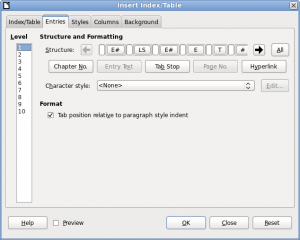
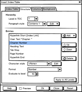
The Libreoffice UX team started last week with another type of meeting, the design session. The goal is to discuss one issue in detail along with possible solutions, mostly a mockup. This includes a clear description of the issue, functional and non-functional requirements, as well as constraints for the design. Based on these artifacts we design the mockup together via screen sharing. Last week’s topic was the Entries tab on the dialog Indexes and Tables.
This article was posted first on 2015-Mar-12 at user-prompt.com (site closed now)
Issue
- Abbreviations hinder understanding of content → Entries should have the full text
- Horizontal usage of space is cumbersome; we have much more room for vertical arrangement
- Interactions are neither clear from layout nor the captions
- Setting up entries and formatting/styling should get merged
- Design is not appealing (at least the list with levels is too small)
- Summarized in bug report #89608
Screenshot of the current dialog

Functional Requirements
- Entries
Chapter number (E#), Heading Text (E), Page number (#), Hyperlink start/end (LS,LE), Tabstop (T),Text Entry - Style and formatting
Formatting of entries (e.g. number with or w/o separator), Style of entry, Format (Tab position relative…) → should rather be moved into Index/Table since it affects the whole table of contents (TOC) and not a particular entry - Functions
Add entry, Delete an entry (via keyboard only), Sort (newly introduced; nice to have), All (Apply to all levels) - Levels
- Live preview
Non-functional requirements / Constraints for the design
- Information of the current scope is shown in one dialog using tabs to structure the content
- No hidden features; ‘expanded’ controls are favored
- Edit options first, apply to doc later
- Full flexible and customizable by user
Proposal for new layout

- Change list of levels from full view to drop down
- Add paragraph style from other tab into the form
- Have full names for entries
- Update labels
- Add sorting feature
- Use more descriptive labels
Workflow:
- Click Add, select type of entry from dropdown, and have a new item below the current selection (selection changes to the new one)
- Specify options for the added entry
- Select an entry and get the respective options to change
- Move entry up/down
- Delete selected entry
Conclusion
The first discussion with developers and experts was about labels and the fact that the entries depend on the type of index (first tab). So we have not only the table of contents (TOC) but as well Alphabetical Index, Illustration Index, Index of Tables, User-Defined Index, Table of Objects, and Bibliography. Two solutions come in mind: First, the concept allows to change the list content from TOC items to bibliography related information. The workflow wouldn’t be affected. Second, we could offer the new content only in case of TOC and keep the current for all other. What do you think?
We plan to do the design sessions regularly. This week we will discuss the integration of content management systems. You are welcome to join us on Friday 1pm UTC.
