
The metaphor of a floppy for Save is one of the most controversially discussed and challenged icons. There are haters who argue that many younger people never have seen a floppy (except at the Save icons). And there are lovers who favor the clear and unique depiction of the floppy.
The German newspaper ‘Stuttgarter Zeitung’ and the ‘Stuttgart Region Economic Development Corporation’ ran a competition to design a new icon for ‘Save as…’: http://speichern-unter.net/ (German only webpage). The task was simple: Design an icon for Save-As. Thousands of suggestions have been submitted, most likely overwhelming to the organizers as well.
This article was posted first on 2014-Nov-13 at user-prompt.com (site closed now)
Approaching the ideas
Looking at the bunch of ideas we got thought that a categorization makes sense. We grouped icons by the metaphor that the designer might had in mind (examples are chosen randomly from the sample).
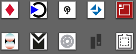
- Arrows and check-marks
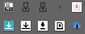
Arrows Designers seem to love arrows. Many icons consist of a downward pointing arrow or convey mainly on arrow like symbols. The idea behind is that Save is an action where users put something into a container (this container varies largely).
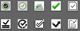
Checkmarks Similar to the arrows, a check mark is very common. The designers might have a finalization or affirmation in mind, saying something like ‘Action conducted successfully’.
- Storage
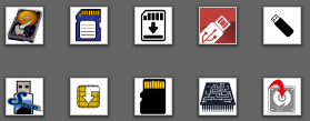
Storage The next big category is the medium. Several submitted proposals still trust in the floppy, more or less symbolic. Other ideas want to associate Save with an USB stick, chips (mostly as known from SD cards), hard discs, compact discs, and clouds (we tried to sort this list by the number of items in the category).
- Text

Icons using text Other metaphors trust in text. Locks, keys, and safes are used quite often to indicate the safety aspect of the Save action (whereas a safe might have literal reasons). The letter S was suggested very often, disregarding that the label in languages other than English (Save as) or German (Speichern unter) does not start with S, for instance French (Enregistrer sous). Funny in this respect is the idea with a squirrel whose tall is inverted S shaped (there are at least three participants with this idea!).
- Memory
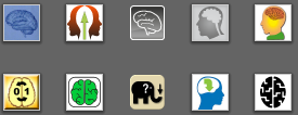
Utilizing memory Surprisingly often a brain was suggested as metaphor. The idea is obviously to memorize stuff. And consequently elephants must not be missed due to their proverbial long term memory. Those icons reveal the problem with size and level of detail: the submitted images had to have a size of 275 px, but toolbar icons usually have only 22 by 22 px. And a brain that is resized to 22 pixels does not differ from a cloud, for example.
- Symbols
Symbolic approaches Last but not least we have a large number of icons that are designed symbolic or are mainly abstract. If an established metaphor should really get replaced it might be a good idea to introduce an abstract symbol. By doing so you trust in learnability – and in the fast technical development: All concrete icons may be outdated tomorrow.
Official Evaluation
Evaluating all the ideas cannot be done in a definite or complete manner. Due to the huge amount of submissions it is just a subjective impression, probably ignoring some great ideas. The organizers ran the evaluation in two steps: first the users were asked to vote. That was done by presenting some randomized icons with the option to up-vote as many icons as desired but each only once. However, publicity over social media was explicitly approved. (This might have significantly biased the result.)
Unfortunately the icons were presented in 275 x 275 pixels using an endless list (by scrolling down the content is being refreshed). As a thumb of rule from our icon tests we recommend to have at least 100 values for a valid result. This was not possible for this large data base.
In the second step the 20 most favored icons have been evaluated by experts (10 from the amateurs and 10 done by professionals). And the winner presented today on world Usability Day is… Check it on the page http://speichern-unter.net/.
If a change is required I favour the ARROWS – no question.